Jetpack Compose Text: A Complete Guide
Welcome to this all-encompassing guide on Jetpack Compose Text! Jetpack Compose has revolutionized the way we think about UI development in Android. With a more intuitive and functional approach, it offers a wide range of tools to manage and style text.
Whether you’re a seasoned developer or just getting started, this guide will walk you through the many facets of text management in Jetpack Compose.
Basic Text Display
Text is an essential part of any application. In Jetpack Compose, displaying basic text is as simple as using the Text composable:
@Composable
fun TextExample() {
    Text("Hello, Jetpack Compose!")
}
This code will render a simple text on the screen.

Display Variables within Text
Sometimes, you need to display dynamic data. For instance, user input or data fetched from a server. In Compose, you can easily integrate variables into text:
@Composable
fun TextExample() {
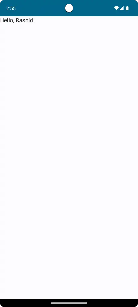
val name = "Rashid"
Text("Hello, $name!")
}This will display: “Hello, Rashid!”
Display Number in Text
Displaying numbers works similarly to displaying variables. If you have an integer or a float, you can seamlessly incorporate it:
@Composable
fun TextExample() {
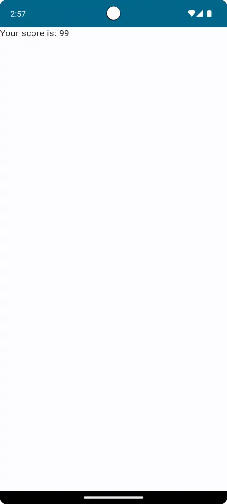
val score = 99
Text("Your score is: $score")
}This displays: “Your score is: 99”
Display Text from Resource
It is recommended to display text from string resources instead of hard coding. Got res > values > strings.xml and add a text as given below.
<resources>
    <string name="app_name">My Application</string>
    <string name="hello_world">Hello World!</string>
</resources>
Then you can display this string as text.
@Composable
fun TextExample() {
    Text(stringResource(R.string.hello_world))
}
Text Font
System Fonts
Jetpack Compose provides default support for system fonts. Using these is straightforward and ensures consistency with the platform’s design:
@Composable
fun TextExample() {
    Text("Using System Font", style = TextStyle.Default)
}
With this, your text will adopt the default font style of the Android system.
Change Font Size
Adjusting font size is essential for readability and design:
@Composable
fun TextExample() {
    Text("Bigger Font", fontSize = 20.sp)
}
Using the sp unit ensures that the text scales according to user preferences and device settings.

Custom Fonts
To set your app apart, you might want to use a custom font. First, place your font file (e.g., .ttf or .otf) in the res/font/ directory. Then, use it in Compose:
val customFont = FontFamily(Font(R.font.your_custom_font))
Text("Custom Font Style", fontFamily = customFont)
This will render the text with your chosen custom font.
Font Style
Italic Text
Giving emphasis to specific parts of your text can be achieved with italics:
Text("This is italic text", fontStyle = FontStyle.Italic)The FontStyle property makes it easy to render italicized text on the screen.

Bold Text
For stronger emphasis or highlighting key information, bold is the way to go:
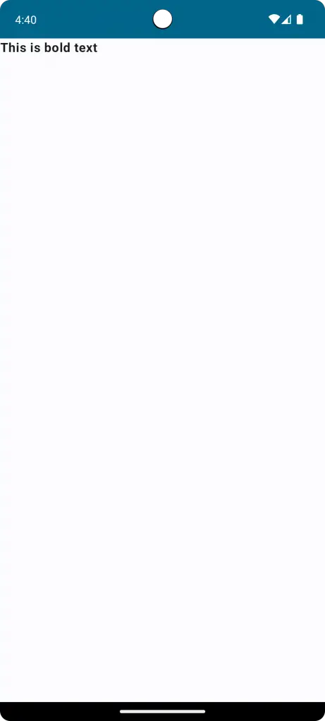
Text("This is bold text", fontWeight = FontWeight.Bold)With FontWeight, you can effortlessly make your text bold.
Text Underline
Underlining is another effective way to highlight or draw attention:
Text("Underlined text", textDecoration = TextDecoration.Underline)The TextDecoration property offers a suite of decorative features, including underline.

Strikethrough Text
To signify outdated information or show a crossed-out option, a strikethrough is handy:
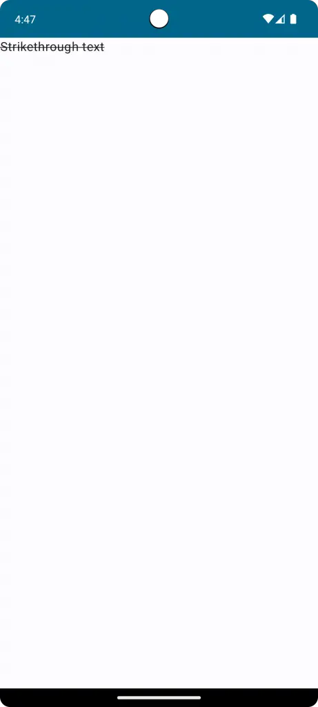
Text("Strikethrough text", textDecoration = TextDecoration.LineThrough)Simply use the LineThrough option of TextDecoration to achieve this effect.
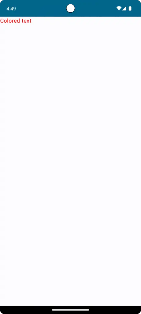
Font Color
Colors can help convey mood, significance, or categorization:
Text("Colored text", color = Color.Red)With the color parameter, you can easily choose from a variety of colors.
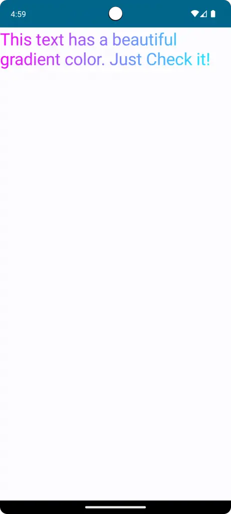
Gradient Text
For a more dynamic look, apply a gradient to your text:
@OptIn (ExperimentalTextApi::class)
@Composable
fun TextExample() {
    Text(
        fontSize = 30.sp,
        text = ("This text has a beautiful gradient color. Just Check it!"),
        style = TextStyle(
            brush = Brush.linearGradient(
                colors = listOf(Color.Magenta, Color.Cyan)
            )
        )
    )
}
Using a gradient brush adds flair to your textual content.
Font Family
Jetpack Compose allows for adjustments like serifs for nuanced design choices:
Text("Serif text", fontFamily = FontFamily.Serif)Choose from Serif, SansSerif, Monospace, and more to match your design vision.
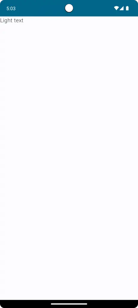
Font Weight
Beyond just bold, you can select from a range of font weights:
Text("Light text", fontWeight = FontWeight.Light)From UltraLight to Black, there’s a weight for every need.
Text Shadow
Shadows are a great way to give depth to your text, making it stand out against various backgrounds. With Jetpack Compose, adding a shadow to your text is easy.
@Composable
fun TextExample() {
    val offset = Offset(5.0f, 10.0f)
    Text(
        text = "Hello world!",
        style = TextStyle(
            fontSize = 24.sp,
            shadow = Shadow(
                color = Color.Gray, offset = offset, blurRadius = 3f
            )
        )
    )
}
In the above code, Offset which determines the horizontal and vertical distance of the shadow from the text. we apply a shadow using the Shadow class and a blurRadius that softens the edges of the shadow.

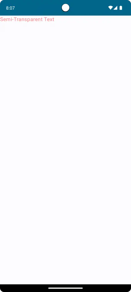
Text Opacity
Opacity can play an important role in text design, especially when you’re looking to create hierarchy or subtly blend text with its background. Adjusting text opacity in Jetpack Compose is straightforward.
Consider the following:
Text(
    text = "Semi-Transparent Text",
    color = Color.Red.copy(alpha = 0.5f)
)
To adjust the opacity, we utilize the color property with the copy function on Color.Red. The alpha parameter within copy sets the transparency level.
An alpha of 1f means fully opaque, while 0f is fully transparent. Here, we’ve set it to 0.5f, making our text semi-transparent.
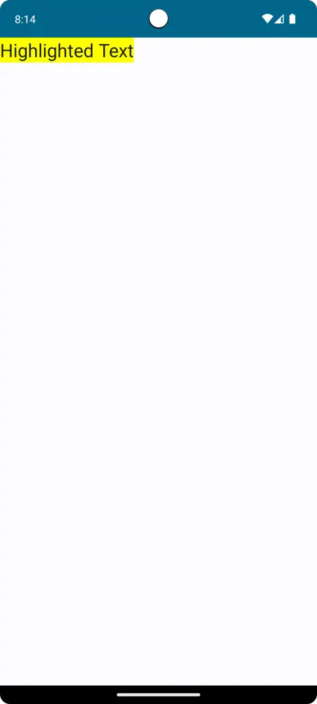
Text Background
Backgrounds play a pivotal role in highlighting text and making it more legible against diverse backdrops. In Jetpack Compose, we can easily assign backgrounds to your text.
@Composable
fun TextExample() {
    Text(
        text = "Highlighted Text",
        style = TextStyle(
            fontSize = 24.sp,
            background = Color.Yellow
        )
    )
}
Within TextStyle, there’s the background property. Here, we’ve chosen Color.yellow to give our text a yellow background.
Combine Styles
Combining styles is a powerful way to create standout and expressive text designs. With Jetpack Compose, mixing various text attributes is both intuitive and effective.
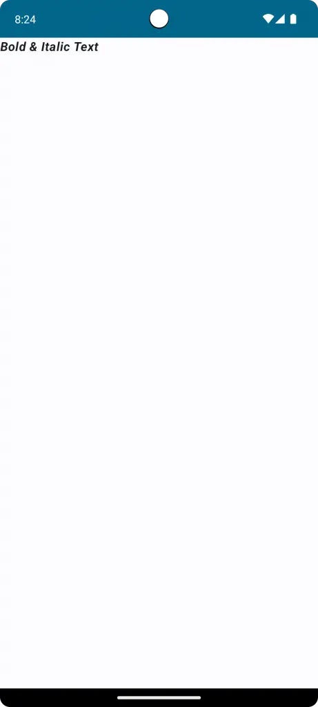
Combine Font Styles
Let’s start by combining basic font styles, such as bold and italic:
Text(
    "Bold & Italic Text",
    fontWeight = FontWeight.Bold,
    fontStyle = FontStyle.Italic
)
This results in text that’s both bold and italicized, perfect for grabbing attention.
Multiple Styles in Text
In Jetpack Compose, you might want to style different parts of your text differently within a single Text composable. This can be achieved using an AnnotatedString, which is essentially a string that can be adorned with varied styles.
For creating an AnnotatedString with multiple styles, the buildAnnotatedString builder comes in handy.
@Composable
fun TextExample() {
    Text(
        buildAnnotatedString {
            withStyle(style = SpanStyle(color = Color.Blue)) {
                append("H")
            }
            append("ello ")
            withStyle(style = SpanStyle(fontWeight = FontWeight.Bold, color = Color.Red)) {
                append("W")
            }
            append("orld")
        },
        fontSize = 40.sp,
    )
}
Inside the builder, withStyle allows us to apply a specific SpanStyle to a portion of the text.
The result? Our text will display as “H” in blue, followed by “ello “, and then “W” in bold red, ending with “orld”.
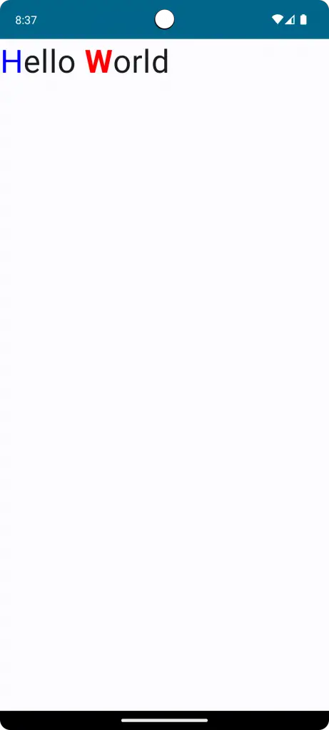
Combining multiple styles in this manner lets you craft more engaging and informative textual UIs.
Multiple Decorations
Why limit yourself to just one text decoration when you can have more?
Text(
    "Underlined & Strikethrough",
    textDecoration = TextDecoration.combine(listOf(TextDecoration.Underline, TextDecoration.LineThrough))
)
Here, we’ve combined underlining with a strikethrough, creating a unique visual cue.

Text Alignment
Text alignment determines the arrangement of text relative to a reference point or line. Proper alignment enhances readability and aesthetic appeal. Jetpack Compose provides versatile tools to achieve your desired text alignment with ease.
Left Alignment
By default, text in Jetpack Compose is left-aligned. It starts from the left edge and moves to the right:
Text("This is left-aligned text", textAlign = TextAlign.Left)Left alignment is standard for most written content, especially in left-to-right languages.
Center Alignment
For titles or when you wish to draw attention to specific text, center alignment is ideal:
Text("Centered Text", textAlign = TextAlign.Center)The text will be perfectly centered relative to its container.
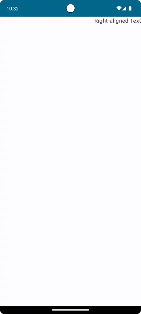
Right Alignment
Right alignment is especially useful for languages that are read from right to left, or for specific design choices:
Text("Right-aligned Text", textAlign = TextAlign.Right)The text starts from the right edge and extends to the left.
Justify Alignment
For a more uniform look, especially in larger blocks of text, you might opt for justify alignment. This ensures even spacing between words, making both the left and right edges straight:
Text("This is a sample justified text. It ensures that both edges align neatly.", textAlign = TextAlign.Justify)It’s essential to choose an alignment that complements the content and design of your app. Remember, while alignment contributes to aesthetics, readability should always be the priority.
Text Spacing
Effective text spacing can dramatically enhance readability and the overall look of your app’s content. Jetpack Compose offers a suite of tools to help developers finely tune spacing, ensuring text is presented clearly and appealingly.
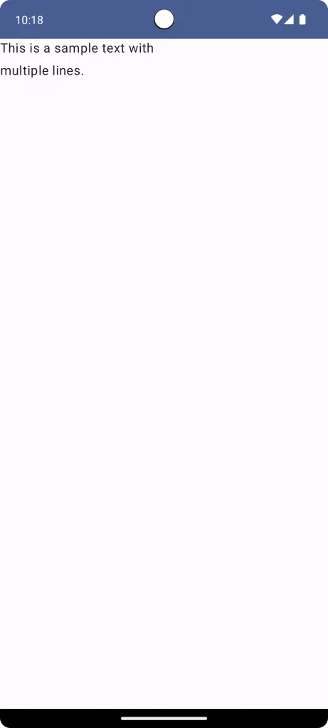
Line Spacing
Adjusting the space between lines can help improve the flow and legibility of paragraphs:
Text("This is a sample text with\nmultiple lines.", lineHeight = 28.sp)By using the lineHeight property, you can set a specific height for each line, which includes the text height and the space above and below it.
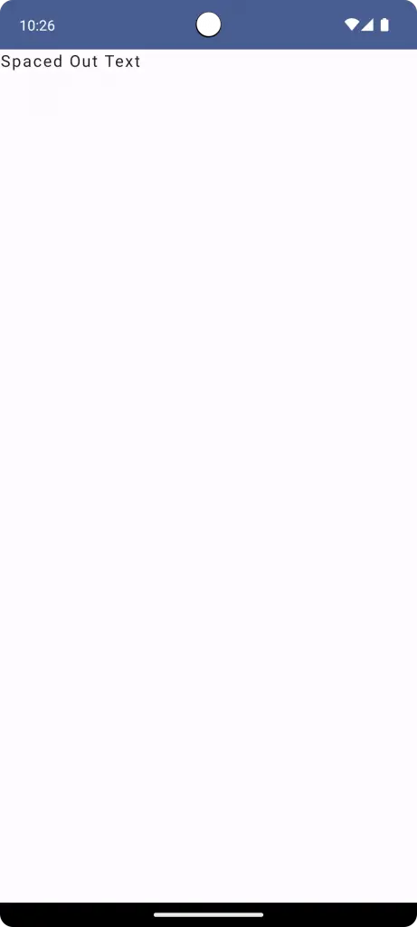
Letter Spacing
To modify the space between individual characters, use letter spacing:
Text("Spaced Out Text", letterSpacing = 1.5.sp)With the letterSpacing property, characters in the text will have increased space between them, which can create a distinctive appearance or improve readability in certain fonts.
When adjusting text spacing, always remember the user experience. Over-spacing or under-spacing can reduce readability. Testing on various devices and screen sizes will help strike the perfect balance.
Text Line Limit and Truncation
Managing the display of lengthy textual content is crucial for maintaining a clean and user-friendly interface. Jetpack Compose provides straightforward methods to limit lines and truncate text, ensuring your UI remains tidy and readers aren’t overwhelmed.
Line Limit
You can easily set a maximum number of lines for your text to occupy. This is especially useful for previews or brief snippets:
Text("This is a long piece of text that may not fit within two lines. Yiu have to check how this text is gonna end finally. See the difference", maxLines = 2)By setting the maxLines property, the text will be cut off after the specified number of lines, ensuring it doesn’t dominate the screen.

Text Truncation
When you’re limiting lines, you might also want to indicate to the user that there’s more content than what’s currently visible. Truncation comes in handy here:
Text("This is a long piece of text that may not fit within two lines. Yiu have to check how this text is gonna end finally. See the difference", maxLines = 2, overflow = TextOverflow.Ellipsis)With the TextOverflow.Ellipsis value for the overflow property, any text exceeding the maxLines will be replaced with an ellipsis (...), signaling to users that the content continues.

Text Selection
In interactive UIs, allowing users to select text can enhance functionality, aiding in tasks like copying, sharing, or looking up information. Jetpack Compose simplifies the process of enabling text selection, ensuring both usability and a seamless user experience.
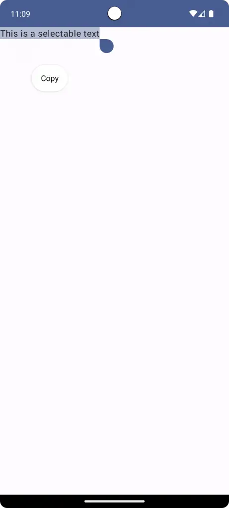
Basic Text Selection
To make text selectable in Jetpack Compose, wrap your Text composable within a SelectionContainer:
@Composable
fun TextExample() {
    SelectionContainer {
        Text("This is a selectable text")
    }
}
With the SelectionContainer, any text inside becomes selectable. Users can tap and drag to select specific portions of the text, just like they would in native Android.
Providing text selection not only boosts interactivity but also ensures users can engage with content more effectively. Always consider the context and ensure text selection enhances, rather than disrupts, the user experience.
Text Border
Borders can play a pivotal role in highlighting specific portions of text or adding a decorative element. In Jetpack Compose, you have the flexibility to add borders to your text, ensuring it stands out or aligns with your design theme.
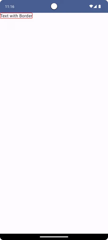
Basic Text Border
Adding a simple border around your text is made easy with the use of the Modifier.border:
@Composable
fun TextExample() {
    Column {
        Text(
            text = "Text with Border",
            modifier = Modifier.border(1.dp, Color.Red, shape = RoundedCornerShape(4.dp))
        )
    }
}
In the above example, the text will be surrounded by a red border of 1.dp thickness. The corners of the border are slightly rounded with a 4.dp radius.
Combine with Padding
To ensure your text doesn’t sit too close to its border, use padding:
@Composable
fun TextExample() {
    Column {
        Text(
            text = "Text with Border",
            modifier = Modifier
                        .border(1.dp, Color.Red, shape = RoundedCornerShape(4.dp))
                        .padding(8.dp)
        )
    }
}
The Modifier.padding ensures a gap between the text and its border, enhancing clarity and aesthetics.
Using borders thoughtfully can emphasize important information, enhance aesthetics, or guide users’ attention. However, it’s essential to ensure that borders complement the overall design and don’t overshadow the primary content.
Navigating text in Jetpack Compose is both fun and practical. This guide has showcased how easy it is to style, customize, and manage text in your apps. Remember, while design is essential, always keep your users in mind. Thanks for reading!


One Comment