SwiftUI Text: A Complete Guide
Welcome to SwiftUI Text: A Complete Guide. In this guide, I will explore everything you need to know about text in SwiftUI.
Text is everywhere in apps — from labels and buttons to longer content. With SwiftUI, handling text has become easier and more flexible. I will cover the basics like changing font size and color, and move on to more advanced topics.
Whether you’re new to SwiftUI or have some experience, this guide will help you get the most out of text in your apps. Let’s dive in.
Display Text
Text is the primary means by which apps communicate information to users. In SwiftUI, displaying text is both straightforward and versatile. Here’s a step-by-step guide on how to do it:
Basic Text Display
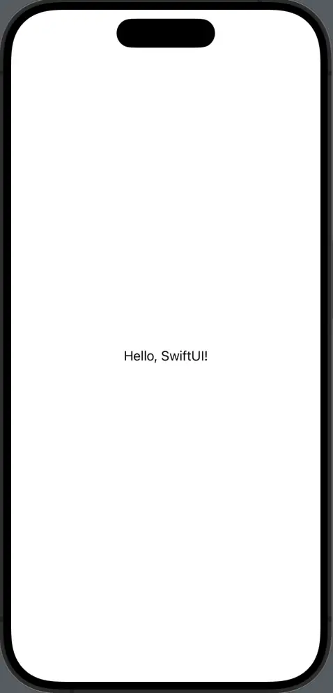
Use the Text view to display a simple string.
import SwiftUI

struct ContentView: View {
    var body: some View {
        Text("Hello, SwiftUI!")
    }
}
By default, SwiftUI’s Text view wraps long lines onto the next line.
Text("This is a long line of text that will wrap onto the next line in your SwiftUI app.")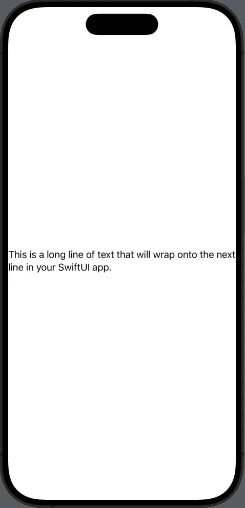
Display Numbers
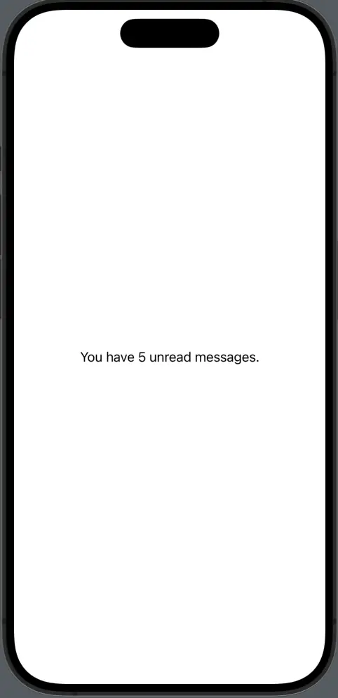
SwiftUI can display numbers directly by interpolating them into strings.
import SwiftUI

struct ContentView: View {
    let count = 5
    var body: some View {
        Text("You have \(count) unread messages.")
    }
}
Text Font
Changing the font of your text can make a world of difference in your app’s look and feel. SwiftUI offers a plethora of font options, making it easy to match your app’s style and tone. Let’s check how to adjust fonts in SwiftUI.
System Fonts
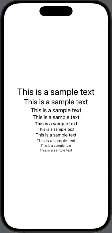
SwiftUI provides several built-in system font styles. We use the font modifier for this. You can get the list of all font types here.
import SwiftUI

struct ContentView: View {
    var body: some View {
        VStack{
            Text("This is a sample text").font(.largeTitle)
            Text("This is a sample text").font(.title)
            Text("This is a sample text").font(.title2)
            Text("This is a sample text").font(.title3)
            Text("This is a sample text").font(.headline)
            Text("This is a sample text").font(.subheadline)
            Text("This is a sample text").font(.body)
            Text("This is a sample text").font(.callout)
            Text("This is a sample text").font(.caption)
            Text("This is a sample text").font(.footnote)
        }
    }
}
Change Font Size
You can define specific sizes for fonts if the system sizes don’t fit your needs.
Text("Custom sized text").font(.system(size: 20))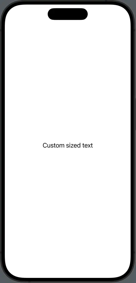
Custom Fonts
If you want to use a unique font not provided by the system, SwiftUI has you covered. First of all, you have to add the font to your Xcode project. Then you can refer to the font as given below.
Text("Using a custom font").font(Font.custom("Roboto-Regular", size: 16))Font Style
The style of a font is just as crucial as its size or typeface. It helps convey emotions, emphasizes important content, and can significantly impact the readability of your app. Here’s how to apply various font styles in SwiftUI:
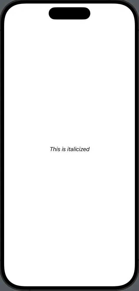
Italic Text
Give your text a slant to highlight or stylize specific content using the italic function.
import SwiftUI

struct ContentView: View {
    var body: some View {
        Text("This is italicized").italic()
    }
}
Bold Text
Make text stand out by making it bold using the bold function. It’s great for headings or important information.
Text("Bold statement here!").bold()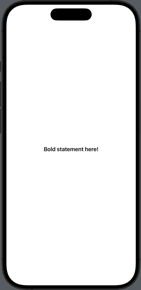
Text Underline
Draw attention to specific pieces of text or denote hyperlinks by underlining the text.
Text("Underlined text").underline()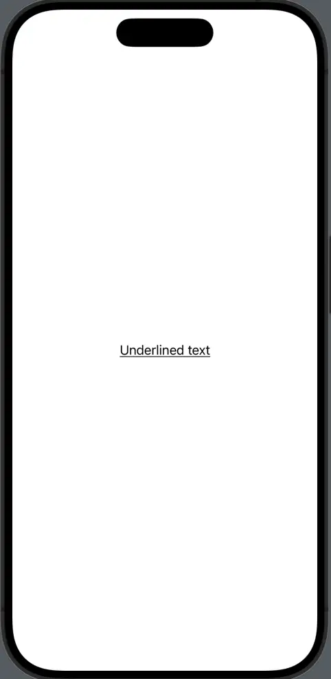
Strikethrough Text
Show corrections or indicate completed items, especially in to-do lists using the strikethrough function.
Text("This task is done").strikethrough()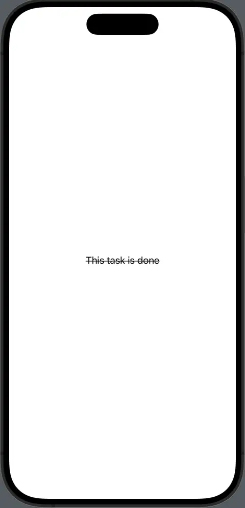
Font Color
Change the color of your text to complement your design, set moods, or align with branding using the foregroundColor modifier.
Text("Red text").foregroundColor(.red)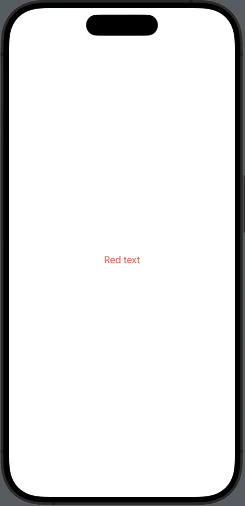
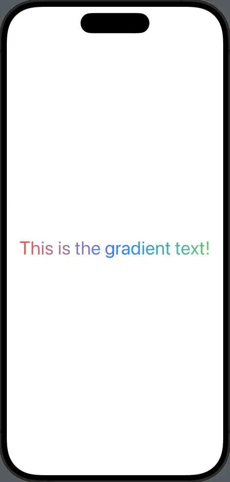
Gradient Text
Use gradients for a more dynamic text appearance. You can use the foreground modifier to create gradient text in SwiftUI.
import SwiftUI

struct ContentView: View {
    var body: some View {
        Text("This is the gradient text!")
            .font(.largeTitle)
            .foregroundStyle(
                LinearGradient(
                    colors: [.red, .blue, .green],
                    startPoint: .leading,
                    endPoint: .trailing
                )
            )

    }
}
Font Design
You can further customize text with design options like .rounded or .monospaced.
Text("Text with rounded design").font(.system(size: 100, design: .rounded))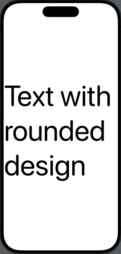
Font Weight
You can change the text font weight using the fontWeight modifier. It accepts many options such as .thin, .bold, .heavy, .semibold, etc.
Text("This is a sample text!").font(.largeTitle).fontWeight(.thin)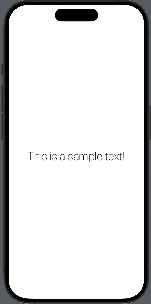
Combine Styles
Sometimes, a single style isn’t enough to convey the message or design you’re aiming for. SwiftUI allows developers to combine various text styles seamlessly, letting the typography tell a story of its own. Let’s explore how to merge different styles effectively:
Basic Combinations
You can mix basic styles like bold and italic for a more pronounced effect.
Text("Bold and Italic").bold().italic()
Color and Style
Combine font styles with color to achieve a specific mood or emphasis.
Text("Bold and Red").bold().foregroundColor(.red)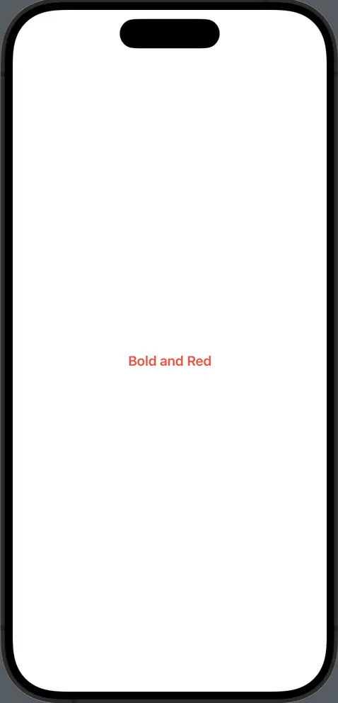
Multi-styled Text
You can have different styles within a single text element using string interpolation.
Text("This is \(Text("bold").bold()) and this is \(Text("italic").italic()).")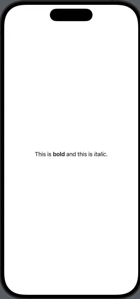
Text Alignment in SwiftUI
Achieving the right text alignment is crucial for both design aesthetics and user readability. SwiftUI offers a flexible approach to aligning text, making it easier for developers to control content presentation.
Let’s explore different ways to align text in SwiftUI:
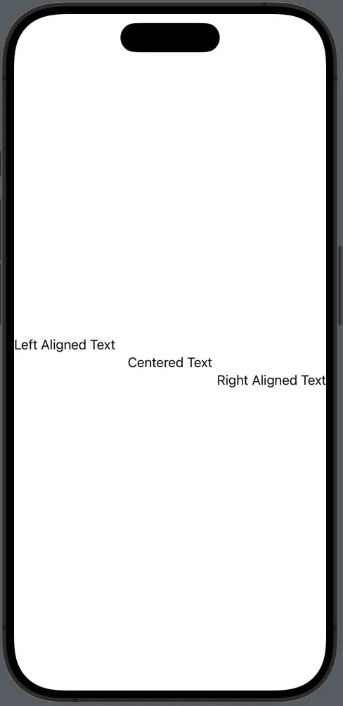
Horizontal Alignment
Align your text horizontally within a frame using the alignment modifier.
import SwiftUI

struct ContentView: View {
    var body: some View {
        VStack{
            Text("Left Aligned Text").frame(maxWidth: .infinity, alignment: .leading)
            Text("Centered Text").frame(maxWidth: .infinity, alignment: .center)
            Text("Right Aligned Text").frame(maxWidth: .infinity, alignment: .trailing)
        }
    }
}
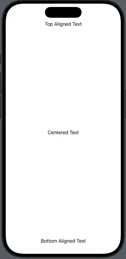
Vertical Alignment
Position your text vertically within a frame.
import SwiftUI

struct ContentView: View {
    var body: some View {
        VStack{
            Text("Top Aligned Text").frame(maxHeight: .infinity, alignment: .top)
            Text("Centered Text").frame(maxHeight: .infinity, alignment: .center)
            Text("Bottom Aligned Text").frame(maxHeight: .infinity, alignment: .bottom)
        }
    }
}
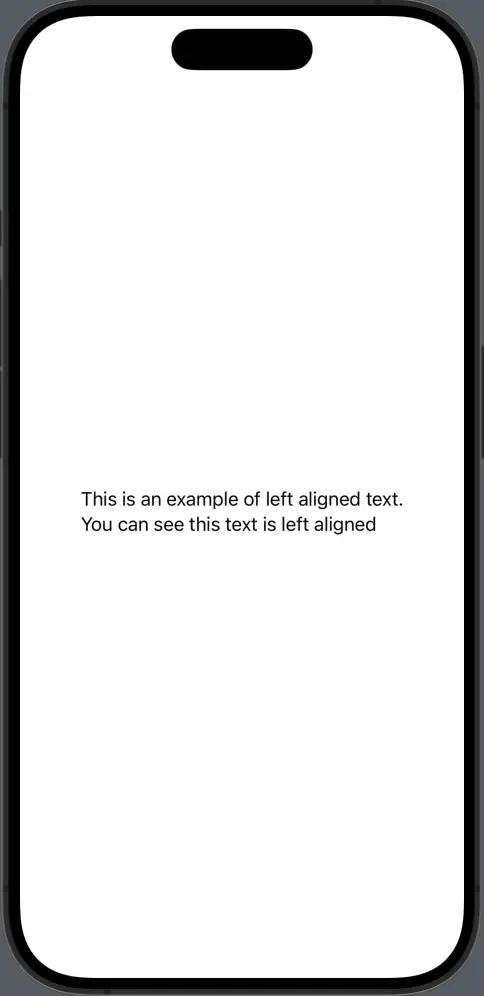
Alignment Inside Containers
Control alignment within container views by using the alignment modifier of the container.
import SwiftUI

struct ContentView: View {
    var body: some View {
        VStack(alignment: .leading){
            Text("This is an example of left aligned text.")
            Text("You can see this text is left aligned")
        }
    }
}
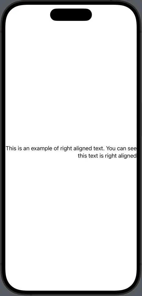
Multiline Text Alignment
The multilineTextAlignment modifier helps to adjust the alignment of multiline texts.
import SwiftUI

struct ContentView: View {
    var body: some View {
        VStack {
            Text("This is an example of right aligned text. You can see this text is right aligned").multilineTextAlignment(.trailing)
        }
    }
}
Proper text alignment is essential to ensure that your content looks organized and is easy for users to read. With these SwiftUI tools, you can perfectly position your text every time.
Text Spacing
The space around and between characters and lines plays a pivotal role in the readability and aesthetics of your content. With SwiftUI, adjusting text spacing to suit your design or enhance legibility is straightforward.
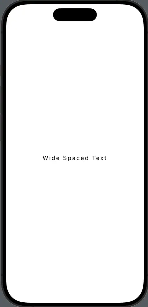
Letter Spacing (Kerning)
Adjust the spacing between characters in a text view using the kerning modifier.
  import SwiftUI

  struct ContentView: View {
      var body: some View {
          Text("Wide Spaced Text").kerning(3)
      }
  }
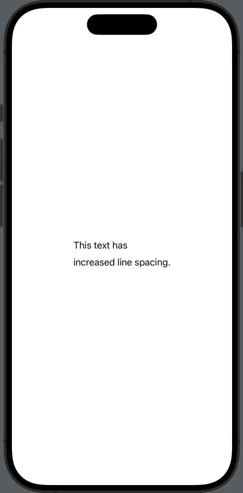
Line Spacing
Manage the space between lines of text, especially useful for multiline text views.
  import SwiftUI

  struct ContentView: View {
      var body: some View {
          Text("This text has\nincreased line spacing.").lineSpacing(10)
      }
  }
Padding
Add space around the text view, which can help separate it from surrounding elements.
  import SwiftUI

  struct ContentView: View {
      var body: some View {
          Text("Padded Text").padding()
      }
  }
Text Offset
Shift the position of your text view relative to its original position using the offset modifier.
  import SwiftUI

  struct ContentView: View {
      var body: some View {
          Text("Offset Text").offset(x: 10, y: 5)
      }
  }
Efficient text spacing ensures that your content remains legible and aesthetically appealing, no matter the design.
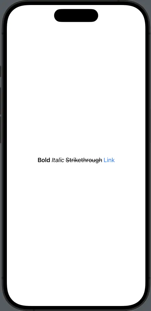
Markdown Text
Markdown simplifies the process of formatting text by using plain text symbols to represent styles. With SwiftUI 3.0 and later, native support for markdown in text views was introduced, making it easier than ever to apply common styles without the need for multiple modifiers.
Basic Markdown Formatting
Common markdown syntax is natively supported.
  import SwiftUI

  struct ContentView: View {
      var body: some View {
          Text("**Bold** *Italic* ~~Strikethrough~~ [Link](https://www.example.com)")
      }
  }
Markdown in SwiftUI offers a concise and human-readable way to format text. It’s an excellent tool for developers aiming for quick styling without the overhead of numerous modifiers.
Text Line Limit
In SwiftUI, managing how text wraps and displays in limited space is essential for a polished user interface. The lineLimit(_:) modifier comes in handy, allowing developers to set the maximum number of lines a text view can occupy.
Set Line Limit
Restrict the Text view to a specific number of lines using the lineLimit modifier.
  import SwiftUI

  struct ContentView: View {
      var body: some View {
          Text("This is a sample text that may end up being too long for its container.")
              .lineLimit(2)
      }
  }
No Line Limit
By setting the line limit to nil, the text can use as many lines as needed.
  Text("This text will wrap onto as many lines as required.")
      .lineLimit(nil)
The lineLimit(_:) modifier provides developers with greater control over the text layout, ensuring that content remains readable and aesthetically pleasing, even in confined spaces.
Text Truncation
In app design, effectively managing limited space is crucial, especially when dealing with dynamic or lengthy content. Text truncation in SwiftUI helps in such scenarios, ensuring that your text fits the allotted space while indicating to users that there’s more content than what’s shown.
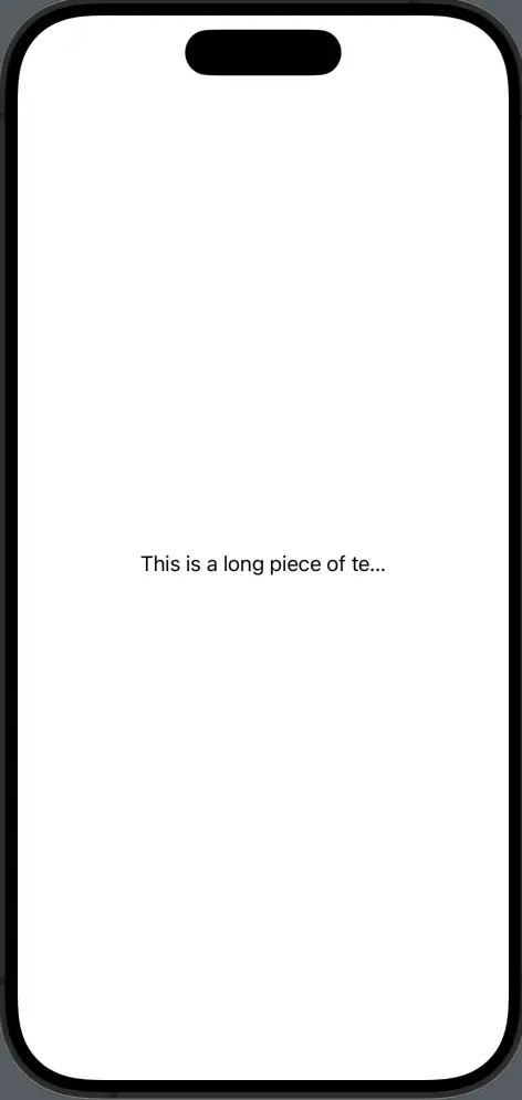
Default Truncation
By default, SwiftUI will truncate text that doesn’t fit its container, placing an ellipsis (...) at the end.
import SwiftUI

  struct ContentView: View {
      var body: some View {
          Text("This is a long piece of text that will be truncated.")
              .frame(width: 200).lineLimit(1)
      }
  }
Truncation Mode
Specify where the truncation should appear: at the start, middle, or end of the text.
Text("This is a long piece of text that will be truncated.")
              .frame(width: 200).lineLimit(1).truncationMode(.middle)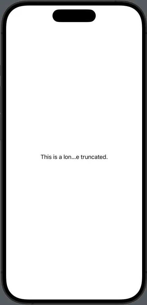
Truncation ensures that your interface remains clean and organized, even with variable content lengths. By mastering truncation in SwiftUI, you can maintain a polished UI while accommodating dynamic text.
Text Selection
Starting from iOS 15 SwiftUI introduced a built-in way to make text selectable using the textSelection(_:) modifier. This offers users the ability to select and copy text within specific views in a platform-appropriate manner.
Basics of Text Selection
The textSelection(_:) modifier controls whether text within a Text view can be selected.
  import SwiftUI

  struct ContentView: View {
      var body: some View {
          Text("Selectable Text").textSelection(.enabled)
      }
  }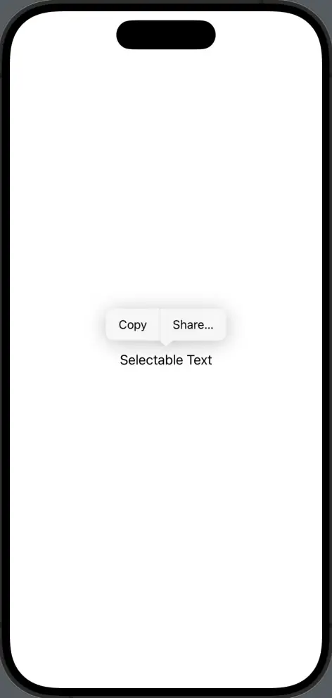
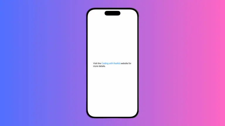
By making text selectable, you enhance user experience, especially in situations where they might need to copy information like error messages, addresses, or other details, and then use it elsewhere.
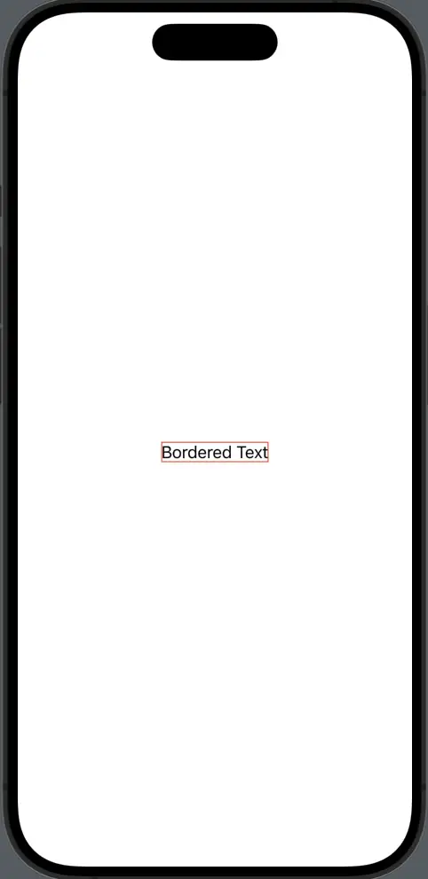
Text Border
Surrounding text with a border can help emphasize or separate content within your app’s interface. In SwiftUI, adding a border to your text or any view is straightforward. Here’s a guide on how to accentuate your text views with borders:
Basic Text Border
Add a simple border around a text view using the border modifier.
  import SwiftUI

  struct ContentView: View {
      var body: some View {
          Text("Bordered Text")
              .border(Color.red)
      }
  }
Customize Border Thickness
You can also modify the border’s width for a custom appearance.
  Text("Custom Border")
      .padding()
      .border(Color.red, width: 3)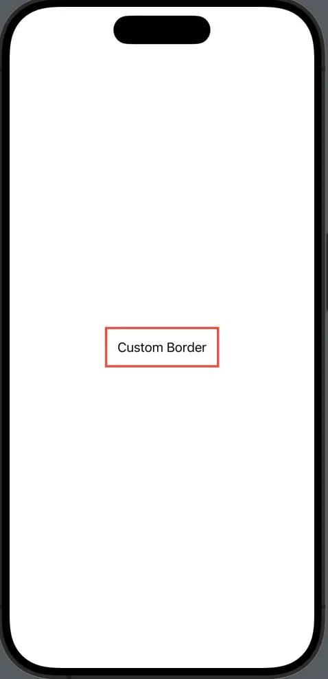
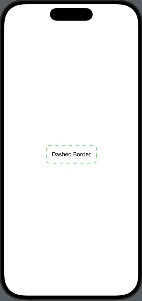
Use Overlay for Advanced Borders
Use the overlay modifier for more intricate border designs, such as dashed lines.
  Text("Dashed Border").padding()
      .overlay(
          RoundedRectangle(cornerRadius: 8)
              .stroke(style: StrokeStyle(lineWidth: 2, dash: [10]))
              .foregroundColor(.green)
      )
Adding borders to text views or any other SwiftUI views not only provides visual emphasis but also guides the user’s attention.
Through this guide, we’ve explored the many facets of handling text in SwiftUI. From basic display to advanced features like selection and borders, it’s clear that SwiftUI offers a robust toolkit for developers.
As you continue building apps, keep these tools in mind to ensure your textual content is both functional and user-friendly. Here’s to creating better app experiences with well-crafted text!
2 Comments