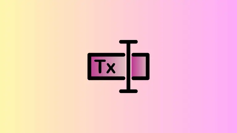
How to Change Letter Spacing in SwiftUI Text
In this blog post, we’re delving into a technique that can subtly but significantly improve your app’s text aesthetics – adjusting the spacing between letters, or “kerning,” in SwiftUI. By carefully applying kerning, you can enhance readability, create emphasis, or bring a unique style to your app’s text.
Basics: Adjust Letter Spacing
SwiftUI provides a simple modifier, .kerning(), to adjust the spacing between the characters of a text view:
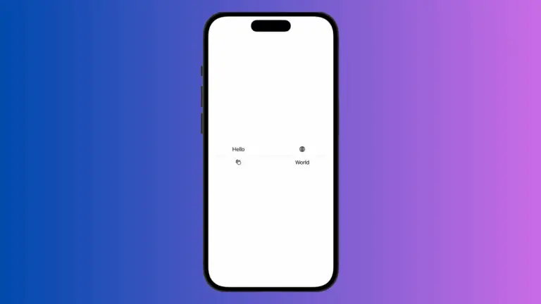
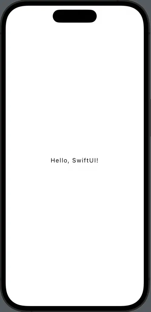
Text("Hello, SwiftUI!")
    .kerning(2)
In the above example, a spacing of 2 points is added between each character in “Hello, SwiftUI!”.
Strategic Kerning
While increasing the kerning value can make text more legible and appealing, remember that too much space might cause the text to look disjointed. Conversely, reducing kerning can help save space, but overly tight text may compromise readability. Here’s an example of negative kerning:
Text("Hello, SwiftUI!")
    .kerning(-1)
In this instance, the characters are closer together by 1 point compared to the default spacing.
Kerning in Different Fonts
Remember that kerning might have different visual impacts depending on the font you’re using. Some fonts may naturally have wider or narrower character spacing. Therefore, when applying kerning, make sure to test the appearance with your chosen font:
Text("Hello, SwiftUI!")
    .font(.custom("YourFontName", size: 24))
    .kerning(2)
Effectively using letter spacing in SwiftUI allows you to subtly control your app’s aesthetics and readability. While it’s a small detail, smart application of kerning can significantly contribute to the overall user experience.