How to add Elevation to Button in Android Jetpack Compose
Elevation plays a key role in Material Design by providing intuitive shadows for your UI elements. In this in-depth Jetpack Compose tutorial, we’ll take a closer look at how to add elevation to buttons in Android.
You’ll learn how to make use of the Button composable and its elevation parameter, as well as how to customize elevation for different button states.
Importance of Elevation
Let’s understand what elevation does. Elevation helps distinguish UI elements from one another by casting appropriate shadows. It adds depth to the interface and makes elements like buttons more interactive. In other words, it can greatly enhance user experience.
The Button Composable and Its Elevation Parameter
The Button composable in Jetpack Compose makes it really easy to add buttons with elevation. It comes with an elevation parameter that lets you define how the button will behave in terms of its shadow depth. Here’s a quick example:
@Composable
fun ElevatedButton() {
    Column {
        Button(
            onClick = { /*TODO*/ },
            elevation = ButtonDefaults.buttonElevation(
                defaultElevation = 20.dp,
                pressedElevation = 15.dp,
                disabledElevation = 0.dp,
                hoveredElevation = 15.dp,
                focusedElevation = 10.dp
            )
        ) {
            Text("Button with Elevation")
        }
    }
}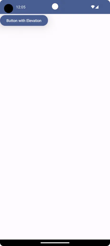
Jetpack Compose allows you to customize elevation based on different states of the button—like when it is pressed, hovered, or disabled. Let’s look at the complete code for adding elevation to a button:
package com.codingwithrashid.myapplication

import android.os.Bundle
import androidx.activity.ComponentActivity
import androidx.activity.compose.setContent
import androidx.compose.foundation.layout.Column
import androidx.compose.foundation.layout.fillMaxSize
import androidx.compose.material3.Button
import androidx.compose.material3.ButtonDefaults
import androidx.compose.material3.MaterialTheme
import androidx.compose.material3.Surface
import androidx.compose.material3.Text
import androidx.compose.runtime.Composable
import androidx.compose.ui.Modifier
import androidx.compose.ui.unit.dp
import com.codingwithrashid.myapplication.ui.theme.MyApplicationTheme

class MainActivity : ComponentActivity() {
    override fun onCreate(savedInstanceState: Bundle?) {
        super.onCreate(savedInstanceState)
        setContent {
            MyApplicationTheme {
                // A surface container using the 'background' color from the theme
                Surface(
                    modifier = Modifier.fillMaxSize(),
                    color = MaterialTheme.colorScheme.background
                ) {
                    Column {
                        ElevatedButton()
                    }
                }
            }
        }
    }
}

@Composable
fun ElevatedButton() {
    Column {
        Button(
            onClick = { /*TODO*/ },
            elevation = ButtonDefaults.buttonElevation(
                defaultElevation = 20.dp,
                pressedElevation = 15.dp,
                disabledElevation = 0.dp,
                hoveredElevation = 15.dp,
                focusedElevation = 10.dp
            )
        ) {
            Text("Button with Elevation")
        }
    }
}
Alternatively, you can also choose the Material 3 elevated button to provide proper elevation.
Now you know how to add elevation to buttons in Jetpack Compose. We learned the significance of elevation in UI, how to use the elevation parameter in the Button composable, and how to customize it for different states.
Elevation can make your UI more interactive and visually appealing, so don’t hesitate to make good use of it in your next Android project.