How to add a Button in Android Jetpack Compose
Android Jetpack Compose is a powerful modern toolkit designed to make UI development easier, more efficient, and more enjoyable. One of the common components used in UI development is a Button, and in this article, we’ll walk you through how to add a button in Jetpack Compose.
Add a Simple Button
To add a basic button in Jetpack Compose, we use the Button composable. This function allows you to create a button, customize its appearance, and provide a click event. Here’s a simple example:
@Composable
fun SimpleButtonExample() {
    Button(onClick = { /* do something on click */ }) {
        Text("Click Me")
    }
}
In this code, the Button is a composable function that accepts two parameters: an onClick lambda function that gets called when the button is clicked, and the content of the button which is another composable (in this case, a Text composable for displaying text on the button).

Add a Button with More Customization
In Jetpack Compose, you can customize your button’s appearance in many ways using the modifier parameter of the Button function. For instance, you can change the background color, size, padding, shape, and more.
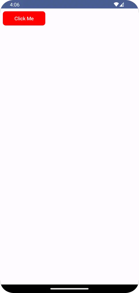
Here’s an example of a button with a custom background color, shape, and size:
@Composable
fun ButtonExample() {
    Column {
        Button(
            onClick = { /* do something on click */ },
            colors = ButtonDefaults.buttonColors(containerColor = Color.Red),
            shape = RoundedCornerShape(8.dp),
            modifier = Modifier.padding(8.dp).width(120.dp).height(40.dp)
        ) {
            Text("Click Me")
        }
    }
}
Following is the complete code for reference.
package com.example.example

import android.os.Bundle
import androidx.activity.ComponentActivity
import androidx.activity.compose.setContent
import androidx.compose.foundation.layout.Column
import androidx.compose.foundation.layout.fillMaxSize
import androidx.compose.foundation.layout.height
import androidx.compose.foundation.layout.padding
import androidx.compose.foundation.layout.width
import androidx.compose.foundation.shape.RoundedCornerShape
import androidx.compose.material3.Button
import androidx.compose.material3.ButtonDefaults
import androidx.compose.material3.MaterialTheme
import androidx.compose.material3.Surface
import androidx.compose.material3.Text
import androidx.compose.runtime.Composable
import androidx.compose.ui.Modifier
import androidx.compose.ui.graphics.Color
import androidx.compose.ui.tooling.preview.Preview
import androidx.compose.ui.unit.dp
import com.example.example.ui.theme.ExampleTheme

class MainActivity : ComponentActivity() {
    override fun onCreate(savedInstanceState: Bundle?) {
        super.onCreate(savedInstanceState)
        setContent {
            ExampleTheme {
                // A surface container using the 'background' color from the theme
                Surface(
                    modifier = Modifier.fillMaxSize(),
                    color = MaterialTheme.colorScheme.background
                ) {
                    ButtonExample()
                }
            }
        }
    }
}

@Composable
fun ButtonExample() {
    Column {
        Button(
            onClick = { /* do something on click */ },
            colors = ButtonDefaults.buttonColors(containerColor = Color.Red),
            shape = RoundedCornerShape(8.dp),
            modifier = Modifier.padding(8.dp).width(120.dp).height(40.dp)
        ) {
            Text("Click Me")
        }
    }
}

@Preview(showBackground = true)
@Composable
fun ExamplePreview() {
    ExampleTheme {
        ButtonExample()
    }
}
Adding a button in Jetpack Compose is quite straightforward thanks to the declarative nature of the framework. You can easily add a simple button or customize it as you want with different parameters.
Remember to always think in terms of composables when working with Jetpack Compose. This will make your UI code more manageable, modular, and easier to read.


4 Comments