How to add Material icons in Android Jetpack Compose
Material Design’s icons are an excellent resource for any Android developer, providing a consistent and sleek set of iconography that can help to make your applications look polished and professional.
Luckily, with Android’s new UI toolkit Jetpack Compose, integrating these icons into your app has never been easier. This blog post will guide you on how to add Material Icons in Android Jetpack Compose.
Icon composable is used to add icons to the app. You can see the list of material icons here. Kindly note that some of the material icons are not available. See the code snippet given below.
@Composable
fun DisplayIcon() {
    Icon(
        Icons.Default.Add,
        contentDescription = "Add Icon",
    )
}
In the example above, Icons.Default.Add represents the ‘add’ icon from the Material Design icons. You can use the same icons but with different types such as Icons.Rounded, Icons.Filled, Icons.Outlined etc.
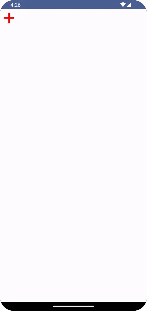
You can also customize your icons using modifiers. For example, you can change the size and color of the icon as follows:
@Composable
fun DisplayIcon() {
    Icon(
        Icons.Default.Add,
        contentDescription = "Add Icon",
        modifier = Modifier.size(48.dp),
        tint = Color.Red
    )
}
Here, the icon’s size has been increased to 48dp, and the tint (color) has been set to Red.
Following is the complete code to show icons in Android Jetpack Compose.
package com.example.example

import android.os.Bundle
import androidx.activity.ComponentActivity
import androidx.activity.compose.setContent
import androidx.compose.foundation.layout.Column
import androidx.compose.foundation.layout.fillMaxSize
import androidx.compose.foundation.layout.size
import androidx.compose.material.icons.Icons
import androidx.compose.material.icons.filled.Add
import androidx.compose.material3.Icon
import androidx.compose.material3.MaterialTheme
import androidx.compose.material3.Surface
import androidx.compose.runtime.Composable
import androidx.compose.ui.Modifier
import androidx.compose.ui.graphics.Color
import androidx.compose.ui.tooling.preview.Preview
import androidx.compose.ui.unit.dp
import com.example.example.ui.theme.ExampleTheme

class MainActivity : ComponentActivity() {
    override fun onCreate(savedInstanceState: Bundle?) {
        super.onCreate(savedInstanceState)
        setContent {
            ExampleTheme {
                // A surface container using the 'background' color from the theme
                Surface(
                    modifier = Modifier.fillMaxSize(),
                    color = MaterialTheme.colorScheme.background
                ) {
                    IconExample()
                }
            }
        }
    }
}

@Composable
fun IconExample() {
    Column {
        Icon(
            Icons.Default.Add,
            contentDescription = "Add Icon",
            modifier = Modifier.size(48.dp),
            tint = Color.Red
        )
    }
}

@Preview(showBackground = true)
@Composable
fun ExamplePreview() {
    ExampleTheme {
        IconExample()
    }
}
And that’s it! With just a few lines of code, you can implement Material Icons into your Jetpack Compose project, making your app more appealing and accessible to users.


One Comment