How to Add Icon to TextField in Android Jetpack Compose
Text fields are crucial UI elements in any mobile application. They allow users to input data, like usernames, passwords, or search queries. Proper styling helps users understand the purpose of each field. One way to enhance your text fields is by adding icons.
In this blog post, we will walk you through how to add icons to TextField components in Android Jetpack Compose.
Why Add Icons to TextFields?
Before diving into the code, let’s understand why adding icons to TextFields can be beneficial. Icons add a visual touch to your text fields, making them more user-friendly. They also help in making the app more intuitive. For example, a small email icon in an email field can instantly convey its purpose to the user.
The Basics: OutlinedTextField
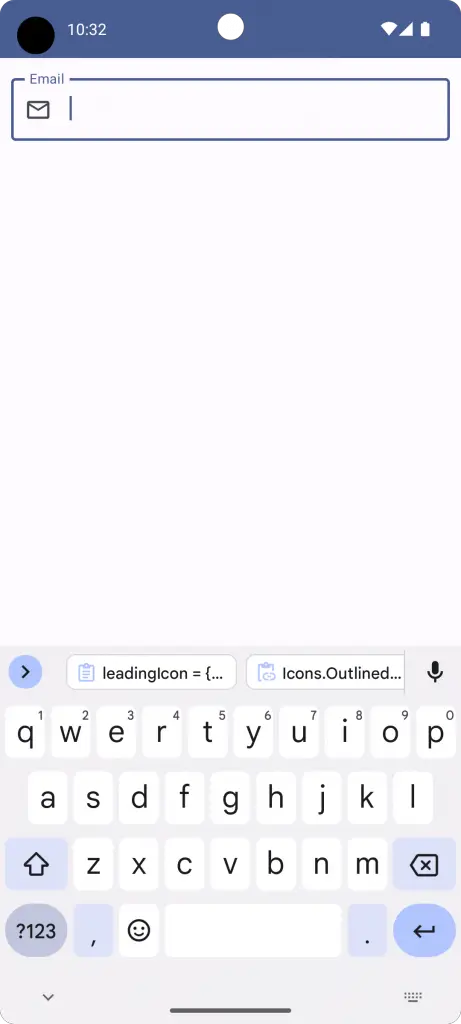
Jetpack Compose’s OutlinedTextField comes with two specific parameters for adding icons: leadingIcon and trailingIcon.
leadingIcon: Adds an icon at the start of the TextField.trailingIcon: Adds an icon at the end of the TextField.
Here is a simple code snippet to demonstrate this:
@Composable
fun TextFieldExample() {
    var textInput by remember { mutableStateOf("")}
    OutlinedTextField(value = textInput,
            onValueChange = {textInput = it},
            label = { Text("Email") },
            leadingIcon = { Icon(Icons.Outlined.Email,
            contentDescription = null) },
        modifier = Modifier.fillMaxWidth()
                        .padding(10.dp))
}
Complete Example with Code
Let’s go through a complete Android application example to better understand how to integrate this feature.
package com.codingwithrashid.myapplication

import android.os.Bundle
import androidx.activity.ComponentActivity
import androidx.activity.compose.setContent
import androidx.compose.foundation.layout.Column
import androidx.compose.foundation.layout.fillMaxSize
import androidx.compose.foundation.layout.fillMaxWidth
import androidx.compose.foundation.layout.padding
import androidx.compose.material.icons.Icons
import androidx.compose.material.icons.outlined.Email
import androidx.compose.material3.ExperimentalMaterial3Api
import androidx.compose.material3.Icon
import androidx.compose.material3.MaterialTheme
import androidx.compose.material3.OutlinedTextField
import androidx.compose.material3.Surface
import androidx.compose.material3.Text
import androidx.compose.runtime.Composable
import androidx.compose.runtime.getValue
import androidx.compose.runtime.mutableStateOf
import androidx.compose.runtime.remember
import androidx.compose.runtime.setValue
import androidx.compose.ui.Modifier
import androidx.compose.ui.unit.dp
import com.codingwithrashid.myapplication.ui.theme.MyApplicationTheme

class MainActivity : ComponentActivity() {
    override fun onCreate(savedInstanceState: Bundle?) {
        super.onCreate(savedInstanceState)
        setContent {
            MyApplicationTheme {
                Surface(
                    modifier = Modifier.fillMaxSize(),
                    color = MaterialTheme.colorScheme.background
                ) {
                    Column {
                        TextFieldExample()
                    }
                }
            }
        }
    }
}

@OptIn(ExperimentalMaterial3Api::class)
@Composable
fun TextFieldExample() {
    var textInput by remember { mutableStateOf("")}
    OutlinedTextField(value = textInput,
            onValueChange = {textInput = it},
            label = { Text("Email") },
            leadingIcon = { Icon(Icons.Outlined.Email,
            contentDescription = null) },
        modifier = Modifier.fillMaxWidth()
                        .padding(10.dp))
}
Adding icons to TextField components in Android Jetpack Compose is straightforward. It not only enhances the user experience but also helps make your application more intuitive. Utilize the leadingIcon and trailingIcon parameters to get the job done.