How to Add TextField Border in Android Jetpack Compose
TextField is a crucial element in UI design. Not only does it allow user input, but it also significantly impacts the look and feel of an application. Adding and customizing borders can elevate the visual appeal of these fields.
In this guide, we’ll go through the steps to add a basic border to a TextField in Android Jetpack Compose, and also explore how to change the border color.
Why Add Border to TextField?
Adding a border to a TextField can make your UI more attractive. It helps distinguish text fields from other elements on the screen. This can be particularly helpful in forms where you have multiple text inputs.
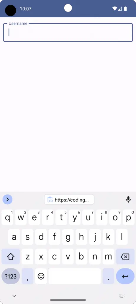
Use OutlinedTextField for Borders
To add a border to a TextField in Jetpack Compose, you generally use the OutlinedTextField composable. Here’s a simple code snippet to show how it’s done.
@Composable
fun TextFieldExample() {
        var textInput by remember { mutableStateOf("")}
        OutlinedTextField(value = textInput, onValueChange = {textInput = it},
            label = { Text("Username") },
            modifier = Modifier
                .fillMaxWidth()
                .padding(10.dp))
}
Complete Example with OutlinedTextField
Here’s a complete example that demonstrates how to add a bordered text field in a Jetpack Compose application.
package com.codingwithrashid.myapplication

import android.os.Bundle
import androidx.activity.ComponentActivity
import androidx.activity.compose.setContent
import androidx.compose.foundation.layout.Column
import androidx.compose.foundation.layout.fillMaxSize
import androidx.compose.foundation.layout.fillMaxWidth
import androidx.compose.foundation.layout.padding
import androidx.compose.material3.ExperimentalMaterial3Api
import androidx.compose.material3.MaterialTheme
import androidx.compose.material3.OutlinedTextField
import androidx.compose.material3.Surface
import androidx.compose.material3.Text
import androidx.compose.runtime.Composable
import androidx.compose.runtime.getValue
import androidx.compose.runtime.mutableStateOf
import androidx.compose.runtime.remember
import androidx.compose.runtime.setValue
import androidx.compose.ui.Modifier
import androidx.compose.ui.unit.dp
import com.codingwithrashid.myapplication.ui.theme.MyApplicationTheme

class MainActivity : ComponentActivity() {
    override fun onCreate(savedInstanceState: Bundle?) {
        super.onCreate(savedInstanceState)
        setContent {
            MyApplicationTheme {
                Surface(
                    modifier = Modifier.fillMaxSize(),
                    color = MaterialTheme.colorScheme.background
                ) {
                    Column {
                        TextFieldExample()
                    }
                }
            }
        }
    }
}

@OptIn(ExperimentalMaterial3Api::class)
@Composable
fun TextFieldExample() {
        var textInput by remember { mutableStateOf("")}
        OutlinedTextField(value = textInput, onValueChange = {textInput = it},
            label = { Text("Username") },
            modifier = Modifier
                .fillMaxWidth()
                .padding(10.dp))
}
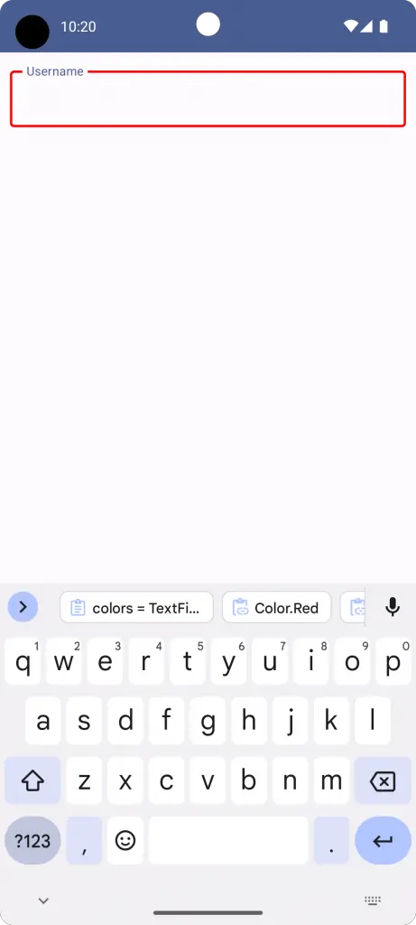
Change TextField Border Color
To change the color of the TextField border, you can use the color parameter of the OutlinedTextField. This allows you to set a specific color for the border for different states. Here’s how you can do it:
@Composable
fun TextFieldExample() {
        var textInput by remember { mutableStateOf("")}
        OutlinedTextField(value = textInput, onValueChange = {textInput = it},
            label = { Text("Username") },
            colors = TextFieldDefaults.outlinedTextFieldColors(
                focusedBorderColor = Color.Red,
                unfocusedBorderColor = Color.Blue),
            modifier = Modifier
                .fillMaxWidth()
                .padding(10.dp))
}
In this example, the border color will be blue and the color turns to red when focused.
Adding a border to TextField in Jetpack Compose is straightforward. By using OutlinedTextField, you can easily achieve this. For additional customization like changing border color, you can use the color parameter.
That’s how you add and customize the border for TextField in Android Jetpack Compose.