How to Create Circular Button in Android Jetpack Compose
Buttons are an essential part of any user interface and are used to initiate an action or navigate to a different screen. In this blog post, let’s learn how to create a circular button in Jetpack Compose.
The Button composable is one of the most used composables in Jetpack Compose. It has a shape parameter where you can define the shape of the button.
See the code snippet given below.
Button(
onClick = { /* ... */ },
colors = ButtonDefaults.buttonColors(Color.Red),
shape = CircleShape,
modifier= Modifier.size(100.dp),
) {
Text("Button")
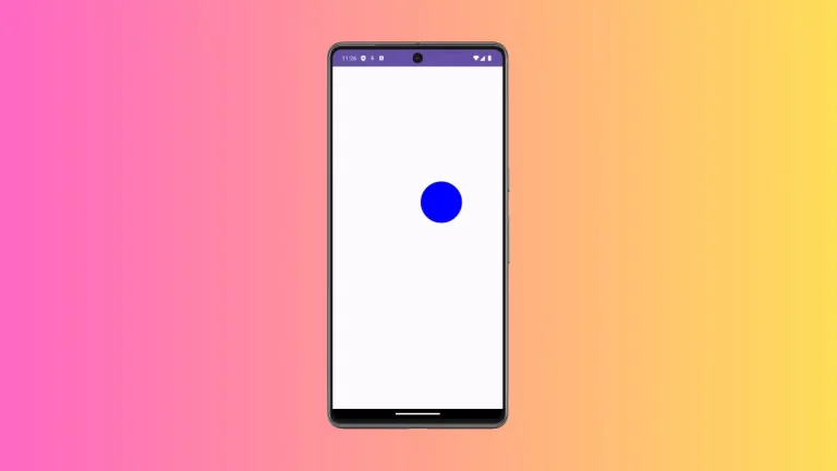
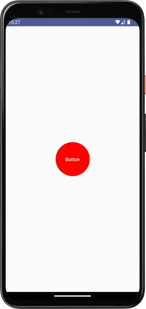
}Then, you will get the following output with red circular button.
Following is the complete code for reference.
package com.example.myapplication

import android.os.Bundle
import androidx.activity.ComponentActivity
import androidx.activity.compose.setContent
import androidx.compose.foundation.layout.*
import androidx.compose.foundation.shape.CircleShape
import androidx.compose.material3.*
import androidx.compose.runtime.Composable
import androidx.compose.ui.Modifier
import androidx.compose.ui.tooling.preview.Preview
import androidx.compose.ui.Alignment
import androidx.compose.ui.graphics.Color
import androidx.compose.ui.unit.dp
import com.example.myapplication.ui.theme.MyApplicationTheme

class MainActivity : ComponentActivity() {
    override fun onCreate(savedInstanceState: Bundle?) {
        super.onCreate(savedInstanceState)
        setContent {
            MyApplicationTheme {
                Surface(
                    modifier = Modifier.fillMaxSize(),
                    color = MaterialTheme.colorScheme.background
                ) {
                    ButtonExample()
                }
            }
        }
    }
}

@Composable
fun ButtonExample() {
    Column(modifier = Modifier.fillMaxSize(),
        horizontalAlignment = Alignment.CenterHorizontally,
        verticalArrangement = Arrangement.Center) {
        Button(
            onClick = { /* ... */ },
            colors = ButtonDefaults.buttonColors(Color.Red),
            shape = CircleShape,
            modifier= Modifier.size(100.dp),
        ) {
            Text("Button")
        }
    }
}

@Preview(showBackground = true)
@Composable
fun DefaultPreview() {
    MyApplicationTheme {
        ButtonExample()
    }
}
That’s how you add a button with a circle shape in Jetpack Compose.