How to Change Jetpack Compose Switch Border Color
Customization is a cornerstone of modern app development, allowing developers to tailor the user interface to their specific needs. Jetpack Compose, Android’s modern UI toolkit, offers extensive customization options, including the ability to change the border color of switches.
This blog post will guide you through the process of customizing the border color of a Switch in Jetpack Compose, using checkedBorderColor and uncheckedBorderColor.
Role of Switches in UI
In Jetpack Compose, a Switch is a UI component that lets users toggle between two states. It’s often used in settings menus or as a way to enable/disable features. While functional, the aesthetic aspect of a switch can significantly impact user experience.
Customizing the border color of the switch can make it more visually appealing and aligned with your app’s design.
Customize the Switch Border Color
Customize with SwitchDefaults
Jetpack Compose’s SwitchDefaults provides a way to customize the appearance of switches, including their border color when checked and unchecked.
Implement Custom Border Colors
To change the border color of a switch, you use the colors parameter of the Switch composable. Within this, you specify checkedBorderColor and uncheckedBorderColor for the different states of the switch.
Example:
@Composable
fun MySwitch() {
var isChecked by remember { mutableStateOf(true) }
Switch(
checked = isChecked,
onCheckedChange = { isChecked = it },
colors = SwitchDefaults.colors(
checkedBorderColor = Color.Red,
uncheckedBorderColor = Color.Green
)
)
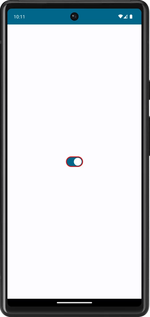
}In this example, the border color of the switch is red when it is in the ON position and green when it is OFF.
Following is the complete code for reference.
package com.example.myapplication

import android.os.Bundle
import androidx.activity.ComponentActivity
import androidx.activity.compose.setContent
import androidx.compose.foundation.layout.fillMaxSize
import androidx.compose.material3.MaterialTheme
import androidx.compose.material3.Surface
import androidx.compose.material3.Switch
import androidx.compose.material3.SwitchDefaults
import androidx.compose.runtime.Composable
import androidx.compose.runtime.getValue
import androidx.compose.runtime.mutableStateOf
import androidx.compose.runtime.remember
import androidx.compose.runtime.setValue
import androidx.compose.ui.Modifier
import androidx.compose.ui.graphics.Color
import com.example.myapplication.ui.theme.MyApplicationTheme

class MainActivity : ComponentActivity() {
    override fun onCreate(savedInstanceState: Bundle?) {
        super.onCreate(savedInstanceState)
        setContent {
            MyApplicationTheme {
                Surface(
                    modifier = Modifier.fillMaxSize(),
                    color = MaterialTheme.colorScheme.background
                ) {
                    MySwitch()
                }
            }
        }
    }
}

@Composable
fun MySwitch() {
    var isChecked by remember { mutableStateOf(true) }

    Switch(
        checked = isChecked,
        onCheckedChange = { isChecked = it },
        colors = SwitchDefaults.colors(
            checkedBorderColor = Color.Red,
            uncheckedBorderColor = Color.Green
        )
    )
}
Customizing the border color of a switch in Jetpack Compose is a simple yet effective way to enhance the aesthetics of your app’s UI. By following these guidelines and considering the importance of consistency and accessibility, you can create a switch that is not only functional but also visually appealing.