How to Change RadioButton Color in Android Jetpack Compose
The ability to customize UI components is a significant aspect of application development. Designing unique interfaces often requires adapting elements to fit a brand’s aesthetic or improve the user experience.
Radio buttons, integral components for displaying selectable options, are no exception to this. This post will guide you through changing radio button colors in Android Jetpack Compose.
To customize the colors of radio buttons in Jetpack Compose, we can utilize the colors parameter in the RadioButton function. This parameter can be set to RadioButtonDefaults.colors() which allows us to customize the selectedColor and unselectedColor.
@Composable
fun RadioButtonExample() {
val radioOptions = listOf("Option 1", "Option 2", "Option 3")
var selectedOption by remember { mutableStateOf(radioOptions[0]) }
Column {
radioOptions.forEach { option ->
Row(
Modifier.fillMaxWidth(),
verticalAlignment = Alignment.CenterVertically
) {
RadioButton(
selected = (option == selectedOption),
onClick = { selectedOption = option },
colors = RadioButtonDefaults.colors(
selectedColor = Color.Red,
unselectedColor = Color.Gray
)
)
Text(
text = option,
modifier = Modifier.padding(start = 8.dp),
)
}
}
}
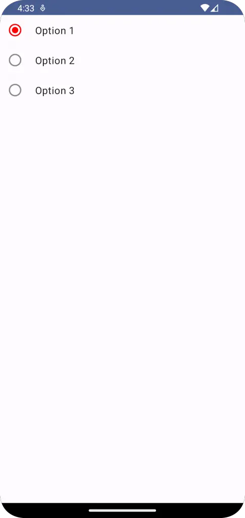
}With the colors parameter, we’ve changed the selectedColor to red and unselectedColor to gray. By using RadioButtonDefaults.colors(), we can easily customize the colors of our radio buttons in Jetpack Compose to better fit the design of our app.
Following is the output.
Following is the complete code for reference.
package com.example.example

import android.os.Bundle
import androidx.activity.ComponentActivity
import androidx.activity.compose.setContent
import androidx.compose.foundation.layout.Column
import androidx.compose.foundation.layout.Row
import androidx.compose.foundation.layout.fillMaxSize
import androidx.compose.foundation.layout.fillMaxWidth
import androidx.compose.foundation.layout.padding
import androidx.compose.material3.MaterialTheme
import androidx.compose.material3.RadioButton
import androidx.compose.material3.RadioButtonDefaults
import androidx.compose.material3.Surface
import androidx.compose.material3.Text
import androidx.compose.runtime.Composable
import androidx.compose.runtime.getValue
import androidx.compose.runtime.mutableStateOf
import androidx.compose.runtime.remember
import androidx.compose.runtime.setValue
import androidx.compose.ui.Alignment
import androidx.compose.ui.Modifier
import androidx.compose.ui.graphics.Color
import androidx.compose.ui.tooling.preview.Preview
import androidx.compose.ui.unit.dp
import com.example.example.ui.theme.ExampleTheme

class MainActivity : ComponentActivity() {
    override fun onCreate(savedInstanceState: Bundle?) {
        super.onCreate(savedInstanceState)
        setContent {
            ExampleTheme {
                // A surface container using the 'background' color from the theme
                Surface(
                    modifier = Modifier.fillMaxSize(),
                    color = MaterialTheme.colorScheme.background
                ) {
                    RadioButtonExample()
                }
            }
        }
    }
}


@Composable
fun RadioButtonExample() {
        val radioOptions = listOf("Option 1", "Option 2", "Option 3")
        var selectedOption by remember { mutableStateOf(radioOptions[0]) }

        Column {
            radioOptions.forEach { option ->
                Row(
                    Modifier.fillMaxWidth(),
                    verticalAlignment = Alignment.CenterVertically
                ) {
                    RadioButton(
                        selected = (option == selectedOption),
                        onClick = { selectedOption = option },
                        colors = RadioButtonDefaults.colors(
                            selectedColor = Color.Red,
                            unselectedColor = Color.Gray
                        )
                    )
                    Text(
                        text = option,
                        modifier = Modifier.padding(start = 8.dp),
                    )
                }
            }
    }
}

@Preview(showBackground = true)
@Composable
fun ExamplePreview() {
    ExampleTheme {
        RadioButtonExample()
    }
}
This example demonstrates how you can adapt radio buttons to your app’s unique design. However, when customizing colors, it’s crucial to consider accessibility to ensure your app is usable by as many users as possible.


One Comment