How to Change RadioButton Size in Android Jetpack Compose
As an Android developer, you’re always seeking ways to improve your app’s UI/UX. And in Jetpack Compose, one way to achieve that is by customizing UI components to match your design needs, like the size of a RadioButton.
In this blog post, we’ll explore how you can use the Modifier.scale() function to adjust the size of RadioButtons in Jetpack Compose.
By default, Jetpack Compose does not provide a direct API to modify the size of a RadioButton. However, the framework is not restrictive. It offers a versatile solution with the Modifier.scale() function. This function scales the size of a Composable by a specified scaling factor.
Let’s look at an example:
@Composable
fun RadioButtonExample() {
val radioOptions = listOf("Option 1", "Option 2", "Option 3")
var selectedOption by remember { mutableStateOf(radioOptions[0]) }
Column {
radioOptions.forEach { option ->
Row(
Modifier.fillMaxWidth(),
verticalAlignment = Alignment.CenterVertically
) {
RadioButton(
modifier = Modifier.scale(2f),
selected = (option == selectedOption),
onClick = { selectedOption = option },
colors = RadioButtonDefaults.colors(
selectedColor = Color.Red,
unselectedColor = Color.Gray
)
)
Text(
text = option,
modifier = Modifier.padding(start = 8.dp),
)
}
}
}
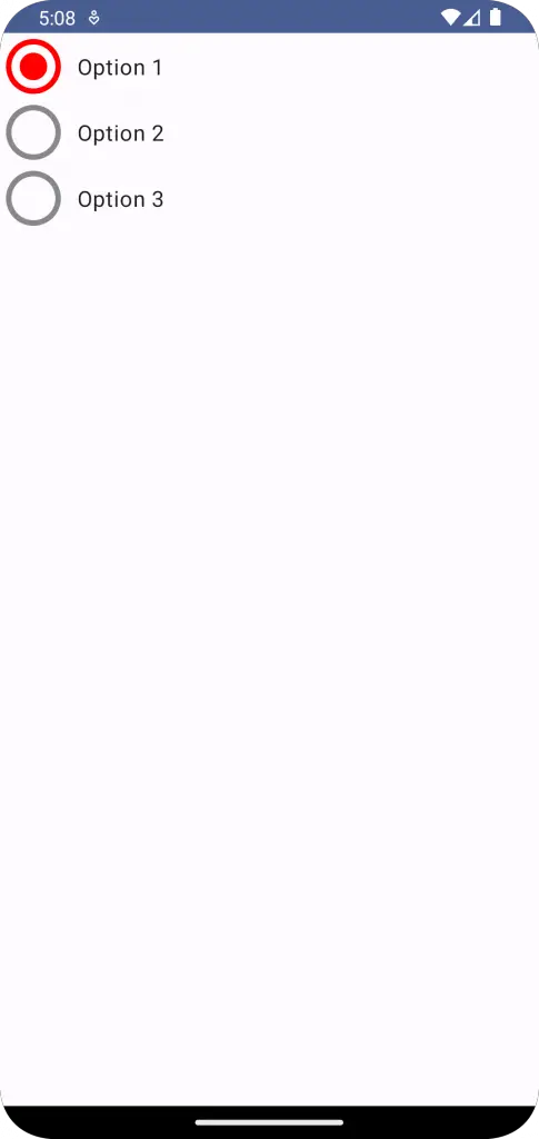
}In this example, we create a list of RadioButtons, each representing an option. We apply the .scale(2f) modifier to the RadioButton Composable. This scales the RadioButton to twice its original size.
In addition to changing the size, we customize the color of the RadioButtons for selected and unselected states. We use the RadioButtonDefaults.colors() function to specify the colors.
Following is the output.
Following is the complete code.
package com.example.example

import android.os.Bundle
import androidx.activity.ComponentActivity
import androidx.activity.compose.setContent
import androidx.compose.foundation.layout.Column
import androidx.compose.foundation.layout.Row
import androidx.compose.foundation.layout.fillMaxSize
import androidx.compose.foundation.layout.fillMaxWidth
import androidx.compose.foundation.layout.padding
import androidx.compose.material3.MaterialTheme
import androidx.compose.material3.RadioButton
import androidx.compose.material3.RadioButtonDefaults
import androidx.compose.material3.Surface
import androidx.compose.material3.Text
import androidx.compose.runtime.Composable
import androidx.compose.runtime.getValue
import androidx.compose.runtime.mutableStateOf
import androidx.compose.runtime.remember
import androidx.compose.runtime.setValue
import androidx.compose.ui.Alignment
import androidx.compose.ui.Modifier
import androidx.compose.ui.draw.scale
import androidx.compose.ui.graphics.Color
import androidx.compose.ui.tooling.preview.Preview
import androidx.compose.ui.unit.dp
import com.example.example.ui.theme.ExampleTheme

class MainActivity : ComponentActivity() {
    override fun onCreate(savedInstanceState: Bundle?) {
        super.onCreate(savedInstanceState)
        setContent {
            ExampleTheme {
                // A surface container using the 'background' color from the theme
                Surface(
                    modifier = Modifier.fillMaxSize(),
                    color = MaterialTheme.colorScheme.background
                ) {
                    RadioButtonExample()
                }
            }
        }
    }
}


@Composable
fun RadioButtonExample() {
        val radioOptions = listOf("Option 1", "Option 2", "Option 3")
        var selectedOption by remember { mutableStateOf(radioOptions[0]) }

        Column {
            radioOptions.forEach { option ->
                Row(
                    Modifier.fillMaxWidth(),
                    verticalAlignment = Alignment.CenterVertically
                ) {
                    RadioButton(
                        modifier = Modifier.scale(2f),
                        selected = (option == selectedOption),
                        onClick = { selectedOption = option },
                        colors = RadioButtonDefaults.colors(
                            selectedColor = Color.Red,
                            unselectedColor = Color.Gray
                        )
                    )
                    Text(
                        text = option,
                        modifier = Modifier.padding(start = 8.dp),
                    )
                }
            }
    }
}

@Preview(showBackground = true)
@Composable
fun ExamplePreview() {
    ExampleTheme {
        RadioButtonExample()
    }
}
As exciting as it is to be able to adjust the size of your RadioButtons, remember to balance customization with consistency. The Material Design guidelines provide size defaults that users are accustomed to across different apps. Unless there’s a compelling need, it’s generally best to stick with these defaults.


One Comment