What Are Different Types of Cards in Android Jetpack Compose
In the exciting world of Android Jetpack Compose, the Card component plays a crucial role in enhancing the user interface and overall user experience. Cards provide a versatile container to display a range of content and actions on a single subject.
They allow for a more organized layout and a clean aesthetic, presenting information in a way that is easy to read and engage with. Jetpack Compose offers three types of Card components: Card, ElevatedCard, and OutlinedCard. Let’s delve deeper into each of them.
Card
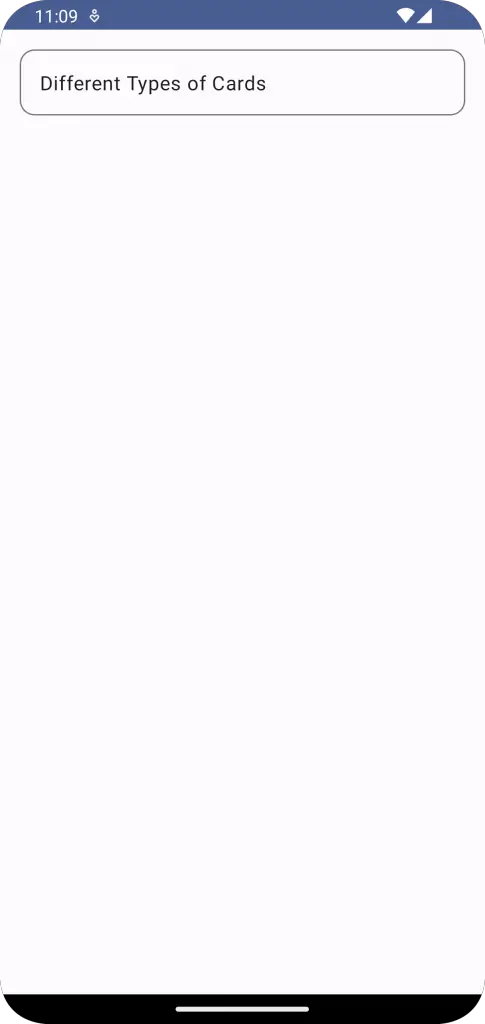
The basic Card component is a material design container that contains content and actions about a single subject. This filled card subtly separates from the background, emphasizing the content without distracting from the overall layout. This component is excellent for presenting compact and crucial information.
Here’s a simple example of how to implement a Card in Jetpack Compose:
Card(
    modifier = Modifier
        .padding(16.dp)
        .fillMaxWidth()
) {
    Column(
        modifier = Modifier
            .fillMaxWidth()
            .padding(16.dp)
    ) {
        Text(text = "Different Types of Cards")
    }
}
ElevatedCard
The ElevatedCard component, as its name suggests, provides an elevated appearance for your card, causing it to stand out more from the background. The component features a drop shadow, offering more visual separation than a filled card but less than an outlined card. This type of card is useful when you want to give particular emphasis to a piece of content.
Below is a straightforward implementation of an ElevatedCard:
ElevatedCard(
    modifier = Modifier
        .padding(16.dp)
        .fillMaxWidth()
) {
    Column(
        modifier = Modifier
            .fillMaxWidth()
            .padding(16.dp)
    ) {
        Text(text = "Different Types of Cards")
    }
}
OutlinedCard
Lastly, the OutlinedCard component is designed to contain content and actions related to a single subject but with a visual boundary around the container. This boundary can highlight the information it encloses more than other card types. If you need to draw the user’s attention more significantly, OutlinedCard should be your go-to.
Here’s an example of an OutlinedCard in action:
OutlinedCard(
    modifier = Modifier
        .padding(16.dp)
        .fillMaxWidth(),
) {
    Column(
        modifier = Modifier
            .fillMaxWidth()
            .padding(16.dp)
    ) {
        Text(text = "Different Types of Cards")
    }
}
Each of these card types serves a unique purpose in your application’s design and helps enhance the user experience. Understanding their distinctions and knowing when to use each will allow you to create more effective and visually appealing applications with Jetpack Compose
