How to Add Border to Box in Android Jetpack Compose
In this blog post, we are going to delve into the nuances of applying borders to Box components in Jetpack Compose, toolkit for building native UI in Android. Borders can be a handy tool when designing UI as they aid in distinguishing, highlighting, and structuring content.
How to Add Border to Box
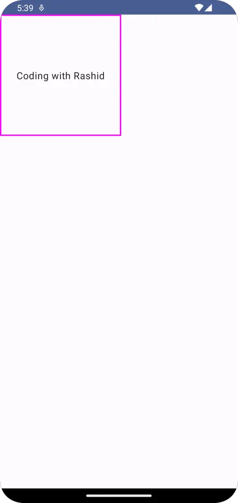
The Box composable allows you to stack different composables on top of each other. To add a border, we utilize the border modifier and specify the width and color of the border. Here’s how to do it:
@Composable
fun BoxExample() {
    Column{
        Box(
            modifier = Modifier
                .size(200.dp)
                .border(2.dp, Color.Magenta),
            contentAlignment = Alignment.Center
        ) {
            Text(
                text = "Coding with Rashid",
            )
        }
    }
}
In the code above, we’ve added a Magenta border of 2.dp width to our Box. The border function requires two parameters – width of the border and the color.
How to Add Border to Box with Shape
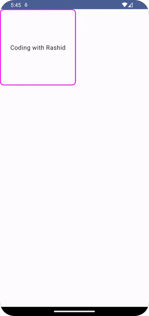
You might want to give your border a specific shape, like rounded corners. In that case, we can include an additional parameter to the border function, that is the shape.
@Composable
fun BoxExample() {
    Column{
        Box(
            modifier = Modifier
                .size(200.dp)
                .border(2.dp, Color.Magenta, RoundedCornerShape(10.dp)),
            contentAlignment = Alignment.Center
        ) {
            Text(
                text = "Coding with Rashid",
            )
        }
    }
}
With RoundedCornerShape(10.dp), our Box now has a Magenta border with rounded corners.
Following is the complete code for reference.
package com.example.example

import android.os.Bundle
import androidx.activity.ComponentActivity
import androidx.activity.compose.setContent
import androidx.compose.foundation.border
import androidx.compose.foundation.layout.Box
import androidx.compose.foundation.layout.Column
import androidx.compose.foundation.layout.fillMaxSize
import androidx.compose.foundation.layout.size
import androidx.compose.foundation.shape.RoundedCornerShape
import androidx.compose.material3.MaterialTheme
import androidx.compose.material3.Surface
import androidx.compose.material3.Text
import androidx.compose.runtime.Composable
import androidx.compose.ui.Alignment
import androidx.compose.ui.Modifier
import androidx.compose.ui.graphics.Color
import androidx.compose.ui.tooling.preview.Preview
import androidx.compose.ui.unit.dp
import com.example.example.ui.theme.ExampleTheme

class MainActivity : ComponentActivity() {
    override fun onCreate(savedInstanceState: Bundle?) {
        super.onCreate(savedInstanceState)
        setContent {
            ExampleTheme {
                // A surface container using the 'background' color from the theme
                Surface(
                    modifier = Modifier.fillMaxSize(),
                    color = MaterialTheme.colorScheme.background
                ) {
                    BoxExample()
                }
            }
        }
    }
}

@Composable
fun BoxExample() {
    Column{
        Box(
            modifier = Modifier
                .size(200.dp)
                .border(2.dp, Color.Magenta, RoundedCornerShape(10.dp)),
            contentAlignment = Alignment.Center
        ) {
            Text(
                text = "Coding with Rashid",
            )
        }
    }
}

@Preview(showBackground = true)
@Composable
fun ExamplePreview() {
    ExampleTheme {
        BoxExample()
    }
}
Borders offer an effective way to visually separate or group your content. Understanding how to manipulate borders is a fundamental step in mastering UI design in Jetpack Compose.