How to Add Border to Icon in Android Jetpack Compose
Icons play an important role in mobile applications, enhancing usability and contributing to a clean, intuitive UI. Sometimes, you may want to add a border to an icon to make it stand out or to align with your app’s aesthetic.
In this blog post, we will discuss how to add borders to icons in Jetpack Compose.
Icon Composable
In Jetpack Compose, the Icon composable is a versatile tool to display icons on your screen, following Material Design guidelines.
Icon(
imageVector = Icons.Default.Home,
contentDescription = "Home Icon"
)
This snippet uses the Icon composable to display a default home icon.
Add Border to Icon
To add a border to an icon, you can use the Modifier.border function. This function requires two parameters: the width of the border and the color of the border.
Here’s an example of how you can add a border to your icon:
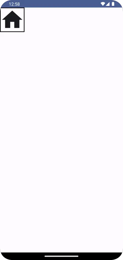
Icon(
     imageVector = Icons.Default.Home,
     contentDescription = "Home Icon",
     modifier = Modifier.border(width = 2.dp, color = Color.Black)
                .size(78.dp)
     )
In this code, Modifier.border adds a black border of width 2.dp to the home icon. You will get the following output.
Following is the complete code for reference.
package com.example.example

import android.os.Bundle
import androidx.activity.ComponentActivity
import androidx.activity.compose.setContent
import androidx.compose.foundation.border
import androidx.compose.foundation.layout.Column
import androidx.compose.foundation.layout.fillMaxSize
import androidx.compose.foundation.layout.size
import androidx.compose.material.icons.Icons
import androidx.compose.material.icons.filled.Home
import androidx.compose.material3.Icon
import androidx.compose.material3.MaterialTheme
import androidx.compose.material3.Surface
import androidx.compose.runtime.Composable
import androidx.compose.ui.Modifier
import androidx.compose.ui.graphics.Color
import androidx.compose.ui.tooling.preview.Preview
import androidx.compose.ui.unit.dp
import com.example.example.ui.theme.ExampleTheme

class MainActivity : ComponentActivity() {
    override fun onCreate(savedInstanceState: Bundle?) {
        super.onCreate(savedInstanceState)
        setContent {
            ExampleTheme {
                // A surface container using the 'background' color from the theme
                Surface(
                    modifier = Modifier.fillMaxSize(),
                    color = MaterialTheme.colorScheme.background
                ) {
                    IconExample()
                }
            }
        }
    }
}

@Composable
fun IconExample() {
    Column{
            Icon(
                imageVector = Icons.Default.Home,
                contentDescription = "Home Icon",
                modifier = Modifier.border(width = 2.dp, color = Color.Black)
                    .size(78.dp)
            )
    }
}

@Preview(showBackground = true)
@Composable
fun ExamplePreview() {
    ExampleTheme {
        IconExample()
    }
}
Styling icons with borders in Jetpack Compose is straightforward and customizable, offering your app a unique visual edge and better guiding user interaction.