How to Change TextField Cursor Color in Android Jetpack Compose
In Android Jetpack Compose, the TextField is a crucial UI element that often needs customization. One of the most asked-for tweaks is changing its cursor color. In this tutorial, we’ll walk through how you can easily change the cursor color in a TextField using Jetpack Compose.
Why Customize Cursor Color?
Before diving into the code, let’s talk about why you might want to change the cursor color. A customized cursor color can align with your app’s theme, improving its visual appeal. It also enhances the user experience by making text input more engaging.
Use TextFieldDefaults and textFieldColors
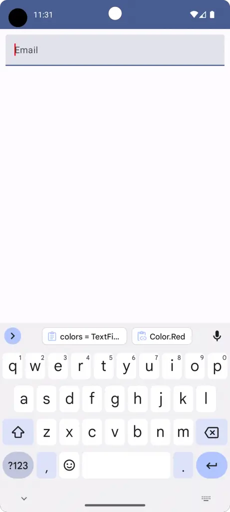
You can easily change the cursor color using TextFieldDefaults and the textFieldColors function. Here’s a quick example:
@Composable
fun TextFieldExample() {
    var textInput by remember { mutableStateOf("")}
    TextField(value = textInput,
            onValueChange = {textInput = it},
            placeholder = { Text("Email") },
            colors = TextFieldDefaults.textFieldColors(cursorColor = Color.Red),
            modifier = Modifier.fillMaxWidth()
                        .padding(10.dp))
}
By setting the cursorColor to Color.Red, your cursor will now appear red.
Complete Code for Customizing Cursor Color
Here’s how you can integrate the cursor customization into a complete MainActivity:
package com.codingwithrashid.myapplication

import android.os.Bundle
import androidx.activity.ComponentActivity
import androidx.activity.compose.setContent
import androidx.compose.foundation.layout.Column
import androidx.compose.foundation.layout.fillMaxSize
import androidx.compose.foundation.layout.fillMaxWidth
import androidx.compose.foundation.layout.padding
import androidx.compose.material3.ExperimentalMaterial3Api
import androidx.compose.material3.MaterialTheme
import androidx.compose.material3.Surface
import androidx.compose.material3.Text
import androidx.compose.material3.TextField
import androidx.compose.material3.TextFieldDefaults
import androidx.compose.runtime.Composable
import androidx.compose.runtime.getValue
import androidx.compose.runtime.mutableStateOf
import androidx.compose.runtime.remember
import androidx.compose.runtime.setValue
import androidx.compose.ui.Modifier
import androidx.compose.ui.graphics.Color
import androidx.compose.ui.unit.dp
import com.codingwithrashid.myapplication.ui.theme.MyApplicationTheme

class MainActivity : ComponentActivity() {
    override fun onCreate(savedInstanceState: Bundle?) {
        super.onCreate(savedInstanceState)
        setContent {
            MyApplicationTheme {
                Surface(
                    modifier = Modifier.fillMaxSize(),
                    color = MaterialTheme.colorScheme.background
                ) {
                    Column {
                        TextFieldExample()
                    }
                }
            }
        }
    }
}

@OptIn(ExperimentalMaterial3Api::class)
@Composable
fun TextFieldExample() {
    var textInput by remember { mutableStateOf("")}
    TextField(value = textInput,
            onValueChange = {textInput = it},
            placeholder = { Text("Email") },
            colors = TextFieldDefaults.textFieldColors(cursorColor = Color.Red),
            modifier = Modifier.fillMaxWidth()
                        .padding(10.dp))
}
Customizing the cursor color in a TextField is an easy yet impactful way to enhance your Android app’s user interface. With just a few lines of code, you can align the cursor color with your app’s overall theme, making it more visually appealing and user-friendly.