How to Create Custom Snackbar in Android Jetpack Compose
Android development is constantly evolving, and Jetpack Compose is a key part of that evolution. This UI toolkit offers a refreshing approach to building interfaces, including Snackbars. In this post, we’re going to dive into how to create a custom Snackbar with Jetpack Compose.
In traditional Android development, altering Snackbars often involves navigating complex layout files and styles. With Jetpack Compose, this process is simplified. Here, we will explore how to customize a Snackbar with less effort and more clarity.
Define Custom Snackbar
Now let’s define our custom Snackbar. For this, we’ll need to write our own @Composable function that takes SnackbarData as input.
@Composable
fun CustomSnackbar(snackbarData: SnackbarData) {
Surface(
shape = RoundedCornerShape(8.dp),
color = Color.Gray,
shadowElevation = 8.dp,
modifier = Modifier.padding(8.dp)
) {
Row(
verticalAlignment = Alignment.CenterVertically,
modifier = Modifier.padding(8.dp)
) {
Text(
text = snackbarData.visuals.message,
color = Color.White
)
Spacer(Modifier.weight(1f))
snackbarData.visuals.actionLabel?.let { actionLabel ->
TextButton(onClick = { snackbarData.performAction() }) {
Text(text = actionLabel.uppercase(Locale.ROOT), color = Color.Blue)
}
}
}
}
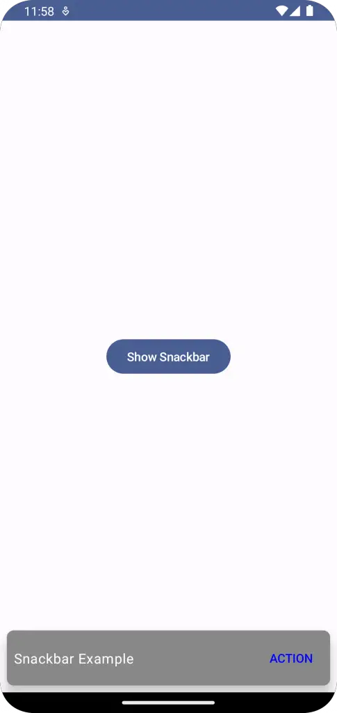
}In the above snippet, we’ve created a custom Snackbar that is placed on a rounded-corner surface. It has an action button displayed to the right.
Display Custom Snackbar
We can now use the SnackbarHost with the custom Snackbar function we defined earlier.
fun SnackbarExample() {
    val snackbarHostState = remember { SnackbarHostState() }
    val scope = rememberCoroutineScope()

    Box {
        Button(onClick = {
            scope.launch {
                val result = snackbarHostState.showSnackbar(
                    message = "Snackbar Example",
                    actionLabel = "Action",
                    withDismissAction = true,
                    duration = SnackbarDuration.Short
                )
                when (result) {
                    SnackbarResult.ActionPerformed -> {
                        //Do Something
                    }
                    SnackbarResult.Dismissed -> {
                        //Do Something
                    }
                }
            }},
            modifier = Modifier
                .fillMaxSize()
                .wrapContentSize()) {
            Text(text = "Show Snackbar")
        }
        SnackbarHost(
            hostState = snackbarHostState,
            modifier = Modifier.align(Alignment.BottomCenter),
            snackbar = { CustomSnackbar(it)}
        )
    }
}
This code snippet shows our custom Snackbar when the “Show Snackbar” button is clicked.
Following is the complete code for reference.
package com.example.example

import android.os.Bundle
import androidx.activity.ComponentActivity
import androidx.activity.compose.setContent
import androidx.compose.foundation.layout.Box
import androidx.compose.foundation.layout.Row
import androidx.compose.foundation.layout.Spacer
import androidx.compose.foundation.layout.fillMaxSize
import androidx.compose.foundation.layout.padding
import androidx.compose.foundation.layout.wrapContentSize
import androidx.compose.foundation.shape.RoundedCornerShape
import androidx.compose.material3.Button
import androidx.compose.material3.MaterialTheme
import androidx.compose.material3.SnackbarData
import androidx.compose.material3.SnackbarDuration
import androidx.compose.material3.SnackbarHost
import androidx.compose.material3.SnackbarHostState
import androidx.compose.material3.SnackbarResult
import androidx.compose.material3.Surface
import androidx.compose.material3.Text
import androidx.compose.material3.TextButton
import androidx.compose.runtime.Composable
import androidx.compose.runtime.remember
import androidx.compose.runtime.rememberCoroutineScope
import androidx.compose.ui.Alignment
import androidx.compose.ui.Modifier
import androidx.compose.ui.graphics.Color
import androidx.compose.ui.tooling.preview.Preview
import androidx.compose.ui.unit.dp
import com.example.example.ui.theme.ExampleTheme
import kotlinx.coroutines.launch
import java.util.Locale

class MainActivity : ComponentActivity() {
    override fun onCreate(savedInstanceState: Bundle?) {
        super.onCreate(savedInstanceState)
        setContent {
            ExampleTheme {
                // A surface container using the 'background' color from the theme
                Surface(
                    modifier = Modifier.fillMaxSize(),
                    color = MaterialTheme.colorScheme.background
                ) {
                    SnackbarExample()
                }
            }
        }
    }
}

@Composable
fun CustomSnackbar(snackbarData: SnackbarData) {
    Surface(
        shape = RoundedCornerShape(8.dp),
        color = Color.Gray,
        shadowElevation = 8.dp,
        modifier = Modifier.padding(8.dp)
    ) {
        Row(
            verticalAlignment = Alignment.CenterVertically,
            modifier = Modifier.padding(8.dp)
        ) {
            Text(
                text = snackbarData.visuals.message,
                color = Color.White
            )

            Spacer(Modifier.weight(1f))

            snackbarData.visuals.actionLabel?.let { actionLabel ->
                TextButton(onClick = { snackbarData.performAction() }) {
                    Text(text = actionLabel.uppercase(Locale.ROOT), color = Color.Blue)
                }
            }
        }
    }
}


@Composable
fun SnackbarExample() {
    val snackbarHostState = remember { SnackbarHostState() }
    val scope = rememberCoroutineScope()

    Box {
        Button(onClick = {
            scope.launch {
                val result = snackbarHostState.showSnackbar(
                    message = "Snackbar Example",
                    actionLabel = "Action",
                    withDismissAction = true,
                    duration = SnackbarDuration.Short
                )
                when (result) {
                    SnackbarResult.ActionPerformed -> {
                        //Do Something
                    }
                    SnackbarResult.Dismissed -> {
                        //Do Something
                    }
                }
            }},
            modifier = Modifier
                .fillMaxSize()
                .wrapContentSize()) {
            Text(text = "Show Snackbar")
        }
        SnackbarHost(
            hostState = snackbarHostState,
            modifier = Modifier.align(Alignment.BottomCenter),
            snackbar = { CustomSnackbar(it)}
        )
    }
}


@Preview(showBackground = true)
@Composable
fun ExamplePreview() {
    ExampleTheme {
        SnackbarExample()
    }
}
And that’s it! You’ve now created a custom Snackbar using Jetpack Compose. This is a great way to ensure that all parts of your app align with your unique design philosophy.