How to Create Switch with Custom Thumb in Jetpack Compose
Customization is a key aspect of modern app development, and Jetpack Compose, Android’s UI toolkit, excels in providing flexibility for such customizations. In this blog post, we’ll explore how to create a switch with a custom thumb in Jetpack Compose, enhancing both functionality and aesthetic appeal.
A Switch in Jetpack Compose is used for toggling between two states, typically ON and OFF. Customizing the thumb of the switch, the part that moves left and right, allows for a more personalized and visually distinct UI element.
Step-by-Step Guide to Customize the Switch Thumb
Set Up the Composable Function
Begin by defining a @Composable function. Here, we’ll name it MySwitch. This function will include our customized switch component.
@Composable
fun MySwitch() {
    // Custom Switch logic will be implemented here
}
Manage the Switch State
Use remember and mutableStateOf to manage the switch’s state. This keeps track of whether the switch is in the ON or OFF position. We initialize it to true (ON).
var checked by remember { mutableStateOf(true) }Implement the Custom Thumb
In Jetpack Compose, you can use the thumbContent parameter of the Switch composable to customize its thumb. We use a conditional statement to check the state of the switch and display an icon if the switch is ON.
Switch(
checked = checked,
onCheckedChange = { checked = it },
thumbContent = if (checked) {
{
Icon(
imageVector = Icons.Filled.Check,
contentDescription = null,
modifier = Modifier.size(SwitchDefaults.IconSize)
)
}
} else {
null
}
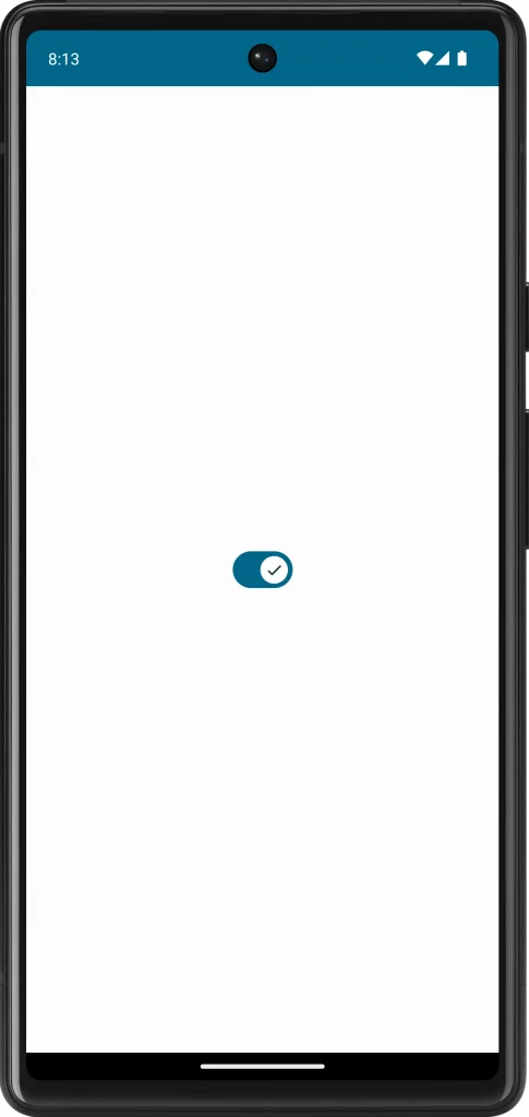
)In this example, when the switch is ON, a check icon appears on the thumb. When OFF, it remains as the default.
Following is the complete code.
package com.example.myapplication

import android.os.Bundle
import androidx.activity.ComponentActivity
import androidx.activity.compose.setContent
import androidx.compose.foundation.layout.fillMaxSize
import androidx.compose.foundation.layout.size
import androidx.compose.material.icons.Icons
import androidx.compose.material.icons.filled.Check
import androidx.compose.material3.Icon
import androidx.compose.material3.MaterialTheme
import androidx.compose.material3.Surface
import androidx.compose.material3.Switch
import androidx.compose.material3.SwitchDefaults
import androidx.compose.runtime.Composable
import androidx.compose.runtime.getValue
import androidx.compose.runtime.mutableStateOf
import androidx.compose.runtime.remember
import androidx.compose.runtime.setValue
import androidx.compose.ui.Modifier
import com.example.myapplication.ui.theme.MyApplicationTheme

class MainActivity : ComponentActivity() {
    override fun onCreate(savedInstanceState: Bundle?) {
        super.onCreate(savedInstanceState)
        setContent {
            MyApplicationTheme {
                Surface(
                    modifier = Modifier.fillMaxSize(),
                    color = MaterialTheme.colorScheme.background
                ) {
                    MySwitch()
                }
            }
        }
    }
}

@Composable
fun MySwitch() {
    var checked by remember { mutableStateOf(true) }

    Switch(
        checked = checked,
        onCheckedChange = { checked = it },
        thumbContent = if (checked) {
            {
                Icon(
                    imageVector = Icons.Filled.Check,
                    contentDescription = null,
                    modifier = Modifier.size(SwitchDefaults.IconSize)
                )
            }
        } else {
            null
        }
    )
}
Customizing the thumb of a switch in Jetpack Compose allows you to create a unique and engaging user interface. By following these steps, you can enhance the visual appeal of your switches while ensuring they remain functional and accessible.