How to Disable Jetpack Compose Switch
In the world of Android app development, Jetpack Compose is a game-changer, offering a more intuitive and efficient way to build UIs. An important aspect of user interface design is handling the disabled state of interactive components, like switches.
This post will guide you through disabling a Switch in Jetpack Compose, including the nuances of styling and usability considerations.
A Switch in Jetpack Compose is typically used for toggling between two states, such as ON and OFF. There are scenarios where you might need to disable the switch, making it non-interactive. This could be due to certain app conditions or user permissions.
Disable the Switch
Implement the Disabled State
Disabling a switch in Jetpack Compose is straightforward. You need to set the enabled parameter of the Switch composable to false.
Example:
@Composable
fun MyDisabledSwitch() {
    var isChecked by remember { mutableStateOf(true) }
    Switch(
        checked = isChecked,
        onCheckedChange = null,
        enabled = false
    )
}
In this example, the Switch is permanently set to the disabled state.
Conditional Disabling
Often, the switch’s disabled state depends on certain conditions. This can be achieved by dynamically setting the enabled parameter.
Example:
@Composable
fun MyConditionalSwitch() {
    var isChecked by remember { mutableStateOf(true) }
    var canToggle by remember { mutableStateOf(false) }

    Switch(
        checked = isChecked,
        onCheckedChange = { if (canToggle) isChecked = it },
        enabled = canToggle
    )
}
Here, the switch’s enabled state is controlled by the canToggle variable.
Style the Disabled Switch
Visual Feedback
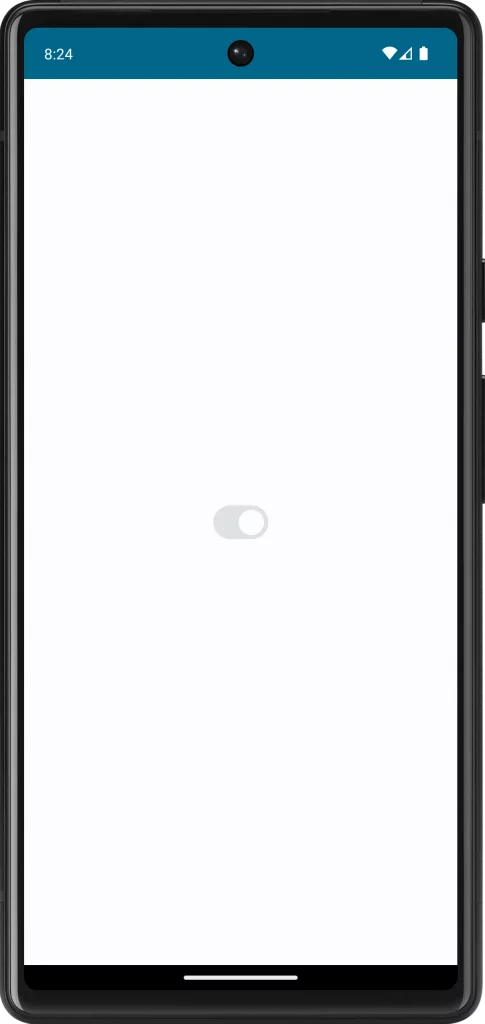
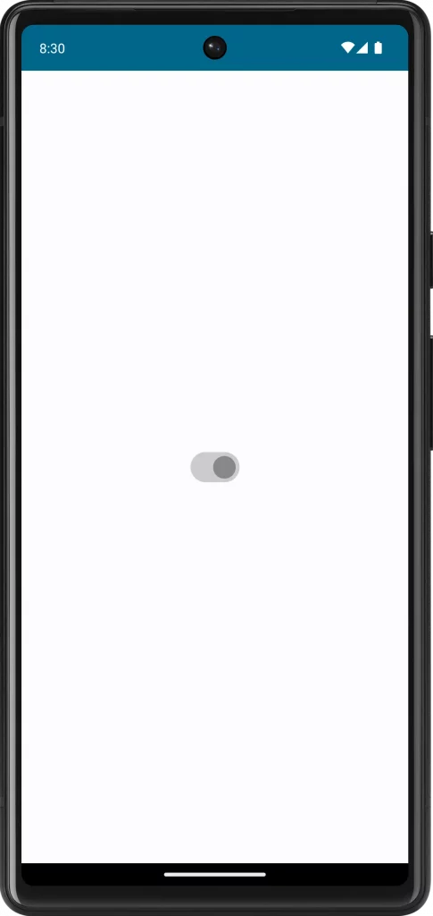
When a switch is disabled, it should give clear visual feedback. Jetpack Compose by default alters the color of the switch to indicate its disabled state. However, you can further customize it to fit your app’s design.
Customize Colors
Use the colors parameter in the Switch composable to define custom colors for the disabled state.
Example:
Switch(
    checked = isChecked.value,
    onCheckedChange = null,
    enabled = false,
    colors = SwitchDefaults.colors(disabledUncheckedThumbColor = Color.Gray, disabledUncheckedTrackColor = Color.LightGray,
            disabledCheckedThumbColor = Color.Gray, disabledCheckedTrackColor = Color.LightGray)
)
Following is the complete code for reference.
package com.example.myapplication

import android.os.Bundle
import androidx.activity.ComponentActivity
import androidx.activity.compose.setContent
import androidx.compose.foundation.layout.fillMaxSize
import androidx.compose.material3.MaterialTheme
import androidx.compose.material3.Surface
import androidx.compose.material3.Switch
import androidx.compose.material3.SwitchDefaults
import androidx.compose.runtime.Composable
import androidx.compose.runtime.getValue
import androidx.compose.runtime.mutableStateOf
import androidx.compose.runtime.remember
import androidx.compose.runtime.setValue
import androidx.compose.ui.Modifier
import androidx.compose.ui.graphics.Color
import com.example.myapplication.ui.theme.MyApplicationTheme

class MainActivity : ComponentActivity() {
    override fun onCreate(savedInstanceState: Bundle?) {
        super.onCreate(savedInstanceState)
        setContent {
            MyApplicationTheme {
                Surface(
                    modifier = Modifier.fillMaxSize(),
                    color = MaterialTheme.colorScheme.background
                ) {
                    MySwitch()
                }
            }
        }
    }
}

@Composable
fun MySwitch() {
    var isChecked by remember { mutableStateOf(true) }
    Switch(
        checked = isChecked,
        onCheckedChange = null,
        enabled = false,
        colors = SwitchDefaults.colors(disabledUncheckedThumbColor = Color.Gray, disabledUncheckedTrackColor = Color.LightGray,
            disabledCheckedThumbColor = Color.Gray, disabledCheckedTrackColor = Color.LightGray)
    )
}
Implementing and styling a disabled Switch in Jetpack Compose is a vital aspect of creating a comprehensive and intuitive user interface. By appropriately handling and styling the disabled state, you can enhance the overall usability and aesthetic of your app.