How to Change Switch Track Color in Jetpack Compose
Jetpack Compose, Android’s modern toolkit for building UIs, offers great flexibility in UI customization. A vital component in many apps is the Switch, used for toggling settings or features.
An important aspect of a switch’s design is its track color, which can significantly enhance the user interface. This post explores how to customize the track color of a switch in Jetpack Compose, aligning it with your app’s theme and style.
In Jetpack Compose, a Switch is a UI element for toggling between two states. It consists of a thumb (the circular element) and a track (the background). Customizing the track color not only adds to the aesthetic appeal but also aids in maintaining consistency throughout the app’s design.
Customize the Track Color
Default Track Color
By default, the track color of a switch in Jetpack Compose reflects the app’s primary color theme. However, you may want to customize this to better fit your design requirements.
Use SwitchDefaults.colors
Jetpack Compose provides the SwitchDefaults.colors method to customize various aspects of a switch, including the track color.
Example: Customize Track Color
@Composable
fun MySwitch() {
var isChecked by remember { mutableStateOf(true) }
Switch(
checked = isChecked,
onCheckedChange = { isChecked = it },
colors = SwitchDefaults.colors(
checkedTrackColor = Color.Green,
uncheckedTrackColor = Color.Gray
)
)
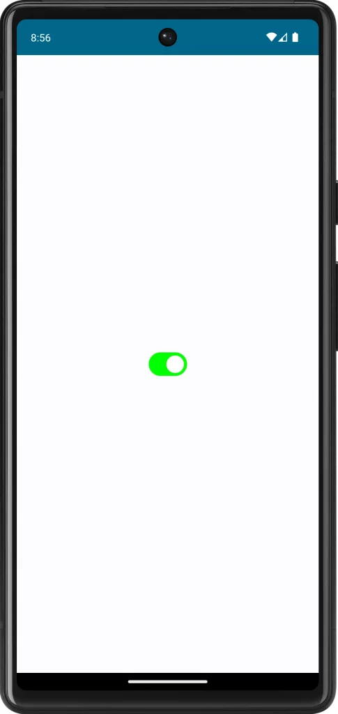
}In this example, the track color changes to green when the switch is ON (checked) and to gray when it is OFF (unchecked).
Following is the complete code for reference.
package com.example.myapplication

import android.os.Bundle
import androidx.activity.ComponentActivity
import androidx.activity.compose.setContent
import androidx.compose.foundation.layout.fillMaxSize
import androidx.compose.material3.MaterialTheme
import androidx.compose.material3.Surface
import androidx.compose.material3.Switch
import androidx.compose.material3.SwitchDefaults
import androidx.compose.runtime.Composable
import androidx.compose.runtime.getValue
import androidx.compose.runtime.mutableStateOf
import androidx.compose.runtime.remember
import androidx.compose.runtime.setValue
import androidx.compose.ui.Modifier
import androidx.compose.ui.graphics.Color
import com.example.myapplication.ui.theme.MyApplicationTheme

class MainActivity : ComponentActivity() {
    override fun onCreate(savedInstanceState: Bundle?) {
        super.onCreate(savedInstanceState)
        setContent {
            MyApplicationTheme {
                Surface(
                    modifier = Modifier.fillMaxSize(),
                    color = MaterialTheme.colorScheme.background
                ) {
                    MySwitch()
                }
            }
        }
    }
}

@Composable
fun MySwitch() {
    var isChecked by remember { mutableStateOf(true) }

    Switch(
        checked = isChecked,
        onCheckedChange = { isChecked = it },
        colors = SwitchDefaults.colors(
            checkedTrackColor = Color.Green,
            uncheckedTrackColor = Color.Gray
        )
    )
}
Customizing the track color of a switch in Jetpack Compose is a simple yet effective way to enhance the look and feel of your Android app’s UI. By carefully selecting colors and considering aspects like contrast, consistency, and accessibility, you can create a more intuitive and visually appealing switch component.