How to Add a Switch with Label in Jetpack Compose
Jetpack Compose, Android’s modern toolkit for building UIs, offers a streamlined approach to crafting interactive components. A common requirement in app development is a toggle switch, often used to enable or disable features.
In this tutorial, we’ll look into creating a Switch with a label in Jetpack Compose, enhancing both functionality and user experience.
Create Switch with Label
1. Create the Composable Function:
We start by defining a @Composable function named MySwitch. This function will house our switch component.
@Composable
fun MySwitch() {
    // Our switch logic will go here
}
2. Manage State:
We declare a state variable isChecked using remember and mutableStateOf. This state determines if the switch is ON (true) or OFF (false). Initially, we set it to true.
var isChecked by remember { mutableStateOf(true) }3. Layout Structure:
We use a Column to organize our components vertically. Inside the Column, a Row composable is used to place the label and the switch next to each other.
Column {
    Row(
        verticalAlignment = Alignment.CenterVertically,
        modifier = Modifier
            .fillMaxWidth()
            .padding(10.dp),
        horizontalArrangement = Arrangement.SpaceBetween
    ) {
        // Label and Switch will be placed here
    }
}
4. Add the Label and Switch:
Inside the Row, we add a Text composable for the label and a Switch composable for the toggle switch. The Switch‘s checked property is bound to the isChecked state, and onCheckedChange updates this state.
Text("Enable Notifications")
Switch(checked = isChecked, onCheckedChange = { isChecked = it })
Final Code
Here’s the complete composable function:
@Composable
fun MySwitch() {
var isChecked by remember { mutableStateOf(true) }
Column {
Row(
verticalAlignment = Alignment.CenterVertically,
modifier = Modifier
.fillMaxWidth()
.padding(10.dp),
horizontalArrangement = Arrangement.SpaceBetween
) {
Text("Enable Notifications")
Switch(checked = isChecked, onCheckedChange = { isChecked = it })
}
}
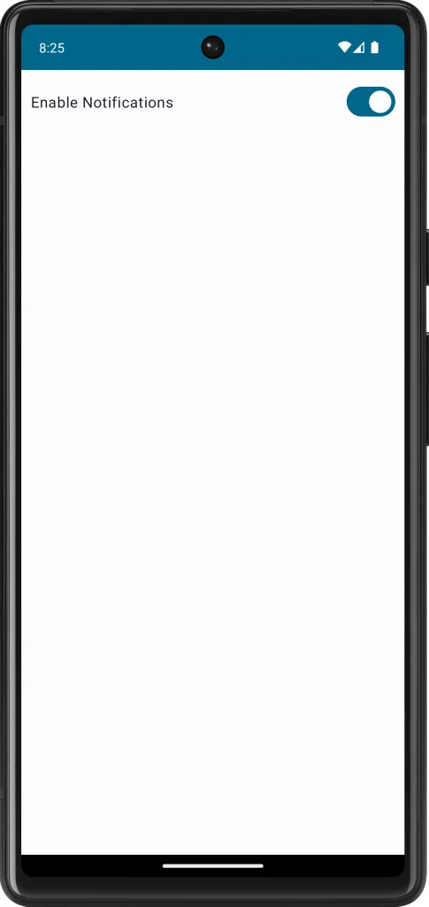
}Following is the output.
Following is the complete code for reference.
package com.example.myapplication

import android.os.Bundle
import androidx.activity.ComponentActivity
import androidx.activity.compose.setContent
import androidx.compose.foundation.layout.Arrangement
import androidx.compose.foundation.layout.Column
import androidx.compose.foundation.layout.Row
import androidx.compose.foundation.layout.fillMaxSize
import androidx.compose.foundation.layout.fillMaxWidth
import androidx.compose.foundation.layout.padding
import androidx.compose.material3.MaterialTheme
import androidx.compose.material3.Surface
import androidx.compose.material3.Switch
import androidx.compose.material3.Text
import androidx.compose.runtime.Composable
import androidx.compose.runtime.getValue
import androidx.compose.runtime.mutableStateOf
import androidx.compose.runtime.remember
import androidx.compose.runtime.setValue
import androidx.compose.ui.Alignment
import androidx.compose.ui.Modifier
import androidx.compose.ui.unit.dp
import com.example.myapplication.ui.theme.MyApplicationTheme

class MainActivity : ComponentActivity() {
    override fun onCreate(savedInstanceState: Bundle?) {
        super.onCreate(savedInstanceState)
        setContent {
            MyApplicationTheme {
                Surface(
                    modifier = Modifier.fillMaxSize(),
                    color = MaterialTheme.colorScheme.background
                ) {
                    MySwitch()
                }
            }
        }
    }
}

@Composable
fun MySwitch() {
    var isChecked by remember { mutableStateOf(true) }
    Column {
        Row(verticalAlignment = Alignment.CenterVertically,modifier = Modifier.fillMaxWidth().padding(10.dp),
            horizontalArrangement = Arrangement.SpaceBetween) {
            Text("Enable Notifications")
            Switch(checked = isChecked, onCheckedChange = { isChecked = it })
        }
    }
}
When implementing this component, consider accessibility and UI consistency. Ensure the label is clear and descriptive, and style the switch to match your app’s theme. This simple yet effective component can significantly enhance the user interface of your Android app.


4 Comments