How to Create Rounded Button in Android Jetpack Compose
Buttons play a pivotal role in enhancing the user experience in Android apps. In this updated and extended tutorial, we’ll explore how to create buttons with rounded corners using Jetpack Compose, including the new Material 3 design updates.
The Basics: Create a Rounded Button
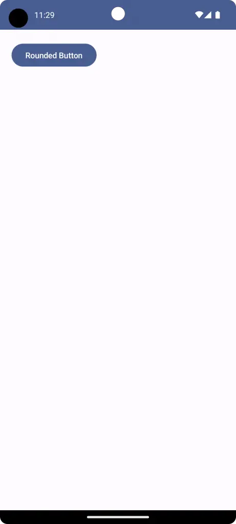
Jetpack Compose simplifies UI development on Android. The default button in Material 3 already comes with rounded corners. Here’s a basic example:
@Composable
fun ButtonWithRoundedCorner() {
    Button(onClick = { }, modifier = Modifier.padding(20.dp)) {
        Text("Rounded Button")
    }
}
Customize Corner Radius
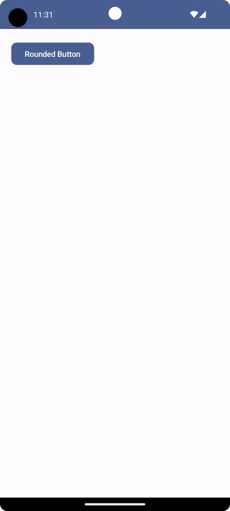
You can further customize the corner radius using the shape modifier. For example:
@Composable
fun ButtonWithRoundedCorner() {
    Button(onClick = { }, shape = RoundedCornerShape(10.dp), modifier = Modifier.padding(20.dp)) {
        Text("Rounded Button")
    }
}
A Complete Example with Code Snippets
Here’s a more complete example that includes setting up your main activity and providing a button with rounded corners.
package com.codingwithrashid.myapplication
import android.os.Bundle
import androidx.activity.ComponentActivity
import androidx.activity.compose.setContent
import androidx.compose.foundation.layout.Box
import androidx.compose.foundation.layout.fillMaxSize
import androidx.compose.foundation.layout.padding
import androidx.compose.foundation.shape.RoundedCornerShape
import androidx.compose.material3.Button
import androidx.compose.material3.MaterialTheme
import androidx.compose.material3.Surface
import androidx.compose.material3.Text
import androidx.compose.runtime.Composable
import androidx.compose.ui.Modifier
import androidx.compose.ui.unit.dp
import com.codingwithrashid.myapplication.ui.theme.MyApplicationTheme
class MainActivity : ComponentActivity() {
override fun onCreate(savedInstanceState: Bundle?) {
super.onCreate(savedInstanceState)
setContent {
MyApplicationTheme {
// A surface container using the 'background' color from the theme
Surface(
modifier = Modifier.fillMaxSize(),
color = MaterialTheme.colorScheme.background
) {
Box {
ButtonWithRoundedCorner()
}
}
}
}
}
}
@Composable
fun ButtonWithRoundedCorner() {
Button(onClick = { }, shape = RoundedCornerShape(10.dp), modifier = Modifier.padding(20.dp)) {
Text("Rounded Button")
}
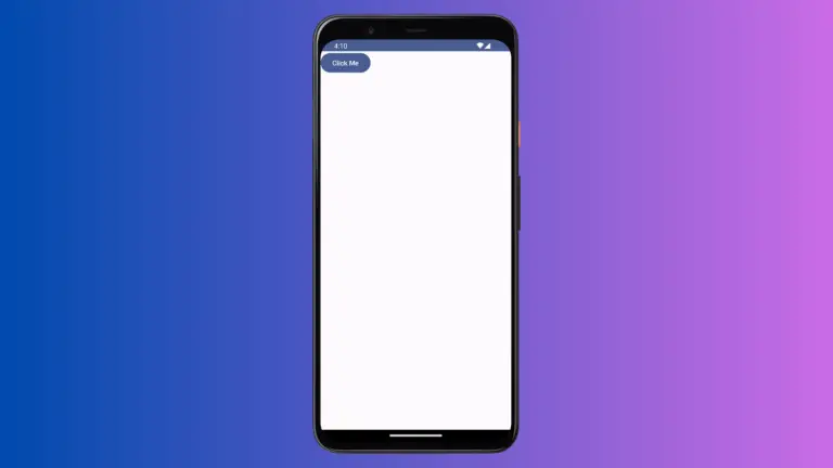
}Once you run this code, you will see a button in the center of the screen with rounded corners. The corner radius here is 20 dp, but you can adjust this according to your design needs.
Creating buttons with rounded corners has never been easier, thanks to Jetpack Compose. Whether you are using the default Material 3 style or customizing the corner radius, you have the flexibility to create a UI that aligns with your design vision.