How to Create Custom Checkbox in Android Jetpack Compose
Checkboxes play an integral role in user interface design. They’re a simple but powerful UI component that users interact with regularly. This blog post will focus on the process of creating a custom checkbox using Jetpack Compose.
A Checkbox is a Composable function in Jetpack Compose. Although the built-in Composable Checkbox is efficient and customizable to some extent, there might be a requirement to create a custom Checkbox which completely differs from the default one. This is where the power of Jetpack Compose shines.
Firstly, let’s understand the built-in Checkbox. A simple Checkbox can be defined as:
@Composable
fun DefaultCheckbox() {
    var checkedState by remember { mutableStateOf(true) }
    Checkbox(
        checked = checkedState,
        onCheckedChange = { checkedState = it }
    )
}
This creates a simple Checkbox with a checked state. When clicked, it changes its state from checked to unchecked and vice versa.
Custom Checkbox in Jetpack Compose
Now, let’s try creating a custom Checkbox.
@Composable
fun CustomCheckbox(checked: Boolean, onCheckedChange: (Boolean) -> Unit) {
    Icon(
        imageVector = if (checked) Icons.Default.Star else Icons.Outlined.Star,
        contentDescription = "Custom Checkbox",
        tint = if (checked) Color.Red else Color.Gray,
        modifier = Modifier.clickable { onCheckedChange(!checked) }
    )
}
Here, instead of using the built-in Checkbox composable, we’ve used the Icon composable and handled the checked state. We’ve used a star icon to represent the checked state and a star outline icon for the unchecked state.
When the star icon is clicked, the state is toggled. The clickable modifier is used to handle the click event. To use the CustomCheckbox, you can call it like this:
@Composable
fun CustomCheckboxExample() {
    var checkedState by remember { mutableStateOf(false) }
    CustomCheckbox(
        checked = checkedState,
        onCheckedChange = { checkedState = it }
    )
}
Following is the complete code.
package com.example.example
import android.os.Bundle
import androidx.activity.ComponentActivity
import androidx.activity.compose.setContent
import androidx.compose.foundation.clickable
import androidx.compose.foundation.layout.Column
import androidx.compose.foundation.layout.fillMaxSize
import androidx.compose.foundation.layout.size
import androidx.compose.material.icons.Icons
import androidx.compose.material.icons.filled.Star
import androidx.compose.material.icons.outlined.Star
import androidx.compose.material3.Icon
import androidx.compose.material3.MaterialTheme
import androidx.compose.material3.Surface
import androidx.compose.runtime.Composable
import androidx.compose.runtime.getValue
import androidx.compose.runtime.mutableStateOf
import androidx.compose.runtime.remember
import androidx.compose.runtime.setValue
import androidx.compose.ui.Modifier
import androidx.compose.ui.graphics.Color
import androidx.compose.ui.tooling.preview.Preview
import androidx.compose.ui.unit.dp
import com.example.example.ui.theme.ExampleTheme
class MainActivity : ComponentActivity() {
override fun onCreate(savedInstanceState: Bundle?) {
super.onCreate(savedInstanceState)
setContent {
ExampleTheme {
// A surface container using the 'background' color from the theme
Surface(
modifier = Modifier.fillMaxSize(),
color = MaterialTheme.colorScheme.background
) {
CustomCheckboxExample()
}
}
}
}
}
@Composable
fun CustomCheckboxExample() {
Column {
var checkedState by remember { mutableStateOf(false) }
CustomCheckbox(
checked = checkedState,
onCheckedChange = { checkedState = it }
)
}
}
@Composable
fun CustomCheckbox(checked: Boolean, onCheckedChange: (Boolean) -> Unit) {
Icon(
imageVector = if (checked) Icons.Default.Star else Icons.Outlined.Star,
contentDescription = "Custom Checkbox",
tint = if (checked) Color.Red else Color.Gray,
modifier = Modifier.clickable { onCheckedChange(!checked) }.size(50.dp)
)
}
@Preview(showBackground = true)
@Composable
fun ExamplePreview() {
ExampleTheme {
CustomCheckboxExample()
}
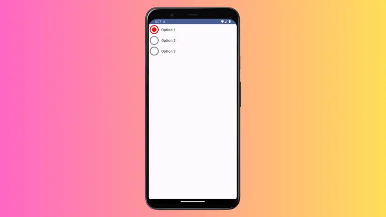
}Following is the output.

As you can see, creating a custom checkbox in Jetpack Compose gives you the flexibility to design and behave exactly how you want it to be, while maintaining the interactivity and functionality that users expect from a checkbox.
Remember, when creating custom checkboxes, it’s essential to prioritize user experience. The user should still recognize your custom checkbox as a checkbox. Customizing checkboxes can be a great way to add personality and brand identity to your app, but don’t sacrifice usability in the process.