What are Different Types of Text Fields in Android Jetpack Compose
In the Android app development ecosystem, the arrival of Jetpack Compose has heralded a shift towards more declarative and reactive UI design. In this blog post, we are going to look into one of the cornerstones of any user interface – text fields.
Text fields are essential in almost any application for gathering user input. In Jetpack Compose, we have a selection of text fields to choose from, each with its characteristics and use cases.
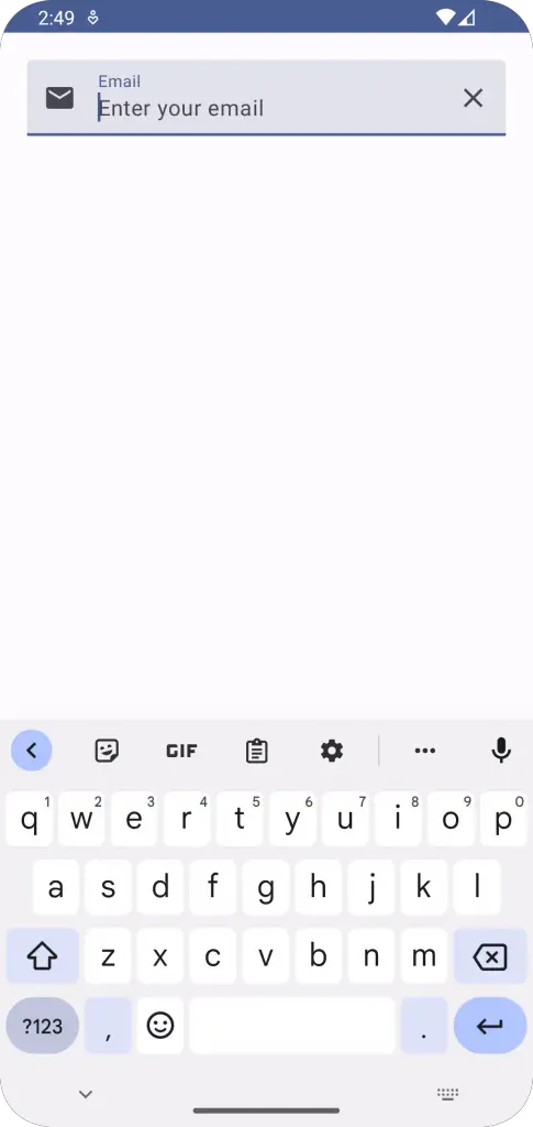
TextField
The TextField component in Jetpack Compose is a Material Design text field complete with a filled background. This component comes with a host of customization options, allowing you to tweak it to fit your UI needs perfectly.
Below are some of its notable features:
Label: TextField can include a label that describes the text field’s purpose. The label appears within the text field’s outline when it’s empty and then shrinks to the corner when the user starts typing.
Placeholder: You can set placeholder text, which will be visible when the field is empty to provide a hint to the user about the expected input.
Leading and Trailing Icons: TextField also supports adding icons both before and after the text.
Here’s a code snippet showcasing a TextField with these features:
var text by remember { mutableStateOf("") }
TextField(
    value = text,
    onValueChange = { text = it },
    label = { Text("Email") },
    placeholder = { Text("Enter your email") },
    leadingIcon = { Icon(Icons.Default.Email, contentDescription = null) },
    trailingIcon = { Icon(Icons.Default.Clear, contentDescription = null) },
    modifier = Modifier.fillMaxWidth().padding(20.dp)
)
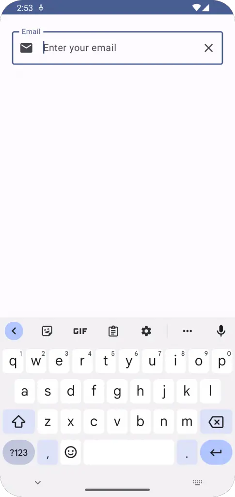
OutlinedTextField
Jetpack Compose also includes an OutlinedTextField component, which, as the name suggests, has an outline around it instead of a filled background. The OutlinedTextField has the same customization options as the TextField, such as label, placeholder, and leading and trailing icons.
Here’s an example:
var text by remember { mutableStateOf("") }
OutlinedTextField(
    value = text,
    onValueChange = { text = it },
    label = { Text("Email") },
    placeholder = { Text("Enter your email") },
    leadingIcon = { Icon(Icons.Default.Email, contentDescription = null) },
    trailingIcon = { Icon(Icons.Default.Clear, contentDescription = null) },
    modifier = Modifier.fillMaxWidth().padding(20.dp)
)
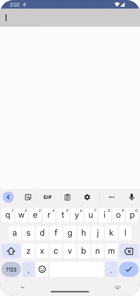
BasicTextField
Finally, there’s BasicTextField. This is the most fundamental text field component in Jetpack Compose, coming without any decorations. It gives you the most control over how your text field will look, making it perfect if you need a customized text field that doesn’t adhere to Material Design guidelines.
With BasicTextField, you would typically handle decorations, such as background, border, and padding, on your own. Here’s an example of how to use BasicTextField with a custom background and padding:
var text by remember { mutableStateOf("") }

Box(
    modifier = Modifier
        .background(Color.LightGray)
        .padding(16.dp)
        .fillMaxWidth()
) {
    BasicTextField(
        value = text,
        onValueChange = { text = it },
        singleLine = true,
        textStyle = TextStyle(color = Color.White),
    )
}
Jetpack Compose’s text fields offer a great deal of flexibility and power, allowing developers to construct interfaces that are both beautiful and functional.
By taking the time to understand the characteristics of TextField, OutlinedTextField, and BasicTextField, you can ensure that you’re using the right tool for the job and delivering the best possible user experience.
Remember, the examples we’ve gone over in this blog post are just the tip of the iceberg when it comes to what you can achieve with Jetpack Compose’s text fields. By delving into the official documentation, you can learn even more ways to tailor these components to your precise needs.