How to Make Column Scrollable in Android Jetpack Compose
The Column composable is a powerful tool that allows you to arrange child components vertically through your layout. In this blog post, let’s learn how to make the Column scrollable in Jetpack Compose.
You can easily make it scrollable by using Modifier.verticalScroll method. See the code snippet given below.
Column(
modifier = Modifier
.fillMaxSize()
.verticalScroll(rememberScrollState())
) {
repeat(25) {
Text("Item $it", modifier = Modifier.padding(10.dp))
}
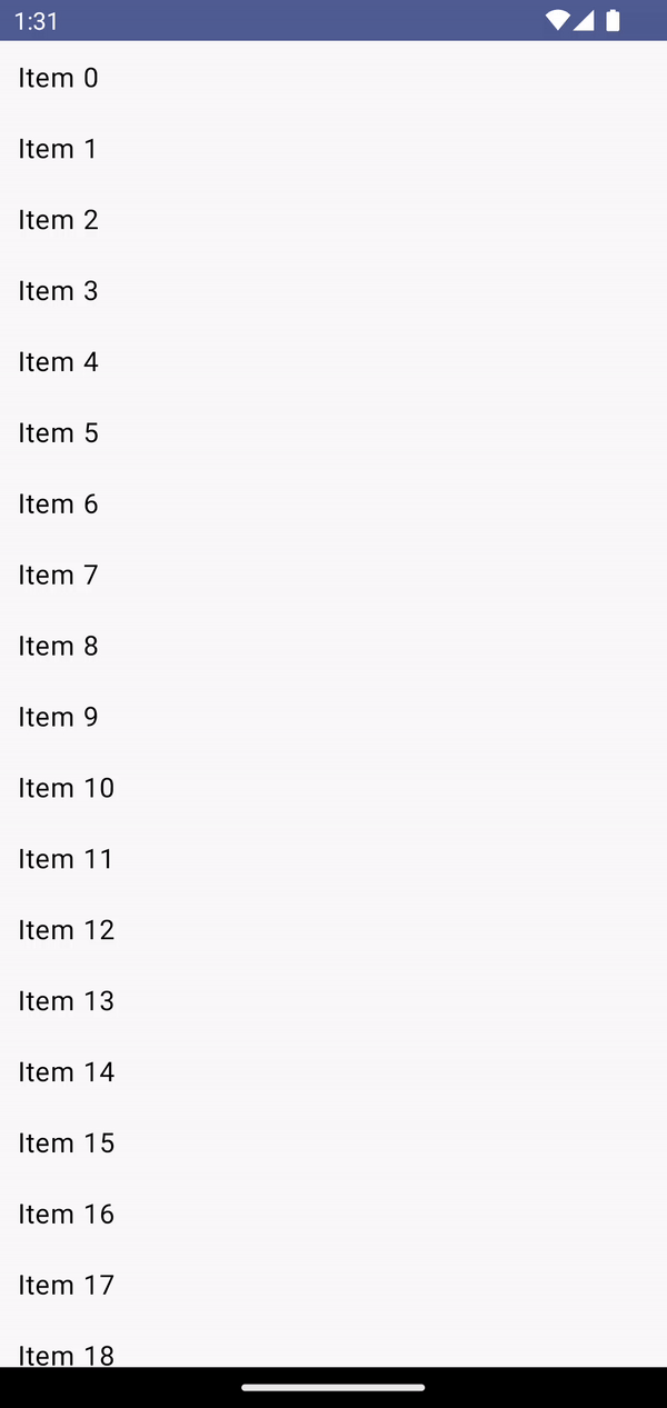
}You will get the following output.
Following is the complete code.
package com.example.myapplication

import android.os.Bundle
import androidx.activity.ComponentActivity
import androidx.activity.compose.setContent
import androidx.compose.foundation.layout.*
import androidx.compose.material3.MaterialTheme
import androidx.compose.material3.Surface
import androidx.compose.runtime.Composable
import androidx.compose.ui.Modifier
import androidx.compose.ui.tooling.preview.Preview
import androidx.compose.foundation.rememberScrollState
import androidx.compose.foundation.verticalScroll
import androidx.compose.material3.Text
import androidx.compose.ui.unit.dp
import com.example.myapplication.ui.theme.MyApplicationTheme

class MainActivity : ComponentActivity() {
    override fun onCreate(savedInstanceState: Bundle?) {
        super.onCreate(savedInstanceState)
        setContent {
            MyApplicationTheme {
                Surface(
                    modifier = Modifier.fillMaxSize(),
                    color = MaterialTheme.colorScheme.background
                ) {
                    ColumnExample()
                }
            }
        }
    }
}

@Composable
fun ColumnExample() {
        Column(
            modifier = Modifier
                .fillMaxSize()
                .verticalScroll(rememberScrollState())
        ) {
            repeat(25) {
                Text("Item $it", modifier = Modifier.padding(10.dp))
            }
        }
}

@Preview(showBackground = true)
@Composable
fun DefaultPreview() {
    MyApplicationTheme {
        ColumnExample()
    }
}
When the content or data is too long you should prefer LazyColumn over Column.