How to add a Button with Text and Icon in Android Jetpack Compose
Buttons are an essential element in any user interface and are used to initiate an action or navigate to another part of the app. Adding an icon to a button can enhance its visual appeal and make it more recognizable while adding text can provide additional context and clarify the button’s purpose.
In this blog post, let’s learn how to create a button with an icon and text easily in Jetpack Compose.
You can add an icon and text to a Button as given below.
Button(
            onClick = { /* ... */ },
            colors = ButtonDefaults.buttonColors(Color.Red),
            ) {
            Icon(
                Icons.Filled.Favorite,
                contentDescription = "Favorite",
                modifier = Modifier.size(ButtonDefaults.IconSize),
                tint = Color.White
            )
            Spacer(Modifier.size(ButtonDefaults.IconSpacing))
            Text("Like")
        }
Here, we have a favorite icon with the text label ‘Like’. We used Spacer to add space between the icon and the text.
You will get the following output.
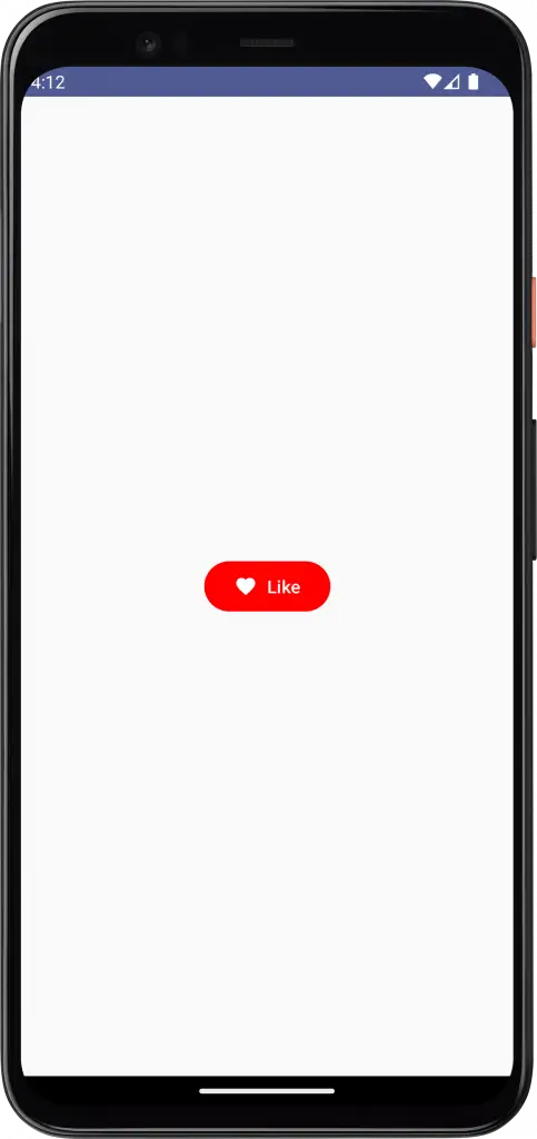
Following is the complete code for reference.
package com.example.myapplication

import android.os.Bundle
import androidx.activity.ComponentActivity
import androidx.activity.compose.setContent
import androidx.compose.foundation.layout.*
import androidx.compose.material.icons.Icons
import androidx.compose.material.icons.filled.Favorite
import androidx.compose.material3.*
import androidx.compose.runtime.Composable
import androidx.compose.ui.Modifier
import androidx.compose.ui.tooling.preview.Preview
import androidx.compose.ui.Alignment
import androidx.compose.ui.graphics.Color
import com.example.myapplication.ui.theme.MyApplicationTheme

class MainActivity : ComponentActivity() {
    override fun onCreate(savedInstanceState: Bundle?) {
        super.onCreate(savedInstanceState)
        setContent {
            MyApplicationTheme {
                Surface(
                    modifier = Modifier.fillMaxSize(),
                    color = MaterialTheme.colorScheme.background
                ) {
                    ButtonExample()
                }
            }
        }
    }
}

@Composable
fun ButtonExample() {
    Column(modifier = Modifier.fillMaxSize(),
        horizontalAlignment = Alignment.CenterHorizontally,
        verticalArrangement = Arrangement.Center) {
        Button(
            onClick = { /* ... */ },
            colors = ButtonDefaults.buttonColors(Color.Red),
            ) {
            Icon(
                Icons.Filled.Favorite,
                contentDescription = "Favorite",
                modifier = Modifier.size(ButtonDefaults.IconSize),
                tint = Color.White
            )
            Spacer(Modifier.size(ButtonDefaults.IconSpacing))
            Text("Like")
        }
    }
}

@Preview(showBackground = true)
@Composable
fun DefaultPreview() {
    MyApplicationTheme {
        ButtonExample()
    }
}
That’s how you add the button with text and icon in Jetpack Compose.