Box Content Alignment in Android Jetpack Compose
In this blog post, we’re focusing on the Box composable and how to manipulate content alignment to create some impressive UI layouts. Box, a fundamental layout composable in Jetpack Compose, allows us to place its children on top of each other in a stack format.
However, determining how these children are positioned can sometimes be a bit tricky. Let’s dive right in!
The Box Composable
The Box composable is quite straightforward. It lays out its children in a stack, allowing you to layer one composable on top of another. This is useful when you want to create a view that overlaps, such as placing a FloatingActionButton over an image.
But, how do we position our children in a Box? That’s where contentAlignment comes into play.
Align with contentAlignment
The Box composable has a parameter named contentAlignment, which is used to position its children. This parameter accepts an Alignment object. The Alignment object includes predefined positions such as Center, TopStart, BottomEnd, etc.
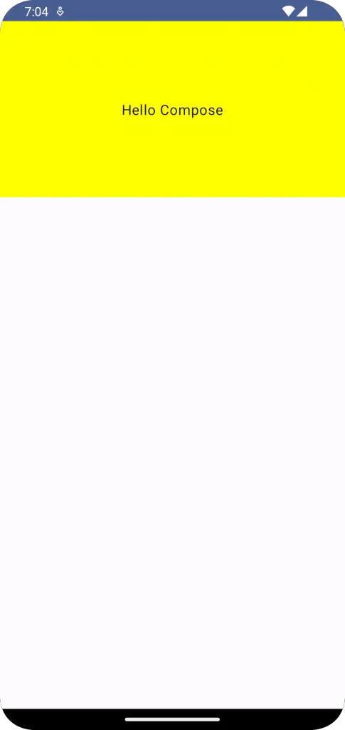
Here’s a simple example:
Box(
    modifier = Modifier.fillMaxWidth().height(200.dp)
                .background(color = Color.Yellow),
    contentAlignment = Alignment.Center
   ) {
       Text("Hello Compose")
     }
In the code above, the Text composable will be positioned at the center of the Box. This is because we set contentAlignment to Alignment.Center.
More Examples
But that’s just the beginning. The contentAlignment parameter can be used to align content to any corner or edge of the Box. Let’s say we want our text to appear in the top-right corner:
Box(
    modifier = Modifier.fillMaxWidth().height(200.dp)
                .background(color = Color.Yellow),
    contentAlignment = Alignment.TopEnd
   ) {
       Text("Hello Compose")
     }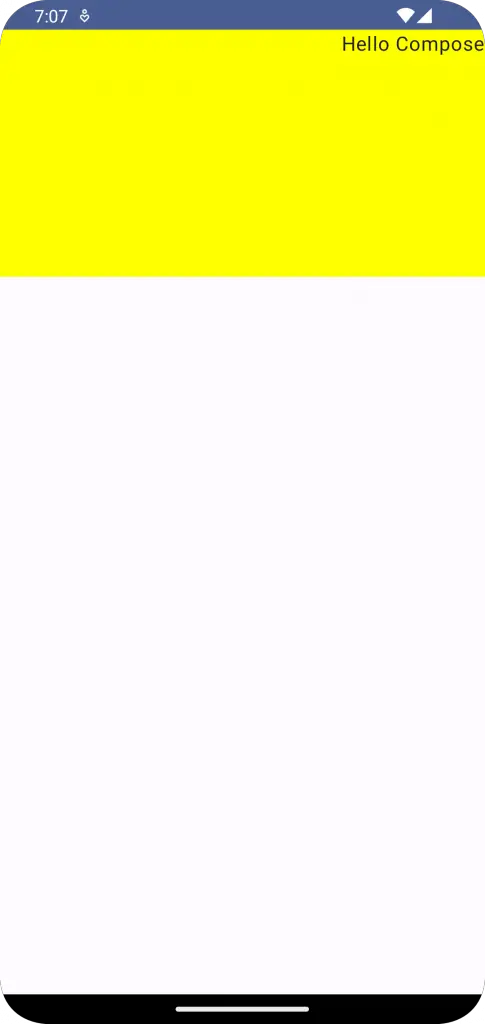
In the code above, the Text composable will be aligned to the top end (top-right corner) of the Box.
Following is the complete code for reference.
package com.example.example

import android.os.Bundle
import androidx.activity.ComponentActivity
import androidx.activity.compose.setContent
import androidx.compose.foundation.background
import androidx.compose.foundation.layout.Box
import androidx.compose.foundation.layout.Column
import androidx.compose.foundation.layout.fillMaxSize
import androidx.compose.foundation.layout.fillMaxWidth
import androidx.compose.foundation.layout.height
import androidx.compose.material3.MaterialTheme
import androidx.compose.material3.Surface
import androidx.compose.material3.Text
import androidx.compose.runtime.Composable
import androidx.compose.ui.Alignment
import androidx.compose.ui.Modifier
import androidx.compose.ui.graphics.Color
import androidx.compose.ui.tooling.preview.Preview
import androidx.compose.ui.unit.dp
import com.example.example.ui.theme.ExampleTheme

class MainActivity : ComponentActivity() {
    override fun onCreate(savedInstanceState: Bundle?) {
        super.onCreate(savedInstanceState)
        setContent {
            ExampleTheme {
                // A surface container using the 'background' color from the theme
                Surface(
                    modifier = Modifier.fillMaxSize(),
                    color = MaterialTheme.colorScheme.background
                ) {
                    BoxExample()
                }
            }
        }
    }
}

@Composable
fun BoxExample() {
    Column{
        Box(
            modifier = Modifier.fillMaxWidth().height(200.dp)
                .background(color = Color.Yellow),
            contentAlignment = Alignment.TopEnd
        ) {
            Text("Hello Compose")
        }
    }
}

@Preview(showBackground = true)
@Composable
fun ExamplePreview() {
    ExampleTheme {
        BoxExample()
    }
}
With the help of contentAlignment, you can create complex UIs that look visually appealing. Remember that the alignment is relative to the Box, so play around with different Alignment values to see what fits best for your design.