How to Add Icon Button to AppBar in Android Jetpack Compose
The App Bar, a pivotal component of many Android applications, is a dedicated space at the top of the UI that provides contextual information and actions. It often contains the screen title, navigation controls, and other action items.
However, to harness its full potential, we need to know how to enrich it with additional components like icon buttons. In this guide, we’ll explore how to introduce icon buttons into an app bar, using the expressive power and simplicity of Jetpack Compose.
To introduce an IconButton into TopAppBar, we leverage the actions parameter. Within this parameter, we’ll invoke the IconButton composable and incorporate the desired icon. This is a typical way to add action items or navigation icons to your app bar.
@Composable
fun AppBarExample() {
Scaffold(
topBar = {
TopAppBar(
title = {
Text("My App")
},
actions = {
IconButton(onClick = { /* Define your action here */ }) {
Icon(Icons.Filled.Favorite, contentDescription = null)
}
},
colors = TopAppBarDefaults.mediumTopAppBarColors(containerColor = Color.Cyan )
)
}
) { contentPadding ->
// Screen content
Text(text = "Jetpack Compose App Bar Example",
modifier = Modifier.padding(contentPadding))
}
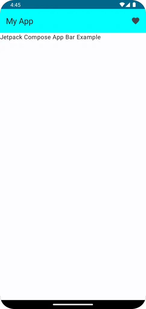
}This code defines a Composable function called AppBarExample. It uses Scaffold, a Jetpack Compose function that provides a flexible structure for your app’s UI. The Scaffold takes various arguments such as topBar, drawerContent, bottomBar, and content, among others. It simplifies the implementation of the material design specifications in your app layout.
For our example, we’re defining the topBar parameter which represents the app bar. The TopAppBar function is used to create the app bar. Inside TopAppBar, we define the title and actions parameters. The title is a Composable function that adds a title to the app bar. In our case, the title is “My App”.
The actions is another Composable function that allows us to add action items or buttons to the app bar. Here, we’re adding an IconButton with an onClick listener to handle the user’s click action on the icon. The icon being used is Icons.Filled.Favorite. The contentDescription is set to null in this case, but it’s generally recommended to provide a description for accessibility reasons.
The colors parameter of TopAppBar allows us to customize the color of the app bar. We’re using TopAppBarDefaults.mediumTopAppBarColors with a containerColor of Color.Cyan, giving our app bar a cyan color.
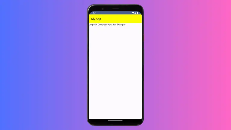
Following is the output.
Following is the complete code for reference.
package com.example.example

import android.os.Bundle
import androidx.activity.ComponentActivity
import androidx.activity.compose.setContent
import androidx.compose.foundation.layout.fillMaxSize
import androidx.compose.foundation.layout.padding
import androidx.compose.material.icons.Icons
import androidx.compose.material.icons.filled.Favorite
import androidx.compose.material3.ExperimentalMaterial3Api
import androidx.compose.material3.Icon
import androidx.compose.material3.IconButton
import androidx.compose.material3.MaterialTheme
import androidx.compose.material3.Scaffold
import androidx.compose.material3.Surface
import androidx.compose.material3.Text
import androidx.compose.material3.TopAppBar
import androidx.compose.material3.TopAppBarDefaults
import androidx.compose.runtime.Composable
import androidx.compose.ui.Modifier
import androidx.compose.ui.graphics.Color
import androidx.compose.ui.tooling.preview.Preview
import com.example.example.ui.theme.ExampleTheme

class MainActivity : ComponentActivity() {
    override fun onCreate(savedInstanceState: Bundle?) {
        super.onCreate(savedInstanceState)
        setContent {
            ExampleTheme {
                // A surface container using the 'background' color from the theme
                Surface(
                    modifier = Modifier.fillMaxSize(),
                    color = MaterialTheme.colorScheme.background
                ) {
                    AppBarExample()
                }
            }
        }
    }
}

@OptIn(ExperimentalMaterial3Api::class)
@Composable
fun AppBarExample() {
    Scaffold(
        topBar = {
            TopAppBar(
                title = {
                        Text("My App")
                },
                actions = {
                    IconButton(onClick = { /* Define your action here */ }) {
                        Icon(Icons.Filled.Favorite, contentDescription = null)
                    }
                },
                colors = TopAppBarDefaults.mediumTopAppBarColors(containerColor = Color.Cyan )
            )
        }
    ) { contentPadding ->
        // Screen content
       Text(text = "Jetpack Compose App Bar Example",
       modifier = Modifier.padding(contentPadding))
    }
}

@Preview(showBackground = true)
@Composable
fun ExamplePreview() {
    ExampleTheme {
        AppBarExample()
    }
}
Integrating icon buttons into your app bar with Jetpack Compose is a breeze, as you’ve witnessed in this walkthrough. Leveraging the ‘actions’ parameter allows you to incorporate as many action items as required, greatly enhancing your app’s functionality and user experience.