How to Add Back Button to TopAppBar in Android Jetpack Compose
Jetpack Compose, Google’s modern toolkit for building native Android UI, offers a variety of components to streamline app development. One such component is the TopAppBar, which serves as the equivalent of the AppBarLayout or Toolbar from the earlier Android UI toolkit.
The TopAppBar is often used to provide navigation controls, branding, and actions that affect the current screen. Adding a back button to the TopAppBar is a common requirement, as it provides a simple way for users to navigate back through the app’s screen hierarchy.
In this blog post, we will guide you on how to implement a back button in Jetpack Compose’s TopAppBar.
The TopAppBar component provides slots for title, navigationIcon, and actions. The navigationIcon slot is typically used to house the back button.
Here is a basic example of how you can add a back button to the TopAppBar:
@Composable
fun AppBarExample() {
    Scaffold(
        topBar = {
            TopAppBar(
                title = {
                        Text("My App")
                },
                navigationIcon = {
                    IconButton(onClick = { /* Handle back action here */ }) {
                        Icon(
                            imageVector = Icons.Filled.ArrowBack,
                            contentDescription = "Back"
                        )
                    }
                },
                colors = TopAppBarDefaults.mediumTopAppBarColors(containerColor = Color.Cyan )
            )
        }
    ) { contentPadding ->
        // Screen content
       Text(text = "Jetpack Compose App Bar Example",
       modifier = Modifier.padding(contentPadding))
    }
}
In the above code, we use the IconButton composable in the navigationIcon slot of the TopAppBar. The IconButton is given an onClick which would typically handle the back navigation logic.
The Icon inside the IconButton is set to display a back arrow, represented by Icons.Filled.ArrowBack. The contentDescription is an important attribute that describes the icon’s appearance or functionality, which is used for accessibility purposes.
Please note that the actual navigation logic (i.e., what happens when the back button is clicked) will depend on your specific app’s navigation setup. This might involve using the Navigation component’s NavController, or your own custom navigation solution.
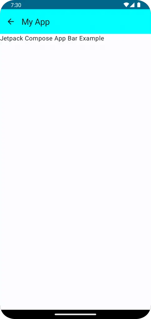
Following is the output.
Following is the complete code for reference.
package com.example.example

import android.os.Bundle
import androidx.activity.ComponentActivity
import androidx.activity.compose.setContent
import androidx.compose.foundation.layout.fillMaxSize
import androidx.compose.foundation.layout.padding
import androidx.compose.material.icons.Icons
import androidx.compose.material.icons.filled.ArrowBack
import androidx.compose.material3.ExperimentalMaterial3Api
import androidx.compose.material3.Icon
import androidx.compose.material3.IconButton
import androidx.compose.material3.MaterialTheme
import androidx.compose.material3.Scaffold
import androidx.compose.material3.Surface
import androidx.compose.material3.Text
import androidx.compose.material3.TopAppBar
import androidx.compose.material3.TopAppBarDefaults
import androidx.compose.runtime.Composable
import androidx.compose.ui.Modifier
import androidx.compose.ui.graphics.Color
import androidx.compose.ui.tooling.preview.Preview
import com.example.example.ui.theme.ExampleTheme

class MainActivity : ComponentActivity() {
    override fun onCreate(savedInstanceState: Bundle?) {
        super.onCreate(savedInstanceState)
        setContent {
            ExampleTheme {
                // A surface container using the 'background' color from the theme
                Surface(
                    modifier = Modifier.fillMaxSize(),
                    color = MaterialTheme.colorScheme.background
                ) {
                    AppBarExample()
                }
            }
        }
    }
}

@OptIn(ExperimentalMaterial3Api::class)
@Composable
fun AppBarExample() {
    Scaffold(
        topBar = {
            TopAppBar(
                title = {
                        Text("My App")
                },
                navigationIcon = {
                    IconButton(onClick = { /* Handle back action here */ }) {
                        Icon(
                            imageVector = Icons.Filled.ArrowBack,
                            contentDescription = "Back"
                        )
                    }
                },
                colors = TopAppBarDefaults.mediumTopAppBarColors(containerColor = Color.Cyan )
            )
        }
    ) { contentPadding ->
        // Screen content
       Text(text = "Jetpack Compose App Bar Example",
       modifier = Modifier.padding(contentPadding))
    }
}

@Preview(showBackground = true)
@Composable
fun ExamplePreview() {
    ExampleTheme {
        AppBarExample()
    }
}
I hope this Jetpack Compose tutorial is helpful for you.