How to Change AppBar Height in Android Jetpack Compose
In this blog post, we’re going to look at how to adjust the height of the TopAppBar in Jetpack Compose, a powerful toolkit for building UI in Android apps. We’ll also address a common issue developers face when increasing the height: the AppBar’s title and icon not being properly visible.
How to Change AppBar Height
Jetpack Compose is flexible and allows you to adjust the height of your TopAppBar. This can be achieved using the Modifier parameter that comes with the TopAppBar. You can specify a fixed height using the height function. Here’s a simple example:
TopAppBar(
    modifier = Modifier.height(150.dp),
    // Other parameters...
)
In this code, 150.dp is the desired height of the TopAppBar. You can adjust this value to suit your needs.
Addressing Visibility Issues
However, there’s a catch. If you’ve tried to increase the height of your AppBar, you might have noticed that the title and icons might not be visible anymore. This is because, by default, the contents of the TopAppBar are not centered vertically. So, when you increase the height, the title and icons stay at the top.
To solve this issue, we need to align the title and icons in the center vertically. This can be achieved by wrapping the Text and Icon in a Box with Alignment.Center. See the following example code.
@Composable
fun AppBarExample() {
Scaffold(
topBar = {
TopAppBar(
modifier = Modifier.height(150.dp),
title = {
Box(Modifier.fillMaxHeight(), contentAlignment = Alignment.Center) {
Text("My App")
}
},
navigationIcon = {
Box(Modifier.fillMaxHeight(), contentAlignment = Alignment.Center) {
IconButton(onClick = { /* doSomething() */ }) {
Icon(
imageVector = Icons.Filled.Menu,
contentDescription = "Localized description"
)
}
}
},
colors = TopAppBarDefaults.mediumTopAppBarColors(containerColor = Color.Gray )
)
}
) { contentPadding ->
// Screen content
Text(text = "Jetpack Compose App Bar Example",
modifier = Modifier.padding(contentPadding))
}
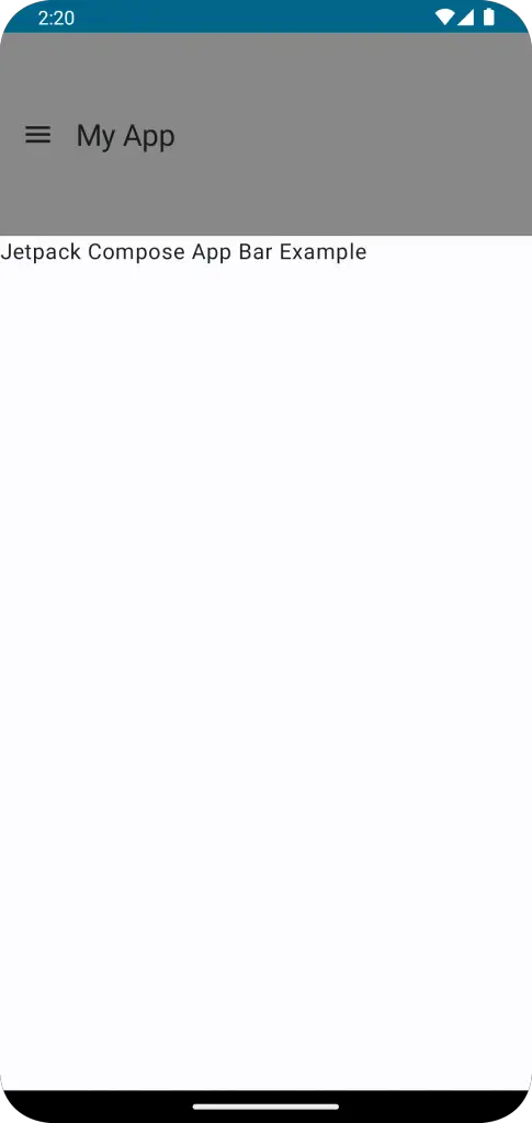
}The Scaffold is used to provide a simple screen layout structure. It includes a topBar parameter, which we use to define our custom AppBar.
The TopAppBar function is used to create the AppBar. The modifier parameter is used to adjust the AppBar’s height to 150 dp. This height is larger than the default AppBar height, so this value has been custom set.
The title parameter is used to set the title displayed in the AppBar. In this case, the title is “My App”. The title is wrapped in a Box composable that fills the maximum height available (due to the fillMaxHeight() modifier) and aligns its content (the Text composable) to the center vertically (due to contentAlignment = Alignment.Center).
The navigationIcon parameter is used to set the navigation icon on the AppBar. Here, an IconButton is used as the navigation icon. Similar to the title, the IconButton is also wrapped in a Box composable to center the icon vertically in the AppBar.
The colors parameter is used to define the color scheme of the AppBar. In this case, TopAppBarDefaults.mediumTopAppBarColors(containerColor = Color.Gray ) is used to set the AppBar color to gray.
Following is the output.
Following is the complete code for reference.
package com.example.example

import android.os.Bundle
import androidx.activity.ComponentActivity
import androidx.activity.compose.setContent
import androidx.compose.foundation.layout.Box
import androidx.compose.foundation.layout.fillMaxHeight
import androidx.compose.foundation.layout.fillMaxSize
import androidx.compose.foundation.layout.height
import androidx.compose.foundation.layout.padding
import androidx.compose.material.icons.Icons
import androidx.compose.material.icons.filled.Menu
import androidx.compose.material3.ExperimentalMaterial3Api
import androidx.compose.material3.Icon
import androidx.compose.material3.IconButton
import androidx.compose.material3.MaterialTheme
import androidx.compose.material3.Scaffold
import androidx.compose.material3.Surface
import androidx.compose.material3.Text
import androidx.compose.material3.TopAppBar
import androidx.compose.material3.TopAppBarDefaults
import androidx.compose.runtime.Composable
import androidx.compose.ui.Alignment
import androidx.compose.ui.Modifier
import androidx.compose.ui.graphics.Color
import androidx.compose.ui.tooling.preview.Preview
import androidx.compose.ui.unit.dp
import com.example.example.ui.theme.ExampleTheme

class MainActivity : ComponentActivity() {
    override fun onCreate(savedInstanceState: Bundle?) {
        super.onCreate(savedInstanceState)
        setContent {
            ExampleTheme {
                // A surface container using the 'background' color from the theme
                Surface(
                    modifier = Modifier.fillMaxSize(),
                    color = MaterialTheme.colorScheme.background
                ) {
                    AppBarExample()
                }
            }
        }
    }
}

@OptIn(ExperimentalMaterial3Api::class)
@Composable
fun AppBarExample() {
    Scaffold(
        topBar = {
            TopAppBar(
                modifier = Modifier.height(150.dp),
                title = {
                    Box(Modifier.fillMaxHeight(), contentAlignment = Alignment.Center) {
                        Text("My App")
                    }
                },
                navigationIcon = {
                    Box(Modifier.fillMaxHeight(), contentAlignment = Alignment.Center) {
                        IconButton(onClick = { /* doSomething() */ }) {
                            Icon(
                                imageVector = Icons.Filled.Menu,
                                contentDescription = "Localized description"
                            )
                        }
                    }
                },
                colors = TopAppBarDefaults.mediumTopAppBarColors(containerColor = Color.Gray )
            )
        }
    ) { contentPadding ->
        // Screen content
       Text(text = "Jetpack Compose App Bar Example",
       modifier = Modifier.padding(contentPadding))
    }
}

@Preview(showBackground = true)
@Composable
fun ExamplePreview() {
    ExampleTheme {
        AppBarExample()
    }
}
Just bear in mind that TopAppBar is designed according to Material Design guidelines, which suggest a specific height for the app bar. If you choose to change the height, make sure that your app’s navigation remains clear and accessible to users.