How to Add Circular Progress Indicator in Android Jetpack Compose
Feedback mechanisms like progress indicators are vital for a good user experience. While linear indicators serve well in many situations, a Circular Progress Indicator often better fits certain UI designs.
In this blog post, we’ll explore how to integrate Circular Progress Indicators using Jetpack Compose, with both indeterminate and determinate examples.
Circular Progress Indicators
Circular progress indicators are rotating circles that represent a task’s ongoing process. Like linear indicators, they come in two types: indeterminate and determinate. Indeterminate indicators suggest an ongoing operation, while determinate ones show the percentage of the task completed.
Basic Example: Indeterminate Circular Progress Indicator
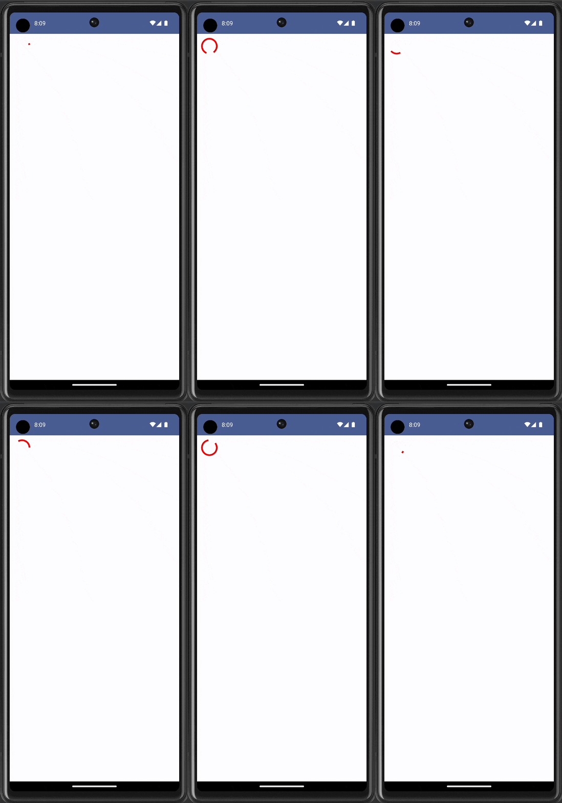
Let’s start with a basic example of an indeterminate circular progress indicator. This will keep rotating, indicating that a task is in progress.
@Composable
fun ProgressIndicator() {
    Column {
        CircularProgressIndicator(
            modifier = Modifier.padding(10.dp),
            color = Color.Red
        )
    }
}
In this example, the CircularProgressIndicator appears with a 10dp padding and a red color.

Example: Determinate Circular Progress Indicator
If you want to indicate how much of the task is complete, use a determinate circular indicator.
@Composable
fun ProgressIndicator() {
    var progress by remember { mutableStateOf(0.3f) }
    Column {
        CircularProgressIndicator(
            progress = progress,
            modifier = Modifier.padding(10.dp),
            color = Color.Green
        )
    }
}
In this example, the CircularProgressIndicator will be 30% filled, as we set the progress value to 0.3f.

Circular Progress Indicators are a versatile tool in UI design. Jetpack Compose makes it remarkably easy to add and customize these indicators for your Android apps. Whether you choose determinate or indeterminate, the implementation is straightforward and the customization options are plentiful.
Also, check out how to add a linear progress indicator in jetpack compose.


