How to Change Slider Track Height in Jetpack Compose
In the versatile world of Android app development, customizing UI components to fit the specific needs of your app is essential. Jetpack Compose, Google’s modern toolkit for building native UIs on Android, offers extensive flexibility in UI customization. A common component in many apps is the slider, used for settings adjustments, volume controls, and more.
Customizing the track height of a slider can significantly enhance both the aesthetics and usability of your app. This blog post will guide you through adjusting the slider track height in Jetpack Compose.
In Jetpack Compose, the Slider component allows users to select a value by moving a thumb along a track. Customizing the track’s height can make the slider more prominent and easier to interact with, especially on devices with larger screens or for users with accessibility needs.
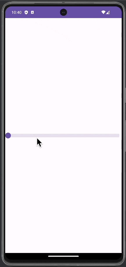
Slider with Custom Track Height
To customize the track height, we modify the track parameter of the Slider. This parameter allows us to define a custom track composable. We use the SliderDefaults.Track and scale it vertically to increase its height.
@Composable
fun MySlider() {
    var sliderPosition by remember { mutableStateOf(0f) }
        Slider(
            value = sliderPosition,
            onValueChange = { sliderPosition = it },
            valueRange = 0f..100f,
            onValueChangeFinished = {},
            track = {sliderPositions ->
                SliderDefaults.Track(
                    modifier = Modifier.scale(scaleX = 1f, scaleY = 3f),
                    sliderPositions = sliderPositions
                )
            }
        )
}
In this implementation, Modifier.scale(scaleX = 1f, scaleY = 3f) increases the track’s height by three times while keeping its width unchanged.
Following is the complete code for reference.
package com.example.myapplication

import android.os.Bundle
import androidx.activity.ComponentActivity
import androidx.activity.compose.setContent
import androidx.compose.foundation.layout.fillMaxSize
import androidx.compose.material3.ExperimentalMaterial3Api
import androidx.compose.material3.MaterialTheme
import androidx.compose.material3.Slider
import androidx.compose.material3.SliderDefaults
import androidx.compose.material3.Surface
import androidx.compose.runtime.Composable
import androidx.compose.runtime.getValue
import androidx.compose.runtime.mutableStateOf
import androidx.compose.runtime.remember
import androidx.compose.runtime.setValue
import androidx.compose.ui.Modifier
import androidx.compose.ui.draw.scale
import com.example.myapplication.ui.theme.MyApplicationTheme

class MainActivity : ComponentActivity() {
    override fun onCreate(savedInstanceState: Bundle?) {
        super.onCreate(savedInstanceState)
        setContent {
            MyApplicationTheme {
                    Surface(
                        modifier = Modifier.fillMaxSize(),
                        color = MaterialTheme.colorScheme.background
                    ) {
                        MySlider()
                    }
            }
        }
    }
}

@OptIn(ExperimentalMaterial3Api::class)
@Composable
fun MySlider() {
    var sliderPosition by remember { mutableStateOf(0f) }
        Slider(
            value = sliderPosition,
            onValueChange = { sliderPosition = it },
            valueRange = 0f..100f,
            onValueChangeFinished = {},
            track = {sliderPositions ->
                SliderDefaults.Track(
                    modifier = Modifier.scale(scaleX = 1f, scaleY = 3f),
                    sliderPositions = sliderPositions
                )
            }
        )
}
Customizing the track height of a slider in Jetpack Compose can significantly enhance the user experience and the visual appeal of your app. By following the steps outlined in this guide, you can create a slider that is not only functional but also perfectly tailored to your app’s design and user needs.