How to Create Custom Thumb for Slider in Jetpack Compose
In Android app development, sliders are a common UI component used for selecting values in a range. Jetpack Compose, Android’s modern toolkit for UI development, not only simplifies the creation of sliders but also offers extensive customization options.
One such customization is creating a custom thumb for the slider, enhancing both its aesthetic appeal and user interaction. This blog post will guide you through the process of creating a slider with a custom thumb in Jetpack Compose, using a heart icon as an example.
Custom Thumb Concept
A custom thumb in a slider replaces the default circular thumb with any composable, such as an icon or an image. This feature can be particularly useful for matching the slider to your app’s theme or for making the slider more intuitive by using an icon that represents the slider’s purpose.
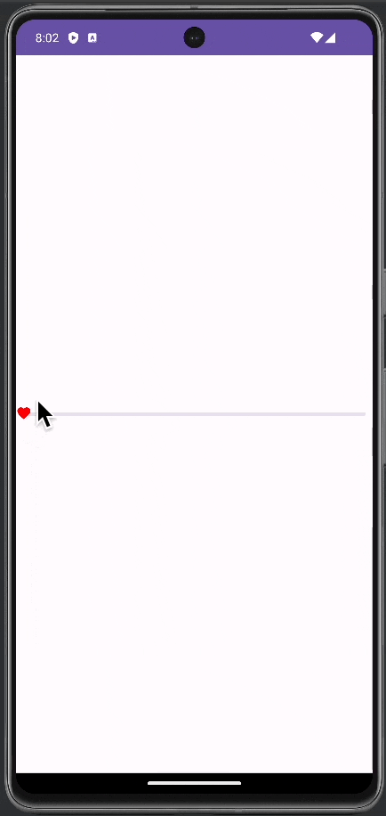
Slider with a Custom Thumb
Let’s create a slider with a heart icon as its thumb.
We use the thumb parameter to specify the content of the thumb, which in this case is a heart icon from the Material Icons set.
@Composable
fun MySlider() {
    var sliderPosition by remember { mutableStateOf(0f) }
    val interactionSource: MutableInteractionSource = remember { MutableInteractionSource() }
        Slider(
            value = sliderPosition,
            onValueChange = { sliderPosition = it },
            valueRange = 0f..100f,
            interactionSource = interactionSource,
            onValueChangeFinished = {},
            thumb = {
                    Icon(
                        imageVector = Icons.Filled.Favorite,
                        contentDescription = null,
                        modifier = Modifier.size(ButtonDefaults.IconSize),
                        tint = Color.Red
                    )
            }
        )
}interactionSource: AMutableInteractionSourcetracks the interaction state of the slider. It is useful for more advanced interactions and feedback.Slider(...): This is the slider component.value: The current value of the slider, bound tosliderPosition.onValueChange: A lambda function that updatessliderPositionas the slider moves.valueRange: Defines the range of values the slider can take.thumb: This parameter allows us to define a custom composable to be used as the slider’s thumb. Here, we use anIconcomposable with a heart icon, giving the slider a unique and visually appealing look.
Following is the complete code for reference.
package com.example.myapplication

import android.os.Bundle
import androidx.activity.ComponentActivity
import androidx.activity.compose.setContent
import androidx.compose.foundation.interaction.MutableInteractionSource
import androidx.compose.foundation.layout.fillMaxSize
import androidx.compose.foundation.layout.size
import androidx.compose.material.icons.Icons
import androidx.compose.material.icons.filled.Favorite
import androidx.compose.material3.ButtonDefaults
import androidx.compose.material3.ExperimentalMaterial3Api
import androidx.compose.material3.Icon
import androidx.compose.material3.MaterialTheme
import androidx.compose.material3.Slider
import androidx.compose.material3.Surface
import androidx.compose.runtime.Composable
import androidx.compose.runtime.getValue
import androidx.compose.runtime.mutableStateOf
import androidx.compose.runtime.remember
import androidx.compose.runtime.setValue
import androidx.compose.ui.Modifier
import androidx.compose.ui.graphics.Color
import com.example.myapplication.ui.theme.MyApplicationTheme

class MainActivity : ComponentActivity() {
    override fun onCreate(savedInstanceState: Bundle?) {
        super.onCreate(savedInstanceState)
        setContent {
            MyApplicationTheme {
                    Surface(
                        modifier = Modifier.fillMaxSize(),
                        color = MaterialTheme.colorScheme.background
                    ) {
                        MySlider()
                    }
            }
        }
    }
}

@OptIn(ExperimentalMaterial3Api::class)
@Composable
fun MySlider() {
    var sliderPosition by remember { mutableStateOf(0f) }
    val interactionSource: MutableInteractionSource = remember { MutableInteractionSource() }
        Slider(
            value = sliderPosition,
            onValueChange = { sliderPosition = it },
            valueRange = 0f..100f,
            interactionSource = interactionSource,
            onValueChangeFinished = {},
            thumb = {
                    Icon(
                        imageVector = Icons.Filled.Favorite,
                        contentDescription = null,
                        modifier = Modifier.size(ButtonDefaults.IconSize),
                        tint = Color.Red
                    )
            }
        )
}
Customizing the thumb of a slider in Jetpack Compose opens up a realm of possibilities for enhancing the user interface of your Android app. By following this guide, you can implement a slider with a custom thumb that is both functional and aligns beautifully with your app’s design.