How to Align Title at Center in Jetpack Compose’s TopAppBar
In this blog post, we’ll dive into a particular aspect of Jetpack Compose that can be a little tricky – centering the title in a TopAppBar. While this might seem like a simple task, it can become complex, especially when you have a navigation icon and actions in your TopAppBar.
To start, let’s familiarize ourselves with what a TopAppBar is. Jetpack Compose offers two types of App Bars: TopAppBar and BottomAppBar. The TopAppBar can be thought of as the Toolbar in traditional Android development, whereas BottomAppBar represents the bottom bar we commonly see in various applications.
How to Center the Title of TopAppBar in Material 3
The advent of Material 3 introduced a straightforward way to center the title in a TopAppBar. You can simply use the CenterAlignedTopAppBar, a Material Design component that offers a center-aligned small top app bar.
See the following code snippet.
@Composable
fun AppBarExample() {
    Scaffold(
        topBar = {
            CenterAlignedTopAppBar(title = {
                Text("My App")
            }, colors = TopAppBarDefaults.smallTopAppBarColors(containerColor = Color.LightGray),
                navigationIcon = {
                    IconButton(onClick = { /* doSomething() */ }) {
                        Icon(
                            imageVector = Icons.Filled.Menu,
                            contentDescription = "Localized description"
                        )
                    }
                }

            )
        }
    ) { contentPadding ->
        // Screen content
       Text(text = "Jetpack Compose App Bar Example",
       modifier = Modifier.padding(contentPadding))
    }
}
This block of code uses the Scaffold layout structure, which is a high-level composable provided by Jetpack Compose. Scaffold implements the basic Material Design visual layout structure.
It provides slots for the app’s top bar, content, and optionally a bottom bar and floating action button. In this case, it defines a CenterAlignedTopAppBar in its topBar slot.
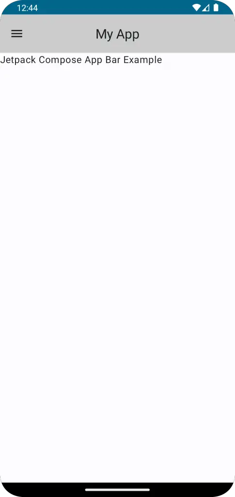
The CenterAlignedTopAppBar is a specialized version of TopAppBar introduced in Material 3 that centers the title. Here, the title is set to “My App”.
The colors parameter of CenterAlignedTopAppBar is set to TopAppBarDefaults.smallTopAppBarColors(containerColor = Color.LightGray). This sets the background color of the AppBar to light gray.
The navigationIcon parameter is used to define an icon button on the left side of the AppBar. Here, the icon used is Icons.Filled.Menu.
The onClick event handler of the IconButton is currently a placeholder. In a real application, this would usually be an event handler function that responds to a user’s tap, for example by opening a navigation drawer.
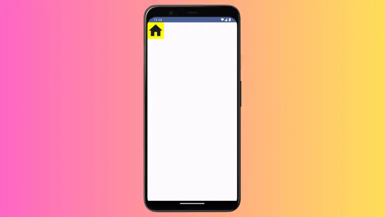
Following is the output.
Following is the complete code for reference.
package com.example.example

import android.os.Bundle
import androidx.activity.ComponentActivity
import androidx.activity.compose.setContent
import androidx.compose.foundation.layout.fillMaxSize
import androidx.compose.foundation.layout.padding
import androidx.compose.material.icons.Icons
import androidx.compose.material.icons.filled.Menu
import androidx.compose.material3.CenterAlignedTopAppBar
import androidx.compose.material3.ExperimentalMaterial3Api
import androidx.compose.material3.Icon
import androidx.compose.material3.IconButton
import androidx.compose.material3.MaterialTheme
import androidx.compose.material3.Scaffold
import androidx.compose.material3.Surface
import androidx.compose.material3.Text
import androidx.compose.material3.TopAppBarDefaults
import androidx.compose.runtime.Composable
import androidx.compose.ui.Modifier
import androidx.compose.ui.graphics.Color
import androidx.compose.ui.tooling.preview.Preview
import com.example.example.ui.theme.ExampleTheme

class MainActivity : ComponentActivity() {
    override fun onCreate(savedInstanceState: Bundle?) {
        super.onCreate(savedInstanceState)
        setContent {
            ExampleTheme {
                // A surface container using the 'background' color from the theme
                Surface(
                    modifier = Modifier.fillMaxSize(),
                    color = MaterialTheme.colorScheme.background
                ) {
                    AppBarExample()
                }
            }
        }
    }
}

@OptIn(ExperimentalMaterial3Api::class)
@Composable
fun AppBarExample() {
    Scaffold(
        topBar = {
            CenterAlignedTopAppBar(title = {
                Text("My App")
            }, colors = TopAppBarDefaults.smallTopAppBarColors(containerColor = Color.LightGray),
                navigationIcon = {
                    IconButton(onClick = { /* doSomething() */ }) {
                        Icon(
                            imageVector = Icons.Filled.Menu,
                            contentDescription = "Localized description"
                        )
                    }
                }

            )
        }
    ) { contentPadding ->
        // Screen content
       Text(text = "Jetpack Compose App Bar Example",
       modifier = Modifier.padding(contentPadding))
    }
}

@Preview(showBackground = true)
@Composable
fun ExamplePreview() {
    ExampleTheme {
        AppBarExample()
    }
}
I hope this Jetpack Compose tutorial is helpful for you.