How to Add App Bar in Android Jetpack Compose
Jetpack Compose is a modern UI toolkit from Google, which is entirely written in Kotlin and follows a declarative programming model. In this blog post, we will learn how to add an app bar to our Android applications using Jetpack Compose.
An App Bar or a Toolbar is a fundamental component in Android applications. It usually presents at the top of the screen, providing information and actions related to the current screen.
With the traditional Android XML layouts, we would typically use a Toolbar or an ActionBar to add an app bar. With Jetpack Compose, however, the approach is quite different.
How to Add App Bar in Jetpack Compose
Jetpack Compose provides TopAppBar component for this purpose. Let’s dive into a basic example.
@Composable
fun AppBarExample() {
    Scaffold(
        topBar = {
            TopAppBar(title = {
                Text("My App")
            }, colors = TopAppBarDefaults.smallTopAppBarColors(containerColor = Color.LightGray)
            )

        }
    ) { contentPadding ->
        // Screen content
       Text(text = "Jetpack Compose App Bar Example",
       modifier = Modifier.padding(contentPadding))
    }
}
The Scaffold is a built-in Composable in Jetpack Compose. It implements a basic Material Design layout structure. It can take parameters to include a top app bar, a bottom app bar, a drawer, a floating action button, etc.
The topBar parameter allows you to pass a Composable function that represents the top bar of the screen. Here, you’re passing TopAppBar.
The colors is an optional parameter that allows you to customize the color scheme of the app bar. Here, we’re using TopAppBarDefaults.smallTopAppBarColors(containerColor = Color.LightGray) to specify a light gray color for the app bar.
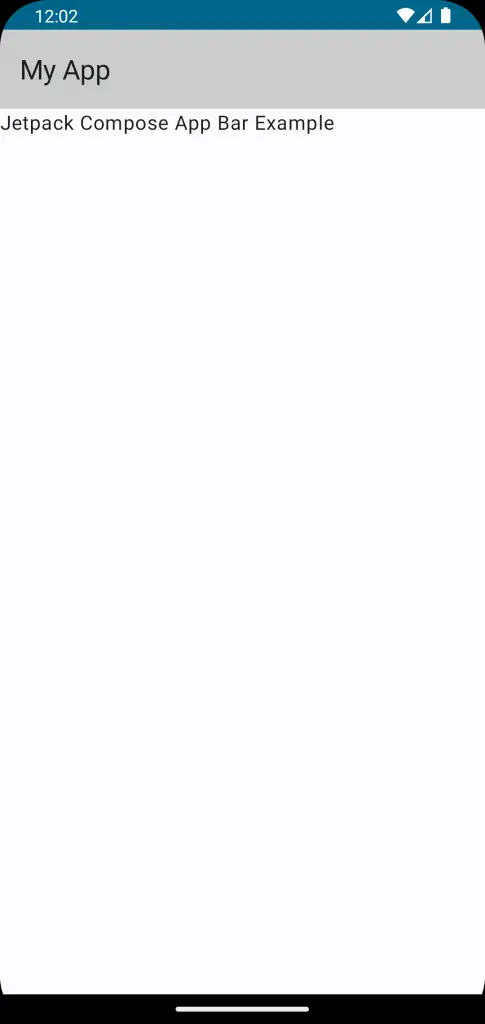
The above code example gives you following output.
Following is the complete code for reference.
package com.example.example

import android.os.Bundle
import androidx.activity.ComponentActivity
import androidx.activity.compose.setContent
import androidx.compose.foundation.layout.fillMaxSize
import androidx.compose.foundation.layout.padding
import androidx.compose.material3.ExperimentalMaterial3Api
import androidx.compose.material3.MaterialTheme
import androidx.compose.material3.Scaffold
import androidx.compose.material3.Surface
import androidx.compose.material3.Text
import androidx.compose.material3.TopAppBar
import androidx.compose.material3.TopAppBarDefaults
import androidx.compose.runtime.Composable
import androidx.compose.ui.Modifier
import androidx.compose.ui.graphics.Color
import androidx.compose.ui.tooling.preview.Preview
import com.example.example.ui.theme.ExampleTheme

class MainActivity : ComponentActivity() {
    override fun onCreate(savedInstanceState: Bundle?) {
        super.onCreate(savedInstanceState)
        setContent {
            ExampleTheme {
                // A surface container using the 'background' color from the theme
                Surface(
                    modifier = Modifier.fillMaxSize(),
                    color = MaterialTheme.colorScheme.background
                ) {
                    AppBarExample()
                }
            }
        }
    }
}

@OptIn(ExperimentalMaterial3Api::class)
@Composable
fun AppBarExample() {
    Scaffold(
        topBar = {
            TopAppBar(title = {
                Text("My App")
            }, colors = TopAppBarDefaults.smallTopAppBarColors(containerColor = Color.LightGray)
            )

        }
    ) { contentPadding ->
        // Screen content
       Text(text = "Jetpack Compose App Bar Example",
       modifier = Modifier.padding(contentPadding))
    }
}

@Preview(showBackground = true)
@Composable
fun ExamplePreview() {
    ExampleTheme {
        AppBarExample()
    }
}
Jetpack Compose makes it easy and intuitive to add an app bar in your Android applications. With its declarative nature, you can easily customize the app bar according to your requirements.