How to Add Switch in Jetpack Compose
Jetpack Compose, the modern toolkit for building native UIs in Android apps, has revolutionized how developers approach interface design. Among its many features, the Switch component stands out for its simplicity and functionality.
In this post, we’ll explore the Jetpack Compose Switch, its applications, and some practical tips for integrating it seamlessly into your apps.
Jetpack Compose Switch
The Switch in Jetpack Compose is a UI component used for toggling between two states, typically denoted as on/off or true/false. It’s commonly used in settings menus, forms, and anywhere you need a simple binary choice.
Key Features
- Customizable Appearance: You can easily customize the color, size, and overall look to match your app’s theme.
- User-Friendly: With a familiar design, it improves user experience by providing an intuitive and interactive element.
- State Management: Jetpack Compose’s declarative approach makes state management straightforward, ensuring the UI accurately reflects the current state.
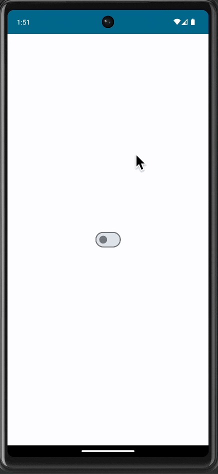
A Basic Switch
Here’s a simple example of implementing a Switch in Jetpack Compose:
@Composable
fun MySwitch() {
    var isChecked by remember { mutableStateOf(false) }

    Switch(
        checked = isChecked,
        onCheckedChange = { isChecked = it }
    )
}
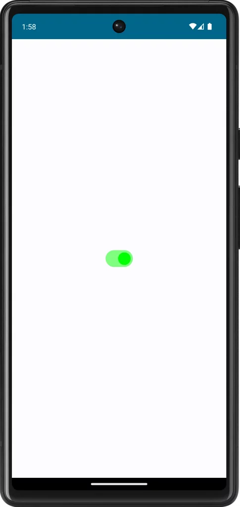
Customize Your Switch
Customization is key to ensuring your Switch aligns with your app’s design language. You can modify the thumb color, track color, and size. For example:
Switch(
    checked = isChecked,
    onCheckedChange = { isChecked = it },
    colors = SwitchDefaults.colors(
        checkedThumbColor = Color.Green,
        uncheckedThumbColor = Color.Gray,
        checkedTrackColor = Color.Green.copy(alpha = 0.7f),
        uncheckedTrackColor = Color.Gray.copy(alpha = 0.7f)
    )
)
Following is the complete code for reference.
package com.example.myapplication

import android.os.Bundle
import androidx.activity.ComponentActivity
import androidx.activity.compose.setContent
import androidx.compose.foundation.layout.fillMaxSize
import androidx.compose.material3.MaterialTheme
import androidx.compose.material3.Surface
import androidx.compose.material3.Switch
import androidx.compose.material3.SwitchDefaults
import androidx.compose.runtime.Composable
import androidx.compose.runtime.getValue
import androidx.compose.runtime.mutableStateOf
import androidx.compose.runtime.remember
import androidx.compose.runtime.setValue
import androidx.compose.ui.Modifier
import androidx.compose.ui.graphics.Color
import com.example.myapplication.ui.theme.MyApplicationTheme

class MainActivity : ComponentActivity() {
    override fun onCreate(savedInstanceState: Bundle?) {
        super.onCreate(savedInstanceState)
        setContent {
            MyApplicationTheme {
                // A surface container using the 'background' color from the theme
                Surface(
                    modifier = Modifier.fillMaxSize(),
                    color = MaterialTheme.colorScheme.background
                ) {
                    MySwitch()
                }
            }
        }
    }
}

@Composable
fun MySwitch() {
    var isChecked by remember { mutableStateOf(false) }

    Switch(
        checked = isChecked,
        onCheckedChange = { isChecked = it },
        colors = SwitchDefaults.colors(
            checkedThumbColor = Color.Green,
            uncheckedThumbColor = Color.Gray,
            checkedTrackColor = Color.Green.copy(alpha = 0.5f),
            uncheckedTrackColor = Color.Gray.copy(alpha = 0.5f)
        )
    )
}
Handle State Changes
When the Switch’s state changes, you might want to perform specific actions. You can handle this within the onCheckedChange lambda. For instance, saving a preference or updating a view model.
Use Cases in Real-World Apps
- Settings Screen: For toggling settings like notifications or dark mode.
- Forms: To indicate agreement with terms and conditions.
- Profile Customization: Enabling or disabling features in a user profile.
The Jetpack Compose Switch is a versatile and user-friendly component that can enhance the interactivity of your Android apps. By customizing and efficiently managing its state, you can integrate this component seamlessly into various parts of your app, providing a better user experience.


One Comment