How to Add RadioButton Group in Android Jetpack Compose
Radio buttons are a common sight in mobile applications, often utilized to enable users to select a single option from a list of predefined choices. A radio button group encapsulates a collection of these radio buttons, reinforcing the rule that only one option can be selected at any given moment.
In Jetpack Compose, creating a radio button group is quite straightforward. Here’s an example of how you can create a radio button group in Jetpack Compose.
@Composable
fun RadioButtonExample() {
    val radioOptions = listOf("Option 1", "Option 2", "Option 3")
    var selectedOption by remember { mutableStateOf(radioOptions[0]) }

    Column {
        radioOptions.forEach { option ->
            Row(
                Modifier
                    .fillMaxWidth()
                    .padding(8.dp),
                verticalAlignment = Alignment.CenterVertically
            ) {
                RadioButton(
                    selected = (option == selectedOption),
                    onClick = { selectedOption = option },
                )
                Text(
                    text = option,
                    modifier = Modifier.padding(start = 8.dp)
                )
            }
        }
    }
}
In this example, we declare a list of options for our radio button group and remember the selected option using remember { mutableStateOf(radioOptions[0]) }. We then use a forEach loop to create a row for each option.
Within each row, we use the RadioButton and Text composables to display the radio button and its corresponding option. The selected parameter of the RadioButton composable is a boolean that is true if the current option matches the selected option, and false otherwise. The onClick function updates the selected option when a radio button is clicked.
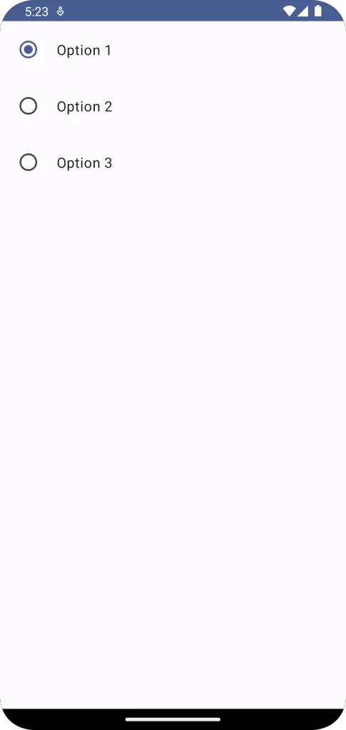
Following is the output.
Following is the complete code for reference.
package com.example.example

import android.os.Bundle
import androidx.activity.ComponentActivity
import androidx.activity.compose.setContent
import androidx.compose.foundation.layout.Column
import androidx.compose.foundation.layout.Row
import androidx.compose.foundation.layout.fillMaxSize
import androidx.compose.foundation.layout.fillMaxWidth
import androidx.compose.foundation.layout.padding
import androidx.compose.material3.MaterialTheme
import androidx.compose.material3.RadioButton
import androidx.compose.material3.Surface
import androidx.compose.material3.Text
import androidx.compose.runtime.Composable
import androidx.compose.runtime.getValue
import androidx.compose.runtime.mutableStateOf
import androidx.compose.runtime.remember
import androidx.compose.runtime.setValue
import androidx.compose.ui.Alignment
import androidx.compose.ui.Modifier
import androidx.compose.ui.tooling.preview.Preview
import androidx.compose.ui.unit.dp
import com.example.example.ui.theme.ExampleTheme

class MainActivity : ComponentActivity() {
    override fun onCreate(savedInstanceState: Bundle?) {
        super.onCreate(savedInstanceState)
        setContent {
            ExampleTheme {
                // A surface container using the 'background' color from the theme
                Surface(
                    modifier = Modifier.fillMaxSize(),
                    color = MaterialTheme.colorScheme.background
                ) {
                    RadioButtonExample()
                }
            }
        }
    }
}


@Composable
fun RadioButtonExample() {
    val radioOptions = listOf("Option 1", "Option 2", "Option 3")
    var selectedOption by remember { mutableStateOf(radioOptions[0]) }

    Column {
        radioOptions.forEach { option ->
            Row(
                Modifier
                    .fillMaxWidth()
                    .padding(8.dp),
                verticalAlignment = Alignment.CenterVertically
            ) {
                RadioButton(
                    selected = (option == selectedOption),
                    onClick = { selectedOption = option },
                )
                Text(
                    text = option,
                    modifier = Modifier.padding(start = 8.dp)
                )
            }
        }
    }
}

@Preview(showBackground = true)
@Composable
fun ExamplePreview() {
    ExampleTheme {
        RadioButtonExample()
    }
}
We’ve now seen how to create a radio button group in Jetpack Compose, allowing us to harness the power of selection controls within our applications effectively and efficiently.