How to Create Custom RadioButton in Android Jetpack Compose
Jetpack Compose is a modern UI toolkit that simplifies UI development on Android. It brings a declarative programming model which is efficient and intuitive, making it easier to create rich, custom UI components. This blog post will explain how to create a custom radio button in Jetpack Compose.
Radio buttons are essential UI components for collecting user input in a form of mutually exclusive options. The standard radio button in Android Jetpack Compose may sometimes not fit the aesthetic or functional needs of your application. In such cases, customizing the radio button is the solution.
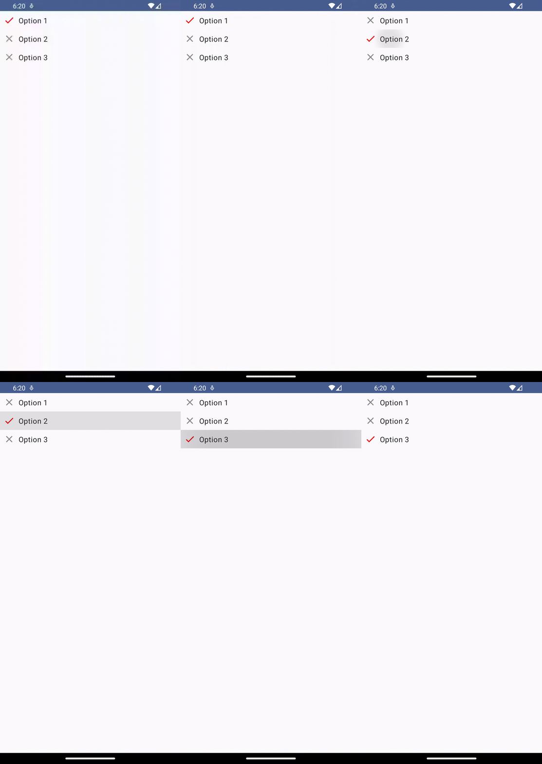
We’re going to create a simple radio button group where the selected option is indicated with a red check mark icon, while the unselected options are denoted by a grey close icon. Below is the complete code for our custom radio button group.
@Composable
fun RadioButtonExample() {
    val radioOptions = listOf("Option 1", "Option 2", "Option 3")
    var selectedOption by remember { mutableStateOf(radioOptions[0]) }

    Column {
        radioOptions.forEach { option ->
            Row(
                Modifier
                    .clickable { selectedOption = option }
                    .padding(8.dp)
                    .fillMaxWidth(),
                verticalAlignment = Alignment.CenterVertically
            ) {
                if (option == selectedOption) {
                    Icon(
                        Icons.Default.Check,
                        contentDescription = "Selected option",
                        modifier = Modifier.size(24.dp),
                        tint = Color.Red
                    )
                } else {
                    Icon(
                        Icons.Default.Close,
                        contentDescription = "Unselected option",
                        modifier = Modifier.size(24.dp),
                        tint = Color.Gray
                    )
                }
                Text(
                    text = option,
                    modifier = Modifier.padding(start = 8.dp)
                )
            }
        }
    }
}
In this code, we’ve created a list of three radio options and initially set the first option as selected. We then loop over the options, creating a Row for each one that is fully clickable.
We apply a padding of 8.dp for aesthetic purposes and use fillMaxWidth() to make sure our row takes the full width of its parent.
The Icon composable within each row is where we customize our radio button. When an option is equal to the selectedOption, a red check icon is displayed. For all other options, a gray close icon is shown instead.
By using clickable modifier on the Row composable, we ensure the entire row is responsive to user input. When a row is clicked, the selectedOption is updated to the current option, and the icons reflect this change accordingly.
Following is the output.
Following is the complete code for reference.
package com.example.example

import android.os.Bundle
import androidx.activity.ComponentActivity
import androidx.activity.compose.setContent
import androidx.compose.foundation.clickable
import androidx.compose.foundation.layout.Column
import androidx.compose.foundation.layout.Row
import androidx.compose.foundation.layout.fillMaxSize
import androidx.compose.foundation.layout.fillMaxWidth
import androidx.compose.foundation.layout.padding
import androidx.compose.foundation.layout.size
import androidx.compose.material.icons.Icons
import androidx.compose.material.icons.filled.Check
import androidx.compose.material.icons.filled.Close
import androidx.compose.material3.Icon
import androidx.compose.material3.MaterialTheme
import androidx.compose.material3.Surface
import androidx.compose.material3.Text
import androidx.compose.runtime.Composable
import androidx.compose.runtime.getValue
import androidx.compose.runtime.mutableStateOf
import androidx.compose.runtime.remember
import androidx.compose.runtime.setValue
import androidx.compose.ui.Alignment
import androidx.compose.ui.Modifier
import androidx.compose.ui.graphics.Color
import androidx.compose.ui.tooling.preview.Preview
import androidx.compose.ui.unit.dp
import com.example.example.ui.theme.ExampleTheme

class MainActivity : ComponentActivity() {
    override fun onCreate(savedInstanceState: Bundle?) {
        super.onCreate(savedInstanceState)
        setContent {
            ExampleTheme {
                // A surface container using the 'background' color from the theme
                Surface(
                    modifier = Modifier.fillMaxSize(),
                    color = MaterialTheme.colorScheme.background
                ) {
                    RadioButtonExample()
                }
            }
        }
    }
}


@Composable
fun RadioButtonExample() {
    val radioOptions = listOf("Option 1", "Option 2", "Option 3")
    var selectedOption by remember { mutableStateOf(radioOptions[0]) }

    Column {
        radioOptions.forEach { option ->
            Row(
                Modifier
                    .clickable { selectedOption = option }
                    .padding(8.dp)
                    .fillMaxWidth(),
                verticalAlignment = Alignment.CenterVertically
            ) {
                if (option == selectedOption) {
                    Icon(
                        Icons.Default.Check,
                        contentDescription = "Selected option",
                        modifier = Modifier.size(24.dp),
                        tint = Color.Red
                    )
                } else {
                    Icon(
                        Icons.Default.Close,
                        contentDescription = "Unselected option",
                        modifier = Modifier.size(24.dp),
                        tint = Color.Gray
                    )
                }
                Text(
                    text = option,
                    modifier = Modifier.padding(start = 8.dp)
                )
            }
        }
    }
}

@Preview(showBackground = true)
@Composable
fun ExamplePreview() {
    ExampleTheme {
        RadioButtonExample()
    }
}
Thus, by using Jetpack Compose’s composable functions and modifiers, we’re able to create and fully customize radio buttons that can easily be tailored to match the rest of our application’s design.
