How to Change Checkbox Size in Android Jetpack Compose
Just like any other component in Jetpack Compose, checkboxes also have customizable attributes that can be easily modified to suit the needs of your application. In this blog post, we will focus on how to adjust the size of a Checkbox.
Checkboxes are a fundamental part of any application. They help to provide a selection feature, allowing the user to select one or multiple items from a given list. Checkboxes enhance user experience by providing easy to understand visual cues that represent selectable options.
However, checkboxes are not immune to design inconsistencies. The size of a checkbox is one of the key attributes that could significantly influence its visibility and accessibility. For instance, if your checkbox is too small, it may be challenging for the user to interact with it, especially on touch devices.
Unfortunately, as of now, there’s no direct way to adjust the size of a Checkbox in Jetpack Compose. The size of the Checkbox is determined by the default Material Design specifications. In other words, the size is fixed.
This does not mean that you can’t adjust the checkbox’s overall appearance size in your application. One potential workaround could involve scaling the checkbox using the scale modifier:
@Composable
fun CheckboxExample() {
Column {
var checked by remember { mutableStateOf(false) }
Checkbox(
modifier = Modifier.scale(1.5f),
checked = checked,
onCheckedChange = { checked = it },
)
}
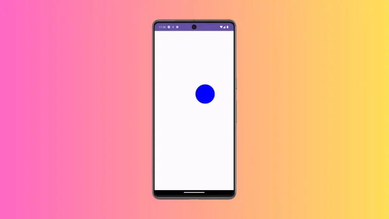
}In the example above, we have applied a scale modifier to the checkbox, effectively enlarging it by 1.5 times. Note that while this may visually scale the Checkbox, it won’t enlarge the touch target, which could have accessibility implications.
Following is the output.

Following is the complete code for reference.
package com.example.example

import android.os.Bundle
import androidx.activity.ComponentActivity
import androidx.activity.compose.setContent
import androidx.compose.foundation.layout.Column
import androidx.compose.foundation.layout.fillMaxSize
import androidx.compose.material3.Checkbox
import androidx.compose.material3.MaterialTheme
import androidx.compose.material3.Surface
import androidx.compose.runtime.Composable
import androidx.compose.runtime.getValue
import androidx.compose.runtime.mutableStateOf
import androidx.compose.runtime.remember
import androidx.compose.runtime.setValue
import androidx.compose.ui.Modifier
import androidx.compose.ui.draw.scale
import androidx.compose.ui.tooling.preview.Preview
import com.example.example.ui.theme.ExampleTheme

class MainActivity : ComponentActivity() {
    override fun onCreate(savedInstanceState: Bundle?) {
        super.onCreate(savedInstanceState)
        setContent {
            ExampleTheme {
                // A surface container using the 'background' color from the theme
                Surface(
                    modifier = Modifier.fillMaxSize(),
                    color = MaterialTheme.colorScheme.background
                ) {
                    CheckboxExample()
                }
            }
        }
    }
}

@Composable
fun CheckboxExample() {
    Column {
        var checked by remember { mutableStateOf(false) }
        Checkbox(
            modifier = Modifier.scale(1.5f),
            checked = checked,
            onCheckedChange = { checked = it },
        )
    }
}

@Preview(showBackground = true)
@Composable
fun ExamplePreview() {
    ExampleTheme {
        CheckboxExample()
    }
}
While this is a quick and easy workaround, remember that altering the size of standard components could impact the visual consistency of your app and user expectations. Always consider these aspects while designing your application.