How to Adjust Snackbar Duration in Android Jetpack Compose
Snackbar duration plays a crucial role in determining how long a message stays visible on the screen. In Android Jetpack Compose, you have the flexibility to control the duration of Snackbar.
In this blog post, we’ll demonstrate how you can customize the duration of a Snackbar message in your Android application.
Understanding Snackbar Duration
Snackbar duration is controlled by the duration parameter in the showSnackbar function. It accepts an instance of the SnackbarDuration enum, which includes three predefined constants: Short, Long, and Indefinite.
SnackbarDuration.Short: This is used when you want the Snackbar to be visible for a short period of time. The actual duration is platform-controlled and can vary between different versions of Android.
SnackbarDuration.Long: This is used when you want the Snackbar to be visible for a slightly longer period of time than Short. Similar to Short, the actual duration is controlled by the platform.
SnackbarDuration.Indefinite: This is used when you want the Snackbar to be visible indefinitely until dismissed by a user action or programmatically.
How to Adjust Snackbar Duration
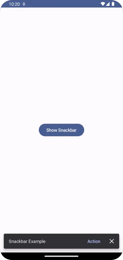
Let’s create a simple example where a button click triggers a Snackbar message with a custom duration. Here is the code:
@Composable
fun SnackbarExample() {
    val snackbarHostState = remember { SnackbarHostState() }
    val scope = rememberCoroutineScope()
    Scaffold(
        snackbarHost = { SnackbarHost(snackbarHostState) },
        content = { innerPadding ->
            Button(onClick = {
                scope.launch {
                    val result = snackbarHostState.showSnackbar(
                        message = "Snackbar Example",
                        actionLabel = "Action",
                        withDismissAction = true,
                        duration = SnackbarDuration.Short
                    )
                    when (result) {
                        SnackbarResult.ActionPerformed -> {
                            //Do Something
                        }
                        SnackbarResult.Dismissed -> {
                            //Do Something
                        }
                    }
                }},
                modifier = Modifier
                    .padding(innerPadding)
                    .fillMaxSize()
                    .wrapContentSize()) {
                Text(text = "Show Snackbar")
            }
        }
    )
}
In the above example, a Scaffold composable is used as the root layout. Inside the Scaffold, a Button composable is defined that triggers a Snackbar with a short duration on click.
Following is the complete code for reference.
package com.example.example

import android.os.Bundle
import androidx.activity.ComponentActivity
import androidx.activity.compose.setContent
import androidx.compose.foundation.layout.fillMaxSize
import androidx.compose.foundation.layout.padding
import androidx.compose.foundation.layout.wrapContentSize
import androidx.compose.material3.Button
import androidx.compose.material3.MaterialTheme
import androidx.compose.material3.Scaffold
import androidx.compose.material3.SnackbarDuration
import androidx.compose.material3.SnackbarHost
import androidx.compose.material3.SnackbarHostState
import androidx.compose.material3.SnackbarResult
import androidx.compose.material3.Surface
import androidx.compose.material3.Text
import androidx.compose.runtime.Composable
import androidx.compose.runtime.remember
import androidx.compose.runtime.rememberCoroutineScope
import androidx.compose.ui.Modifier
import androidx.compose.ui.tooling.preview.Preview
import com.example.example.ui.theme.ExampleTheme
import kotlinx.coroutines.launch

class MainActivity : ComponentActivity() {
    override fun onCreate(savedInstanceState: Bundle?) {
        super.onCreate(savedInstanceState)
        setContent {
            ExampleTheme {
                // A surface container using the 'background' color from the theme
                Surface(
                    modifier = Modifier.fillMaxSize(),
                    color = MaterialTheme.colorScheme.background
                ) {
                    SnackbarExample()
                }
            }
        }
    }
}

@Composable
fun SnackbarExample() {
    val snackbarHostState = remember { SnackbarHostState() }
    val scope = rememberCoroutineScope()
    Scaffold(
        snackbarHost = { SnackbarHost(snackbarHostState) },
        content = { innerPadding ->
            Button(onClick = {
                scope.launch {
                    val result = snackbarHostState.showSnackbar(
                        message = "Snackbar Example",
                        actionLabel = "Action",
                        withDismissAction = true,
                        duration = SnackbarDuration.Short
                    )
                    when (result) {
                        SnackbarResult.ActionPerformed -> {
                            //Do Something
                        }
                        SnackbarResult.Dismissed -> {
                            //Do Something
                        }
                    }
                }},
                modifier = Modifier
                    .padding(innerPadding)
                    .fillMaxSize()
                    .wrapContentSize()) {
                Text(text = "Show Snackbar")
            }
        }
    )
}


@Preview(showBackground = true)
@Composable
fun ExamplePreview() {
    ExampleTheme {
        SnackbarExample()
    }
}
With this, you should be able to effectively control the duration of your Snackbar messages to provide a better user experience. You can choose between short, long, or indefinite durations based on the importance and length of the message you wish to convey.