How to Add Elevated Button in Android Jetpack Compose
Elevated buttons are a part of Material 3 design and are used to indicate that the button will initiate a primary action. They are characterized by their use of shadows to create a sense of depth and dimension.
In this Android tutorial, let’s learn how to add an Elevated Button in Jetpack Compose.
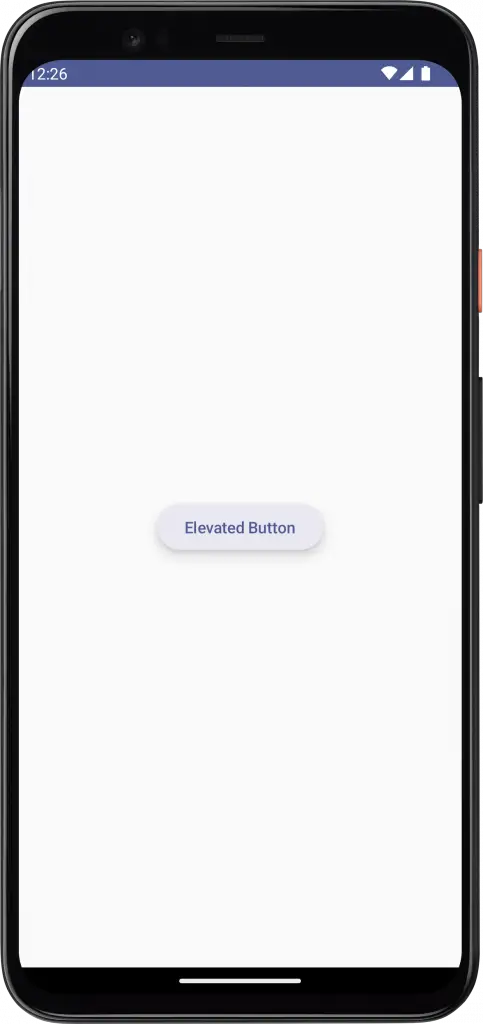
The ElevatedButton is a composable that helps us to create distinct material 3 elevated buttons. See the following code snippet.
ElevatedButton(onClick = { /*TODO*/ },
        elevation = ButtonDefaults.buttonElevation(8.dp)) {
            Text("Elevated Button")
        }
You will get the following output.
Following is the complete code.
package com.example.myapplication

import android.os.Bundle
import androidx.activity.ComponentActivity
import androidx.activity.compose.setContent
import androidx.compose.foundation.layout.Arrangement
import androidx.compose.foundation.layout.Column
import androidx.compose.foundation.layout.fillMaxSize
import androidx.compose.material3.*
import androidx.compose.runtime.Composable
import androidx.compose.ui.Alignment
import androidx.compose.ui.Modifier
import androidx.compose.ui.graphics.Color
import androidx.compose.ui.tooling.preview.Preview
import androidx.compose.ui.unit.dp
import com.example.myapplication.ui.theme.MyApplicationTheme

class MainActivity : ComponentActivity() {
    override fun onCreate(savedInstanceState: Bundle?) {
        super.onCreate(savedInstanceState)
        setContent {
            MyApplicationTheme {
                Surface(
                    modifier = Modifier.fillMaxSize(),
                    color = MaterialTheme.colorScheme.background
                ) {
                    ButtonExample()
                }
            }
        }
    }
}

@Composable
fun ButtonExample() {
    Column(modifier = Modifier.fillMaxSize(),
        horizontalAlignment = Alignment.CenterHorizontally,
        verticalArrangement = Arrangement.Center) {
        ElevatedButton(onClick = { /*TODO*/ },
        elevation = ButtonDefaults.buttonElevation(8.dp)) {
            Text("Elevated Button")
        }
    }
}

@Preview(showBackground = true)
@Composable
fun DefaultPreview() {
    MyApplicationTheme {
        ButtonExample()
    }
}
In order to avoid shadow creep, it is best to only use elevated buttons when they are necessary, for example when the button needs to be visually differentiated from a background with a pattern.
2 Comments