How to Set Slider Step in Jetpack Compose
In Android app development, sliders are a common UI component used for selecting a range of values. Jetpack Compose, Google’s modern toolkit for building native UIs, offers extensive customization for sliders, including the ability to set discrete steps.
This blog post will look into how to implement and use the step feature in a Jetpack Compose slider, enhancing the user experience by allowing the selection of specific values within a range.
Slider Step Feature
The step in a slider allows users to select values at predetermined intervals within the given range. This is particularly useful when you want to restrict the selection to certain values, such as in a rating system or a settings control where only specific values are valid.
Slider with Steps in Jetpack Compose
Basic Setup
First, let’s set up a basic slider in Jetpack Compose. We’ll then modify it to include steps.
@Composable
fun MySteppedSlider() {
var sliderValue by remember { mutableStateOf(0f) }
Slider(
value = sliderValue,
onValueChange = { sliderValue = it },
valueRange = 0f..10f
)
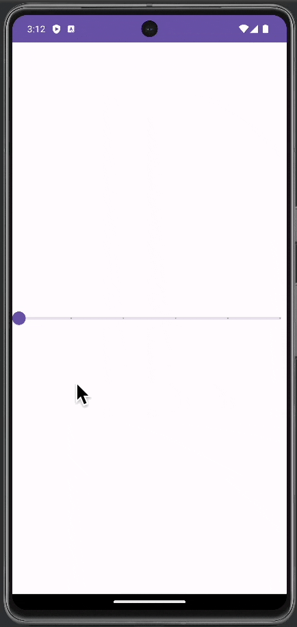
}This code creates a slider that allows any value between 0 and 10 to be selected.
Add Steps to the Slider
To add steps to the slider, you use the steps parameter in the Slider composable. The steps parameter determines the number of discrete values within the value range, excluding the start and end values.
Slider(
    value = sliderValue,
    onValueChange = { sliderValue = it },
    valueRange = 0f..10f,
    steps = 4
)
In this example, the slider will have steps at values 2, 4, 6, and 8, in addition to the range limits (0 and 10). The total number of selectable positions is steps + 1, considering the start and end of the range.
Following is the complete code for reference.
package com.example.myapplication

import android.os.Bundle
import androidx.activity.ComponentActivity
import androidx.activity.compose.setContent
import androidx.compose.foundation.layout.fillMaxSize
import androidx.compose.material3.MaterialTheme
import androidx.compose.material3.Slider
import androidx.compose.material3.Surface
import androidx.compose.runtime.Composable
import androidx.compose.runtime.getValue
import androidx.compose.runtime.mutableStateOf
import androidx.compose.runtime.remember
import androidx.compose.runtime.setValue
import androidx.compose.ui.Modifier
import com.example.myapplication.ui.theme.MyApplicationTheme

class MainActivity : ComponentActivity() {
    override fun onCreate(savedInstanceState: Bundle?) {
        super.onCreate(savedInstanceState)
        setContent {
            MyApplicationTheme {
                    Surface(
                        modifier = Modifier.fillMaxSize(),
                        color = MaterialTheme.colorScheme.background
                    ) {
                        MySteppedSlider()
                    }
            }
        }
    }
}

@Composable
fun MySteppedSlider() {
    var sliderValue by remember { mutableStateOf(0f) }
    Slider(
        value = sliderValue,
        onValueChange = { sliderValue = it },
        valueRange = 0f..10f,
        steps = 4
    )
}
Customize the Stepped Slider
Appearance and Style
You can customize the thumb and track colors, thumb size, and other properties to make the stepped slider fit seamlessly with your app’s design.
Visual Feedback for Steps
Consider providing visual feedback for each step on the slider. This could be in the form of haptic feedback or a sound to enhance the user experience, especially when a new step is reached.
Implementing a slider with steps in Jetpack Compose is an effective way to offer users a more controlled selection experience. By using the steps parameter and customizing the slider to your app’s needs, you can enhance both the functionality and aesthetics of your user interface.