How to create Text Button in Android Jetpack Compose
Text buttons are used to create buttons with lesser significance. They are commonly used in cards and dialogs. Let’s learn how to add a text button in Android using Jetpack Compose.
The Text composable can be made clickable with the help of the Modifier. In this example, we are creating a text button with TextButton composable. The TextButton has useful parameters such as onClick, modifier, enabled, elevation, shape, border, colors, etc.
Jetpack Compose TextButton
@Composable
fun TextButtonExample() {
TextButton(onClick = { /* Do something! */ }) {
Text("Text Button")
}
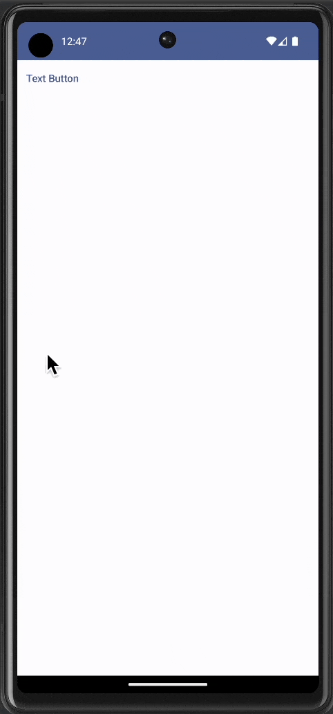
}The TextButton appears as given below.
Complete Code
Following is the complete code for reference.
package com.codingwithrashid.myapplication

import android.os.Bundle
import androidx.activity.ComponentActivity
import androidx.activity.compose.setContent
import androidx.compose.foundation.layout.Column
import androidx.compose.foundation.layout.fillMaxSize
import androidx.compose.material3.MaterialTheme
import androidx.compose.material3.Surface
import androidx.compose.material3.Text
import androidx.compose.material3.TextButton
import androidx.compose.runtime.Composable
import androidx.compose.ui.Modifier
import com.codingwithrashid.myapplication.ui.theme.MyApplicationTheme

class MainActivity : ComponentActivity() {
    override fun onCreate(savedInstanceState: Bundle?) {
        super.onCreate(savedInstanceState)
        setContent {
            MyApplicationTheme {
                Surface(
                    modifier = Modifier.fillMaxSize(),
                    color = MaterialTheme.colorScheme.background
                ) {
                    Column {
                        TextButtonExample()
                    }
                }
            }
        }
    }
}

@Composable
fun TextButtonExample() {
    TextButton(onClick = { /* Do something! */ }) {
        Text("Text Button")
    }
}
That’s how you add a text button in Jetpack Compose.


One Comment