How to Create a Full Screen Modal in iOS SwiftUI
Modal views are an essential part of any mobile application. They help present information or options in a way that doesn’t require the user to navigate away from their current context. SwiftUI makes it incredibly easy to work with modals, and in this blog post, we’ll focus on creating full-screen modals using SwiftUI.
What is a Full Screen Modal?
A full-screen modal is a type of modal that takes up the entire screen space. It’s useful when you want to focus the user’s attention entirely on a single task or piece of information.
The FullScreenCover Function
SwiftUI provides the fullScreenCover function for this purpose. Here’s the function signature from the official documentation:
func fullScreenCover<Content>(
    isPresented: Binding<Bool>,
    onDismiss: (() -> Void)? = nil,
    @ViewBuilder content: @escaping () -> Content
) -> some View where Content : View
Parameters
isPresented: A binding to a Boolean that determines whether the modal is shown or not.onDismiss: A closure that gets called when the modal is dismissed.content: The view you want to display inside the modal.
Basic Usage
Here’s a basic example. We have a button that toggles the isPresented Boolean to show the modal.
import SwiftUI
struct ContentView: View {
@State private var isModalPresented = false
var body: some View {
VStack{
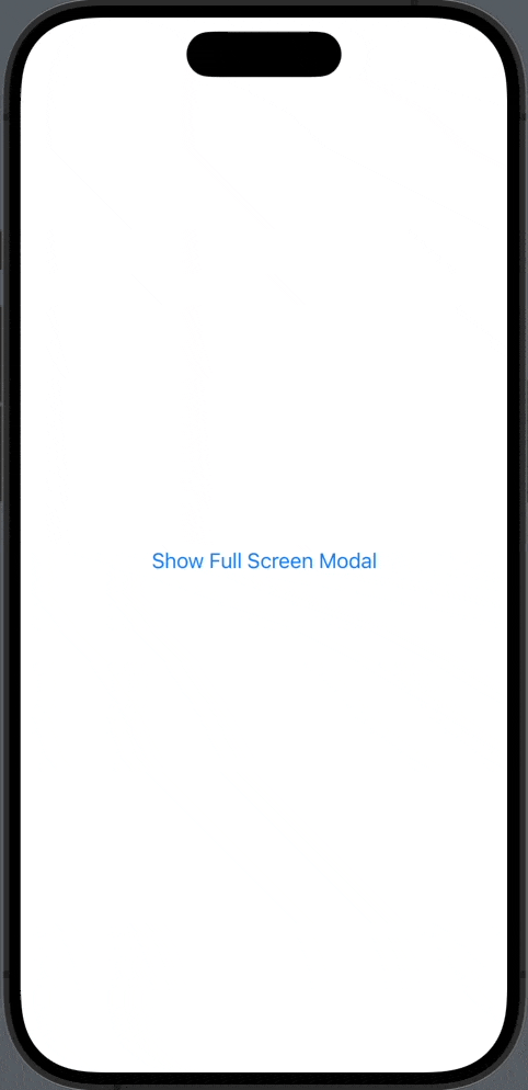
Button("Show Full Screen Modal") {
isModalPresented.toggle()
}
.fullScreenCover(isPresented: $isModalPresented, onDismiss: {
print("Modal dismissed")
}) {
VStack{
Text("This is a full-screen modal")
Button("Hide Modal") {
isModalPresented = false
}
}.frame(maxWidth: .infinity, maxHeight: .infinity).background(.yellow)
}
}
}
}Code Explanation
- VStack: We use a vertical stack to hold the button and the full-screen modal.
- Button “Show Full Screen Modal”: This is the button to trigger the modal.
isModalPresented.toggle(): Toggles theisModalPresentedstate variable to show or hide the modal.onDismiss:: Executes a closure when the modal is dismissed. In this example, it prints “Modal dismissed.”- VStack Inside
fullScreenCover: Houses the content of the modal. - Button “Hide Modal”: A button inside the modal to dismiss it.
.frame(maxWidth: .infinity, maxHeight: .infinity).background(.yellow): Stretches the VStack to full screen and sets the background color to yellow.
Add Content to the Modal
You can make the modal more interesting by adding more views.
struct FullScreenModalView: View {
    var body: some View {
        VStack {
            Text("Welcome to the Full-Screen Modal")
                .font(.headline)
            Spacer()
            Text("You can place any content here.")
                .font(.subheadline)
            Spacer()
        }
    }
}
Then you can update the fullScreenCover like this:
.fullScreenCover(isPresented: $isModalPresented, content: {
    FullScreenModalView()
})
Creating a full-screen modal in SwiftUI is straightforward and convenient. All you need to do is use the fullScreenCover function and pass the relevant parameters. With this function, you can make your apps more dynamic and user-friendly.
6 Comments