How to Change TextField Label Color in Android Jetpack Compose
TextFields are crucial UI elements that enable user input in Android apps. Customizing the look of these TextFields can improve your app’s user experience. In this tutorial, we’ll delve into how to change the label colors in a TextField using Jetpack Compose.
What Are Label Colors?
Label colors in TextFields help users distinguish between different states of interaction. Jetpack Compose allows us to modify these using four key parameters:
focusedLabelColor: Color when the TextField is focused.unfocusedLabelColor: Color when the TextField is not focused.disabledLabelColor: Color when the TextField is disabled.errorLabelColor: Color when there is an error.
Example Code
Here’s an example code snippet that demonstrates how to customize these label colors.
@Composable
fun TextFieldExample() {
    var textInput by remember { mutableStateOf("")}
    TextField(value = textInput,
            onValueChange = {textInput = it},
            label = { Text("Username") },
            colors = TextFieldDefaults.textFieldColors(unfocusedLabelColor = Color.Red,
            focusedLabelColor = Color.Red, disabledLabelColor = Color.Gray, errorLabelColor = Color.Red ),
            modifier = Modifier.fillMaxWidth()
                        .padding(10.dp))
}
In the example, we first create a mutableStateOf to hold the value of the TextField. Then, we use the TextFieldDefaults.textFieldColors method to set the different label colors. The Modifier is used to set layout constraints like width and padding.
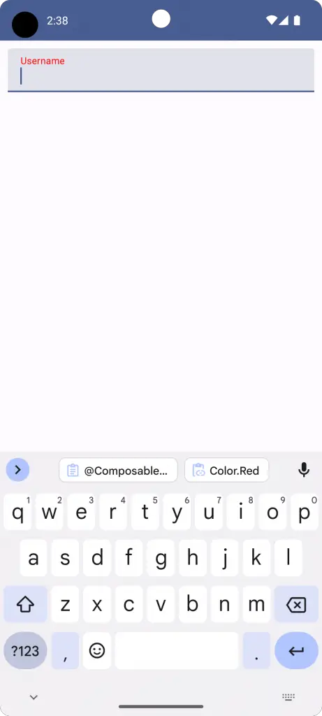
The following screenshot demonstrates how the defined label color appears when the TextField is focused.
Complete Code Reference
If you’d like to see the complete code including the main activity and theme setup, refer to the following:
package com.codingwithrashid.myapplication

import android.os.Bundle
import androidx.activity.ComponentActivity
import androidx.activity.compose.setContent
import androidx.compose.foundation.layout.Column
import androidx.compose.foundation.layout.fillMaxSize
import androidx.compose.foundation.layout.fillMaxWidth
import androidx.compose.foundation.layout.padding
import androidx.compose.material3.ExperimentalMaterial3Api
import androidx.compose.material3.MaterialTheme
import androidx.compose.material3.Surface
import androidx.compose.material3.Text
import androidx.compose.material3.TextField
import androidx.compose.material3.TextFieldDefaults
import androidx.compose.runtime.Composable
import androidx.compose.runtime.getValue
import androidx.compose.runtime.mutableStateOf
import androidx.compose.runtime.remember
import androidx.compose.runtime.setValue
import androidx.compose.ui.Modifier
import androidx.compose.ui.graphics.Color
import androidx.compose.ui.unit.dp
import com.codingwithrashid.myapplication.ui.theme.MyApplicationTheme

class MainActivity : ComponentActivity() {
    override fun onCreate(savedInstanceState: Bundle?) {
        super.onCreate(savedInstanceState)
        setContent {
            MyApplicationTheme {
                Surface(
                    modifier = Modifier.fillMaxSize(),
                    color = MaterialTheme.colorScheme.background
                ) {
                    Column {
                        TextFieldExample()
                    }
                }
            }
        }
    }
}

@OptIn(ExperimentalMaterial3Api::class)
@Composable
fun TextFieldExample() {
    var textInput by remember { mutableStateOf("")}
    TextField(value = textInput,
            onValueChange = {textInput = it},
            label = { Text("Username") },
            colors = TextFieldDefaults.textFieldColors(unfocusedLabelColor = Color.Red,
            focusedLabelColor = Color.Red, disabledLabelColor = Color.Gray, errorLabelColor = Color.Red ),
            modifier = Modifier.fillMaxWidth()
                        .padding(10.dp))
}
Customizing TextField label colors can greatly improve the usability of your Android app. Jetpack Compose makes it easy to implement this functionality, offering a high degree of customization with just a few lines of code.






2 Comments