How to Add Border to Card in Android Jetpack Compose
Adding decorative elements to your UI components can significantly enhance the look and feel of your app. In Jetpack Compose, it’s a breeze to add these elements. In this blog post, we will focus on adding a border to the Card Composable.
The Card Composable is a container that presents content in a neat, clean manner. A border can accentuate a Card’s presence on the screen. Jetpack Compose provides an easy way to add a border to the Card Composable using the border parameter.
Let’s look at an example of how you can add a border to a Card:
@Composable
fun CardExample() {
    Column {
        Card(
            modifier = Modifier
                .fillMaxWidth()
                .padding(20.dp),
            border = BorderStroke(2.dp, Color.Red)
        ) {
                Text("Hello from Jetpack Compose!", Modifier.padding(16.dp))
        }
    }
}
In this example, the border parameter in the Card Composable accepts an instance of BorderStroke. BorderStroke requires two parameters: the width of the border and the color of the border.
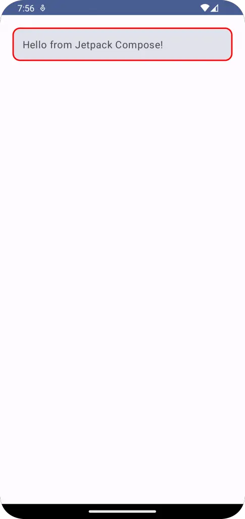
In the code above, we set the border width to 2.dp and the color to Color.Red. This will create a card with a 2.dp red border.
Following is the output.

Following is the complete code for reference.
package com.example.example

import android.os.Bundle
import androidx.activity.ComponentActivity
import androidx.activity.compose.setContent
import androidx.compose.foundation.BorderStroke
import androidx.compose.foundation.layout.Column
import androidx.compose.foundation.layout.fillMaxSize
import androidx.compose.foundation.layout.fillMaxWidth
import androidx.compose.foundation.layout.padding
import androidx.compose.material3.Card
import androidx.compose.material3.MaterialTheme
import androidx.compose.material3.Surface
import androidx.compose.material3.Text
import androidx.compose.runtime.Composable
import androidx.compose.ui.Modifier
import androidx.compose.ui.graphics.Color
import androidx.compose.ui.tooling.preview.Preview
import androidx.compose.ui.unit.dp
import com.example.example.ui.theme.ExampleTheme

class MainActivity : ComponentActivity() {
    override fun onCreate(savedInstanceState: Bundle?) {
        super.onCreate(savedInstanceState)
        setContent {
            ExampleTheme {
                // A surface container using the 'background' color from the theme
                Surface(
                    modifier = Modifier.fillMaxSize(),
                    color = MaterialTheme.colorScheme.background
                ) {
                    CardExample()
                }
            }
        }
    }
}

@Composable
fun CardExample() {
    Column {
        Card(
            modifier = Modifier
                .fillMaxWidth()
                .padding(20.dp),
            border = BorderStroke(2.dp, Color.Red)
        ) {
                Text("Hello from Jetpack Compose!", Modifier.padding(16.dp))
        }
    }
}

@Preview(showBackground = true)
@Composable
fun ExamplePreview() {
    ExampleTheme {
        CardExample()
    }
}
That’s all there is to it! You can experiment with different values for the border width and color to suit your app’s design. Remember, maintaining a consistent design language across your app is crucial for providing a smooth user experience.


