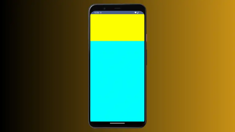
How to Make Card Clickable in Android Jetpack Compose
Interactions are a key aspect of creating engaging user interfaces. They allow users to interact with UI components and perform desired actions. In this blog post, we’ll explore how to make a Card clickable in Jetpack Compose, using the onClick parameter.
The Card Composable
The Card composable in Jetpack Compose serves as a container for other composables, including Text, Image, and more. It’s often used to represent a piece of content alongside related actions.
How to Make Card Clickable
Making a Card clickable is straightforward thanks to the onClick parameter. This parameter takes a lambda function that will be executed when the Card is clicked.
Here is an example:
@Composable
fun CardExample() {
    Column {
        Card(
            onClick = { Log.d("Click", "CardExample: Card Click")},
            modifier = Modifier
                .fillMaxWidth()
                .padding(20.dp)
        ) {
                Text("Hello from Jetpack Compose!", Modifier.padding(16.dp))
        }
    }
}
In this example, we define a Card with an onClick parameter. Inside the onClick lambda function, you can define the actions that should take place when the card is clicked.
Following is the complete code for reference.
package com.example.example

import android.os.Bundle
import android.util.Log
import androidx.activity.ComponentActivity
import androidx.activity.compose.setContent
import androidx.compose.foundation.layout.Column
import androidx.compose.foundation.layout.fillMaxSize
import androidx.compose.foundation.layout.fillMaxWidth
import androidx.compose.foundation.layout.padding
import androidx.compose.material3.Card
import androidx.compose.material3.ExperimentalMaterial3Api
import androidx.compose.material3.MaterialTheme
import androidx.compose.material3.Surface
import androidx.compose.material3.Text
import androidx.compose.runtime.Composable
import androidx.compose.ui.Modifier
import androidx.compose.ui.tooling.preview.Preview
import androidx.compose.ui.unit.dp
import com.example.example.ui.theme.ExampleTheme

class MainActivity : ComponentActivity() {
    override fun onCreate(savedInstanceState: Bundle?) {
        super.onCreate(savedInstanceState)
        setContent {
            ExampleTheme {
                // A surface container using the 'background' color from the theme
                Surface(
                    modifier = Modifier.fillMaxSize(),
                    color = MaterialTheme.colorScheme.background
                ) {
                    CardExample()
                }
            }
        }
    }
}

@OptIn(ExperimentalMaterial3Api::class)
@Composable
fun CardExample() {
    Column {
        Card(
            onClick = { Log.d("Click", "CardExample: Card Click")},
            modifier = Modifier
                .fillMaxWidth()
                .padding(20.dp)
        ) {
                Text("Hello from Jetpack Compose!", Modifier.padding(16.dp))
        }
    }
}

@Preview(showBackground = true)
@Composable
fun ExamplePreview() {
    ExampleTheme {
        CardExample()
    }
}
The Card composable in Jetpack Compose, paired with the onClick parameter, makes it easy for developers to handle click events and create interactive elements in their user interfaces.