How to Do LazyVStack Alignment in iOS SwiftUI
Alignment plays a crucial role in the world of UI design. When using SwiftUI, mastering LazyVStack and its alignment options is a key step to creating engaging, visually pleasing interfaces. This blog post is aimed at helping you understand and implement alignment in SwiftUI’s LazyVStack.
LazyVStack Overview
LazyVStack is a SwiftUI view that arranges its children in a vertical line. It is “lazy” because it only renders the views that are currently visible, thereby improving performance when handling large amounts of data.
Alignment in LazyVStack
The alignment in a LazyVStack can be adjusted using the ‘alignment:’ parameter. The alignment options include: leading, trailing, center, and, in some cases, custom alignments. By default, if no alignment is specified, SwiftUI aligns the stack in the center.
LazyVStack Alignment Example
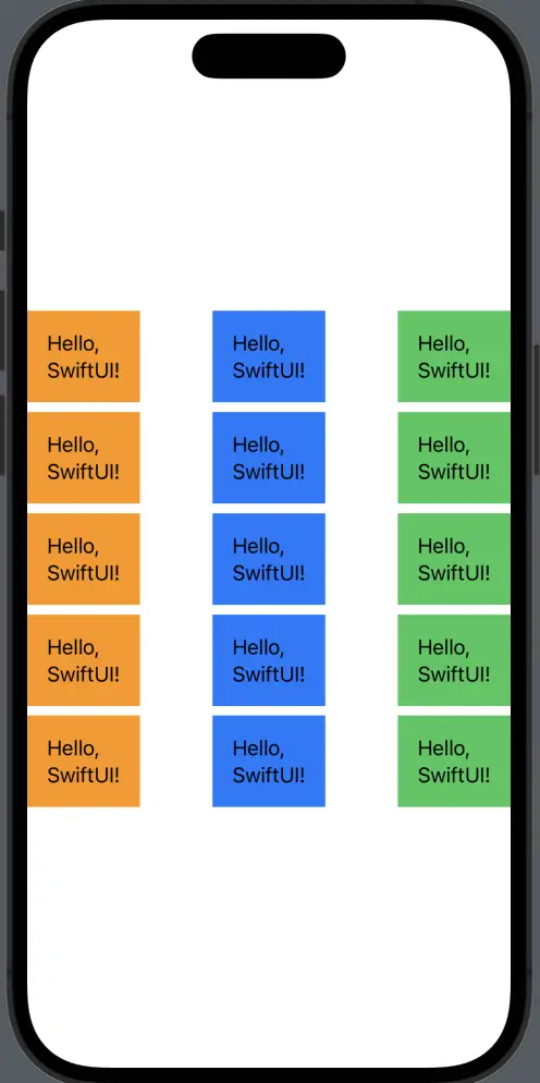
Here’s a simple example of using LazyVStack with different alignment options:
struct ContentView: View {
    var body: some View {
        HStack {
            LazyVStack(alignment: .leading) {
                ForEach(0..<5) { _ in
                    Text("Hello, SwiftUI!")
                        .padding()
                        .background(Color.orange)
                }
            }

            LazyVStack(alignment: .center) {
                ForEach(0..<5) { _ in
                    Text("Hello, SwiftUI!")
                        .padding()
                        .background(Color.blue)
                }
            }

            LazyVStack(alignment: .trailing) {
                ForEach(0..<5) { _ in
                    Text("Hello, SwiftUI!")
                        .padding()
                        .background(Color.green)
                }
            }
        }
    }
}
In this example, we have three LazyVStacks, each with a different alignment. The first is left-aligned (.leading), the second is center-aligned (.center), and the third is right-aligned (.trailing).
Choose the Right Alignment
Alignment selection depends on the specific needs of your UI design. The .leading alignment is suitable when you want the elements to align to the left. It is often used for text to maintain readability.
The .center alignment is suitable for presenting elements symmetrically or for showing small elements in the middle of a larger view. It creates a balanced look and is often used for image presentation or small text blocks.
Lastly, the .trailing alignment is suitable for aligning elements to the right. This alignment is less frequently used, but can be useful for specific design needs or in languages that are read from right to left.
Mastering alignment in SwiftUI’s LazyVStack is essential for creating intuitive and visually appealing user interfaces. By understanding how to use .leading, .center, .trailing, and custom alignments, you can effectively design and manage the layout of your SwiftUI applications.