How to Create Custom Toggle Style in iOS SwiftUI
Toggles are a staple in mobile app interfaces, allowing users to switch between two states. While SwiftUI provides a default toggle style, you might want to create a custom look that aligns with your app’s design.
In this blog post, we’ll dive into how to create a custom toggle style in SwiftUI for iOS.
The Default Toggle
First, let’s see how a basic toggle is created in SwiftUI:
@State private var isOn = false
var body: some View {
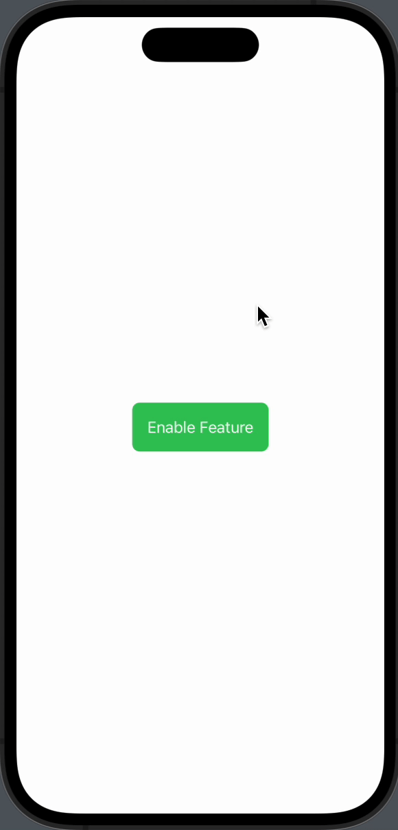
Toggle("Enable Feature", isOn: $isOn)
}This will display a toggle with the default iOS style.
What is ToggleStyle?
In SwiftUI, ToggleStyle is a protocol that allows you to define custom styles for toggles. You’ll need to implement the makeBody function to create your custom toggle.
Create a Custom Toggle Style
To create a custom toggle style, you’ll need to create a struct that conforms to the ToggleStyle protocol. Here’s a simple example:
struct CustomToggleStyle: ToggleStyle {
    func makeBody(configuration: Configuration) -> some View {
        Button(action: {
            configuration.isOn.toggle()
        }) {
            configuration.label
                .padding()
                .background(configuration.isOn ? Color.green : Color.red)
                .foregroundColor(.white)
                .cornerRadius(8)
        }
    }
}
Apply the Custom Style
To apply your custom style, use the toggleStyle modifier like so:
Toggle("Enable Feature", isOn: $isOn)
    .toggleStyle(CustomToggleStyle())
This will apply your custom style to the toggle.
Complete Code
Following is the complete code.
import SwiftUI

struct ContentView: View {
    @State private var isOn = true

    var body: some View {
        Toggle("Enable Feature", isOn: $isOn)
            .toggleStyle(CustomToggleStyle())

    }
}

struct CustomToggleStyle: ToggleStyle {
    func makeBody(configuration: Configuration) -> some View {
        Button(action: {
            configuration.isOn.toggle()
        }) {
            configuration.label
                .padding()
                .background(configuration.isOn ? Color.green : Color.red)
                .foregroundColor(.white)
                .cornerRadius(8)
        }
    }
}


struct ContentView_Previews: PreviewProvider {
    static var previews: some View {
        ContentView()
    }
}
Advantages of Custom Toggle Styles
- Design Consistency: Ensure your toggles match your app’s overall design.
- User Experience: Create a more engaging and intuitive interface.
- Unique Features: Add extra functionalities like animations.
Tips for Custom Toggle Styles
- Use
configuration.isOnto access the toggle’s current state. - Use
configuration.labelto access the toggle’s label. - Make sure to call
configuration.isOn.toggle()to change the toggle state.
Creating a custom toggle style in SwiftUI is not only possible but also quite straightforward. By conforming to the ToggleStyle protocol and using the toggleStyle modifier, you can create toggles that perfectly fit your app’s design and enhance user experience.