How to Customize Button Border Color in iOS SwiftUI
In this blog post, we’re delving into a crucial aspect of SwiftUI’s interface design – customizing the border color of buttons. Buttons form the backbone of user interaction in most applications, and their design plays a crucial role in user experience.
Let’s explore how SwiftUI empowers us to build attractive buttons with customizable border colors.
Basics: Add a Border to a Button
Firstly, let’s take a look at how to add a border to a button in SwiftUI:
Button(action: {
    // Button action
}) {
    Text("Hello, SwiftUI!")
}
.padding()
.overlay(
    RoundedRectangle(cornerRadius: 10)
        .stroke(Color.black, lineWidth: 3)
)
In this example, a border is added around the button using the .overlay() modifier. The border is a RoundedRectangle with a corner radius of 10 and a stroke color of black.
Customize the Border Color
Now, let’s customize the border color of our button. You can use any color from SwiftUI’s Color structure, or you can define a custom color:
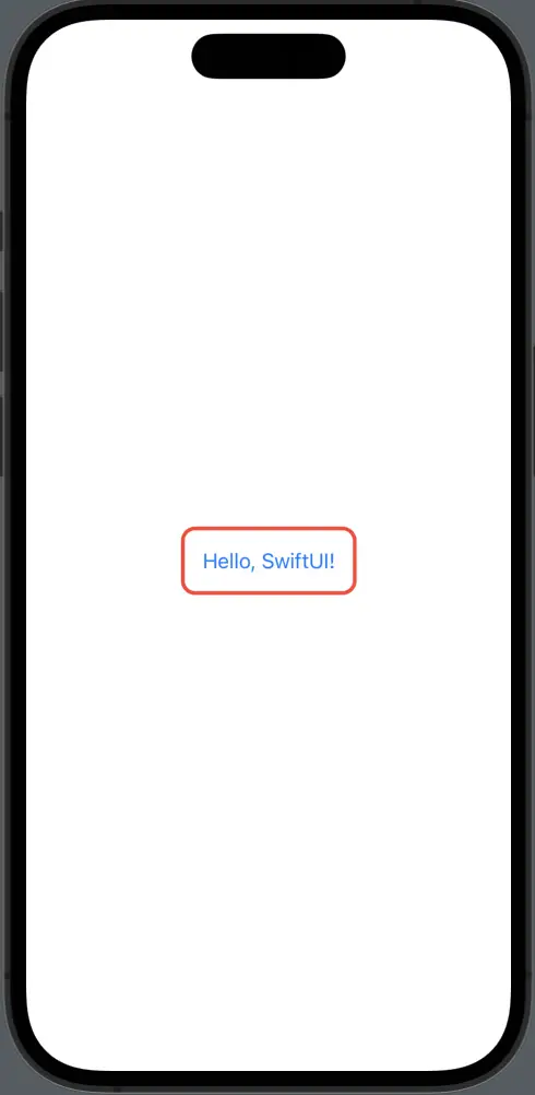
Button(action: {
    // Button action
}) {
    Text("Hello, SwiftUI!")
}
.padding()
.overlay(
    RoundedRectangle(cornerRadius: 10)
        .stroke(Color.red, lineWidth: 3)
)
In this updated example, the border color is changed to red.
Conclusion
Customizing the border color of buttons in SwiftUI opens up a wide range of design possibilities, making your app more visually appealing and interactive. With just a few lines of code, you can create beautiful, engaging buttons that not only perform actions but also provide visual feedback to users.